Three of the best and worst F1 liveries + what makes a good livery?


Formula 1
Jrark from the Members’ Club wants to know “how much Formula 1 teams look purely at feeder series results when assessing young talent compared to, say, their pace on a simulator if they’re part of one of the driver academies”. Here’s Valentin Khorounzhiy’s take:
Members Club Articles
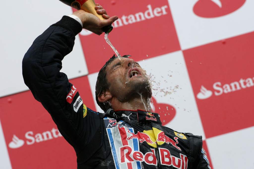
Gavin from the Members’ Club asked how good was Mark Webber and could he have become a Formula 1 champion in the right circumstances? Here’s Mark Hughes’ verdict

Members Club Articles
Danny Elliott from the Members’ Club wanted to know the best drivers to never race in F1. Jack Benyon picks out seven IndyCar aces past and present

Members Club Articles
Group F1 Editor at The Race and the Editor in Chief at WTF1 Ben Anderson is the subject of our latest Meet The Team feature, available to read exclusively on The Race Members’ Club

Formula 1
Max Steib from the Members’ Club wants to know what’s realistic to expect from Logan Sargeant in his rookie Formula 1 season this year