Up Next

Formula 1 noses have changed a lot over the years, but aside from being crucial to the aesthetics of the car, they also have to withstand a severe double impact test and have a significant role in terms of performance.
We’re used to the narrow-nose design favoured by most teams this year, but this is just the latest trend, so it’s worth a look back to see how we got here.
This is a story that started a long time ago when racing cars were actually decent-looking pieces of kit that were pleasing to the eye. Then we went through the self-induced ugly period, with a series of rule changes over the past seven years bringing us into what might be called the not-quite-so-ugly period.
There’s a reason for everything and what I have always told design engineers I was working with was that ‘if it’s ugly, it needs to be quick’. That has certainly been the case in F1 at times.
So why did everyone start pushing the extremes of chassis height, nose height, width and turning vane complexity in this area? Well, it’s all very simple and, like most things with F1 cars, it’s all to do with aerodynamics.
The airflow that you can get through between the front wheels is what the rest of the car has to work with to produce downforce, so reducing the chassis cross-section and nose in this area gives the maximum opening.
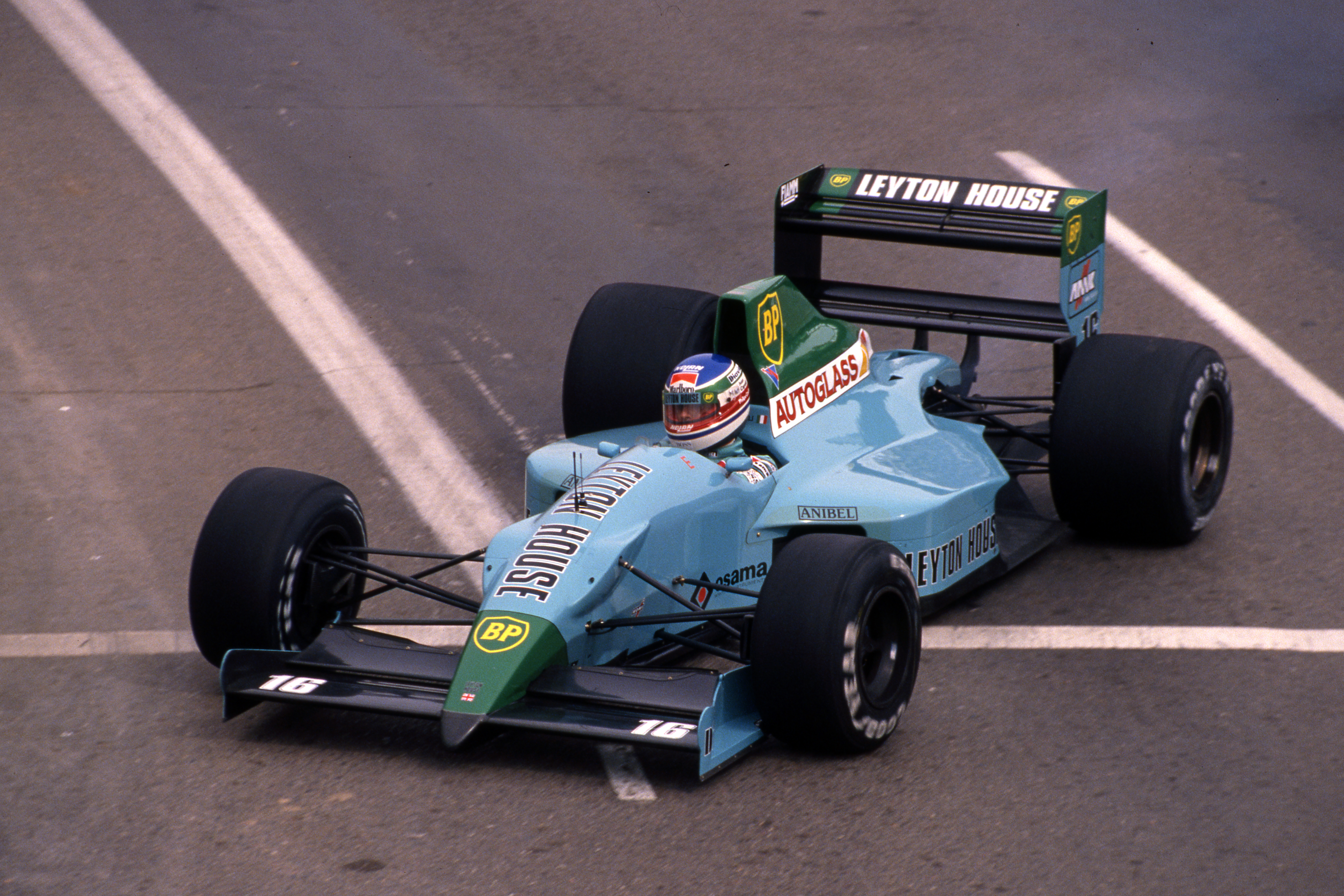
I suppose you could say it was all stated in 1990 by an upstart named Adrian Newey. He was the new boy in town and started to push the limits with his Leyton House designs. And when I say the limit, he often forgot most drivers had two feet! To say the footwell area was compact would be an understatement.
The chassis-to-nose interface was a V-shape and was very narrow at the bottom, which is where the drivers were compromised the most. By doing this, it improved the airflow to the leading edge of the underfloor. Also the front wing was what is now called outboard-loaded, which meant the airflow in the central section of the car was more consistent.
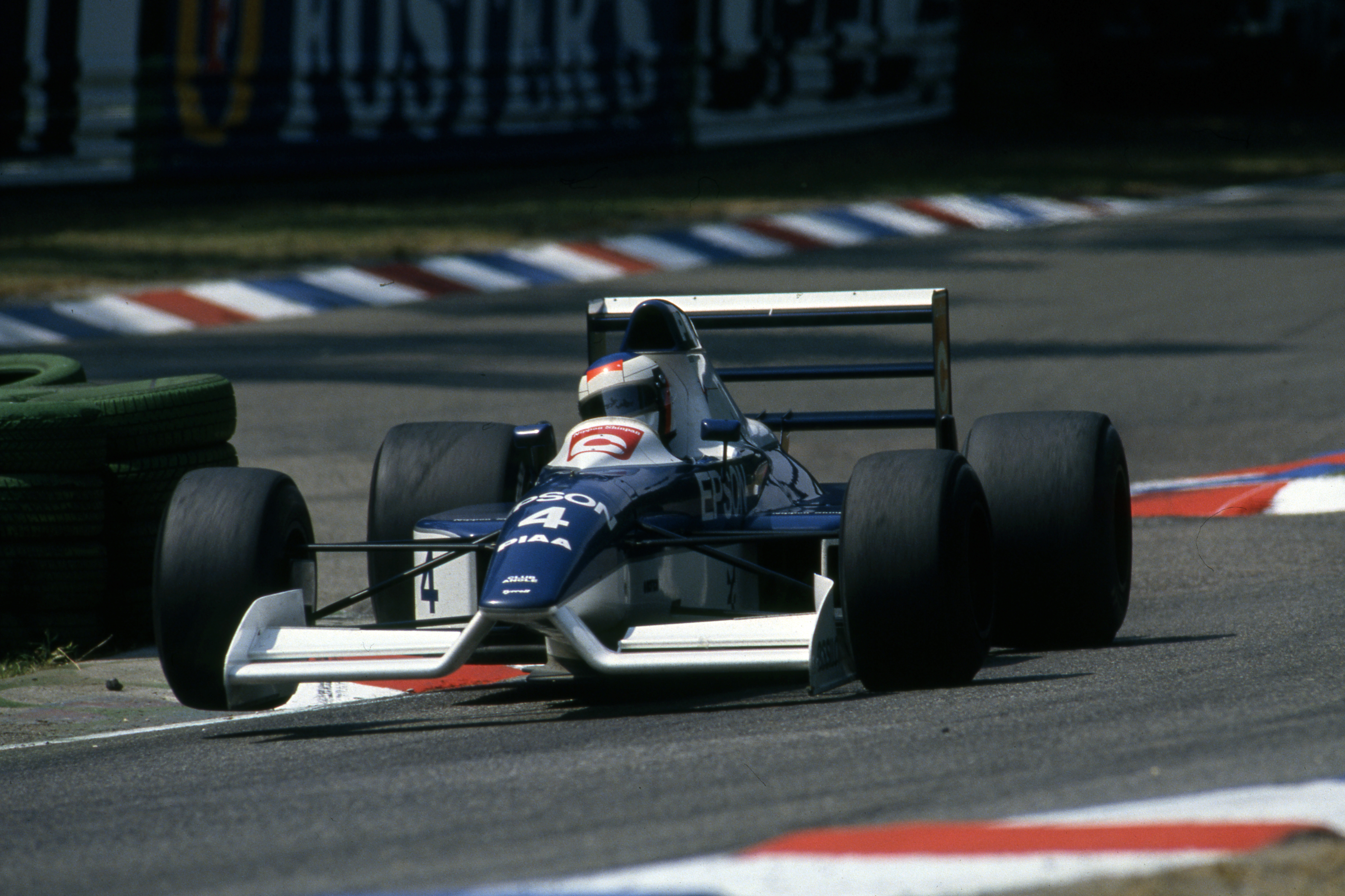
Taking that just that little bit further was Jean-Claude Migeot with his high-nosed Tyrrell. This was a bold move and you could say it set the standard for many years to come with raised footwell allowing airflow underneath the chassis. In effect, this created more open space between the front wheels.
If you can imagine the open area is now a U shape, with the top of hyphen U level with the top of the front tyres, leading to much-improved airflow right across the leading edge of the underfloor.
In 1991, F1 had a new kid on the block in Jordan. We came along with a neat-looking little car that was just that bit different aerodynamically. I have to admit that this team knew very little about anything F1 as it was set up with only three people in the drawing office – Andrew Green, Mark Smith and myself, basically all F1 novices.
We went about designing a car on a very limited budget, that we understood and hoped would be driver-friendly, and came up with the Jordan 911. Porsche wasn’t very happy with that name, so it subsequently became the Jordan 191.
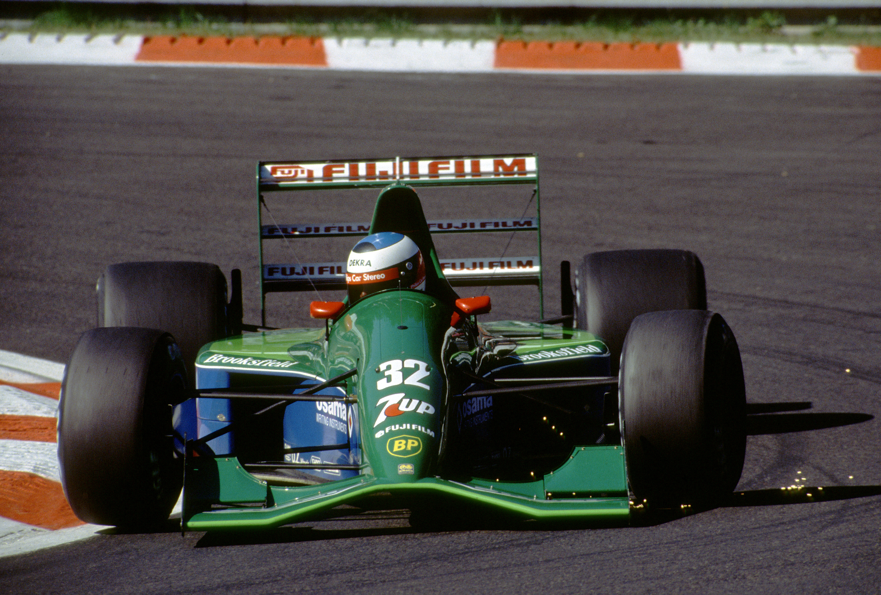
The front wing middle section was slightly lower than the Tyrrell at its highest point, but thanks to being wider it allowed just as much mass flow between the front wheels. The more progressive downward slope to the wing’s outer extremities meant no sharp changes of direction that could set up turbulence. We also loaded the outboard ends to get more consistent airflow through that central section and in turn a more consistent underfloor performance.
One of this car’s assets with this nose and diffuser design was that relatively the total downforce would increase and the centre of pressure would go rearwards under braking. This was because the diffuser performed better at higher ride heights and only the small outer section of the front wing suffered from separation when it got very close the ground. Any driver that drove it – of which there were many – loved that characteristic.
The philosophy was to allow the airflow to do its own thing but then pick up that flow and enhance its performance.
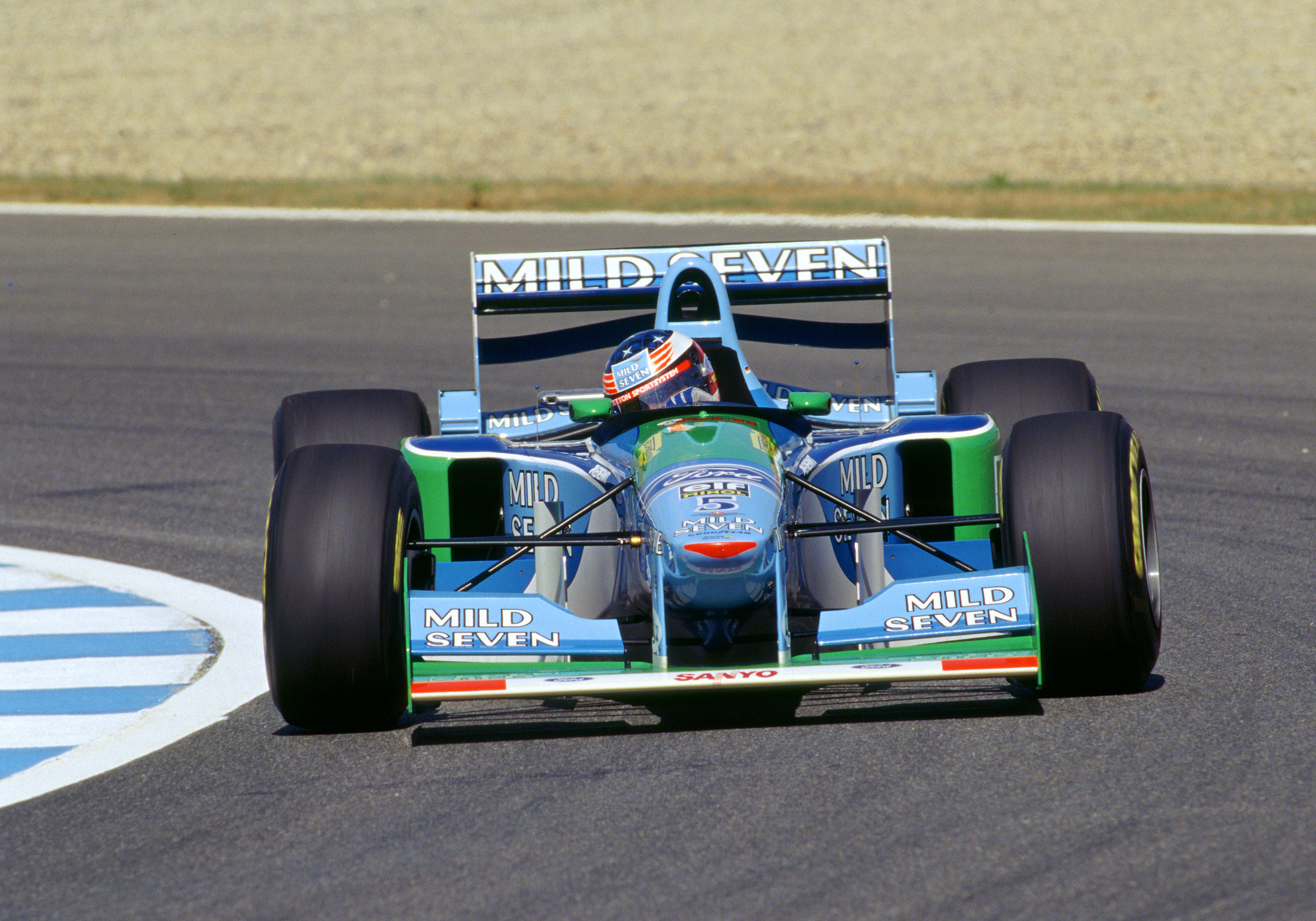
Raising the nose soon became the done thing, with the Benetton B194 the first car built to that concept to win a title in the hands of Michael Schumacher.
The nose path Benetton followed was very similar to that of the Tyrrell of four years ago. But by this time very simple bargeboards had come into play and the raised nose now had three functions.
The first was to open up the space behind the nose and front wing. The second was to maximise the airflow going between the front wheels. And the third was to feed the bargeboards, which in turn allowed the car to pull even more airflow through between the wheels.
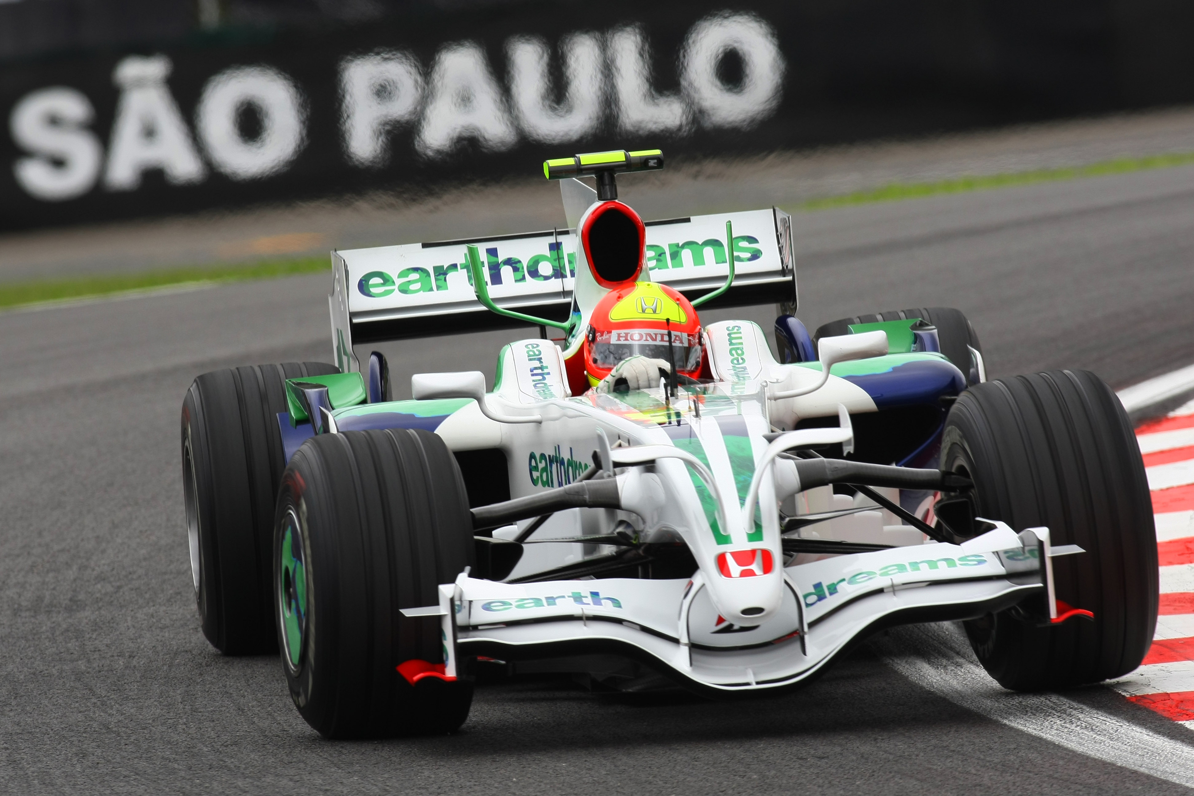
Nose design continued to evolve based on this trend for many years, but the front wing and bargeboard complexity gradually became a work of art. This continued all the way to 2008, when many F1 cars were hugely detailed in these areas.
Things changed with the new regulations in 2009, with the FIA-mandated neutral section of the front wing. This extended to 250mm on either side of the centreline of the car, with only the outboard parts of the wings free for development.

The objective was to improve overtaking. The neutral section was introduced to pick up any disturbed flow from a car in front, tidy it up as best possible before introducing it to the underfloor. Needless to say, it did nothing and the teams soon found a way to make it work for them.
They were able to use the difference in the airflow at the junction between the neutral section that’s doing very little and the outboard part that’s working hard to produce downforce. This is the Y250 vortex, so-called because of the 250mm measurement from the car centreline.
When viewed from the front of the car, this vortex rotated clockwise on the left-hand side of the car and anti-clockwise on the right-hand side. This worked in conjunction with the bargeboards to pull more airflow through from underneath the raised central section of the nose and chassis. It also helped to seal the sides of the underfloor.
In pursuit of minimising the blockage of the airflow between the front wheels, teams often compromised their front suspension geometry for aerodynamic benefit. The 2011 Mercedes W02 is a good example of this.
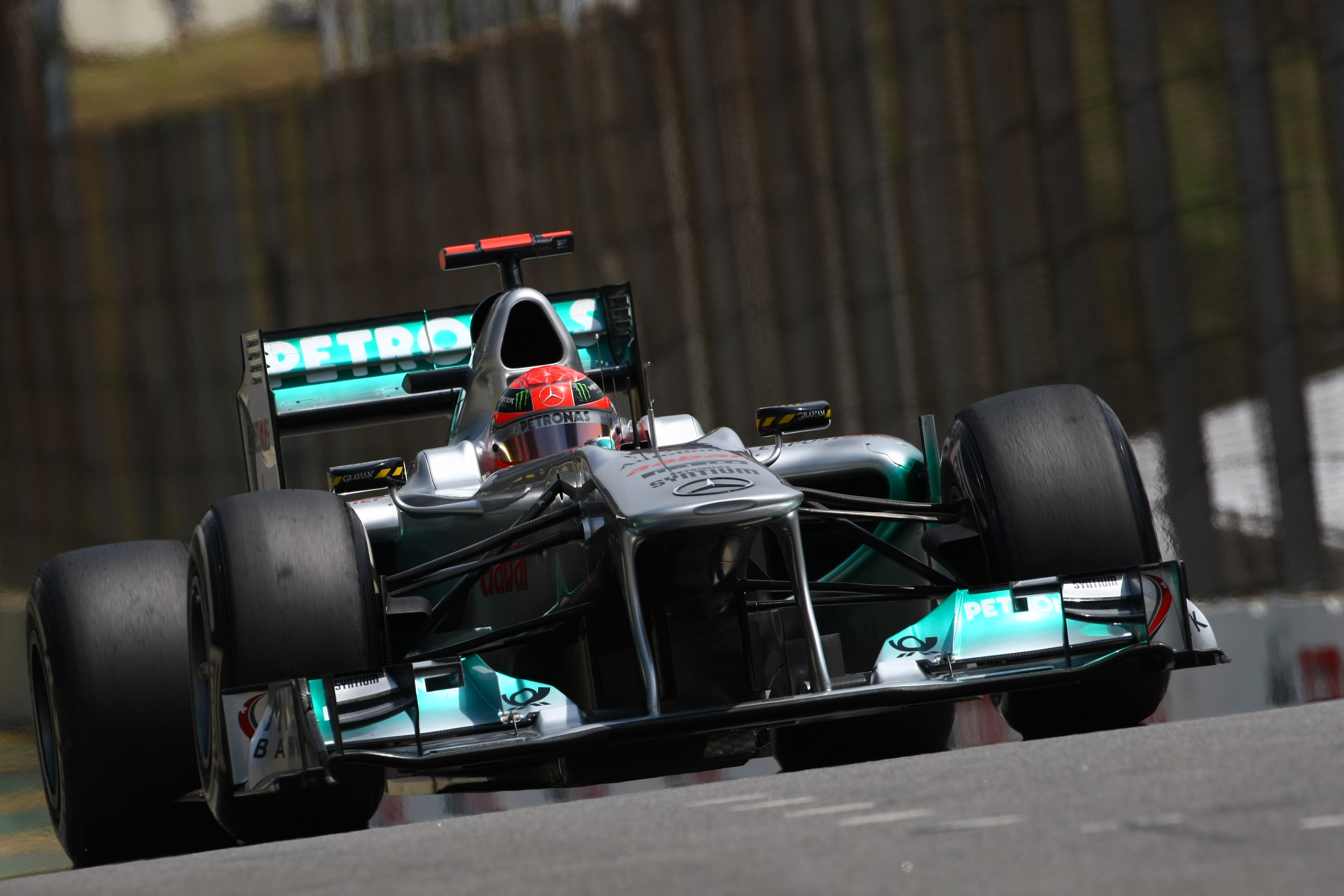
With the noses getting higher and higher, the FIA stepped in and decided that a maximum height of the nose was required for 2012. While the front of the monocoque had a maximum height of 625mm, the nose itself was 75mm lower 150mm ahead of the front of the monocoque.
This didn’t really change anything and inadvertently created what probably stands as the ugliest F1 cars in three decades.
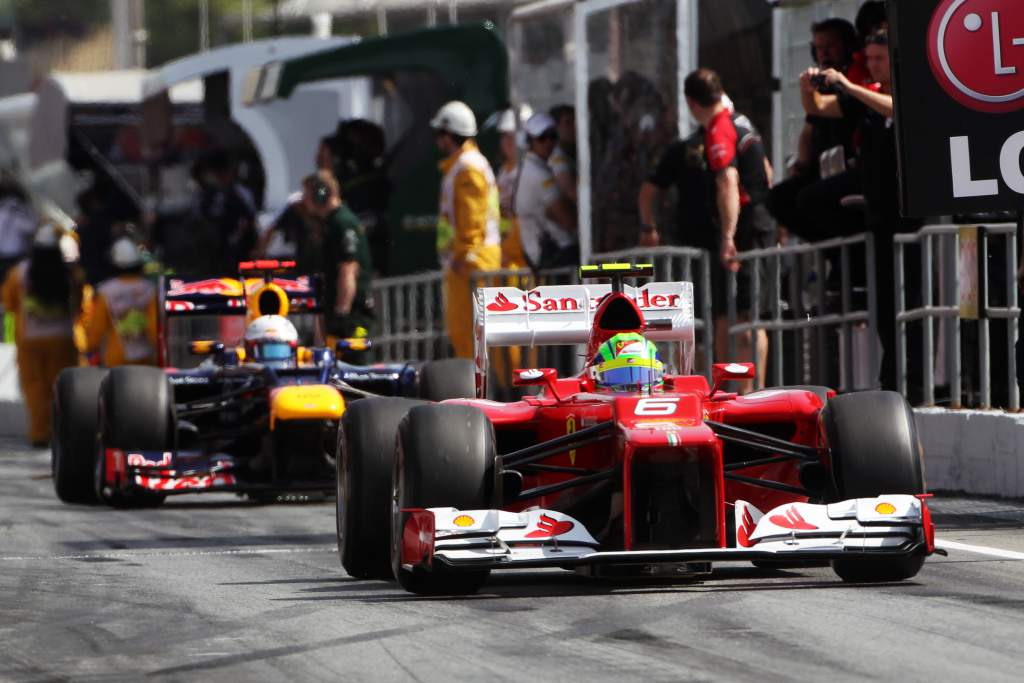
This was mitigated the following year with an optional ‘vanity panel’ that wasn’t structural but did make for a less dramatic transition.
The rules changed again for 2014 with the front bulkhead of the chassis lowered to a maximum height of 525mm. The front of the nose was lowered dramatically to 185mm, which was measured 50mm behind the tip of the nose.
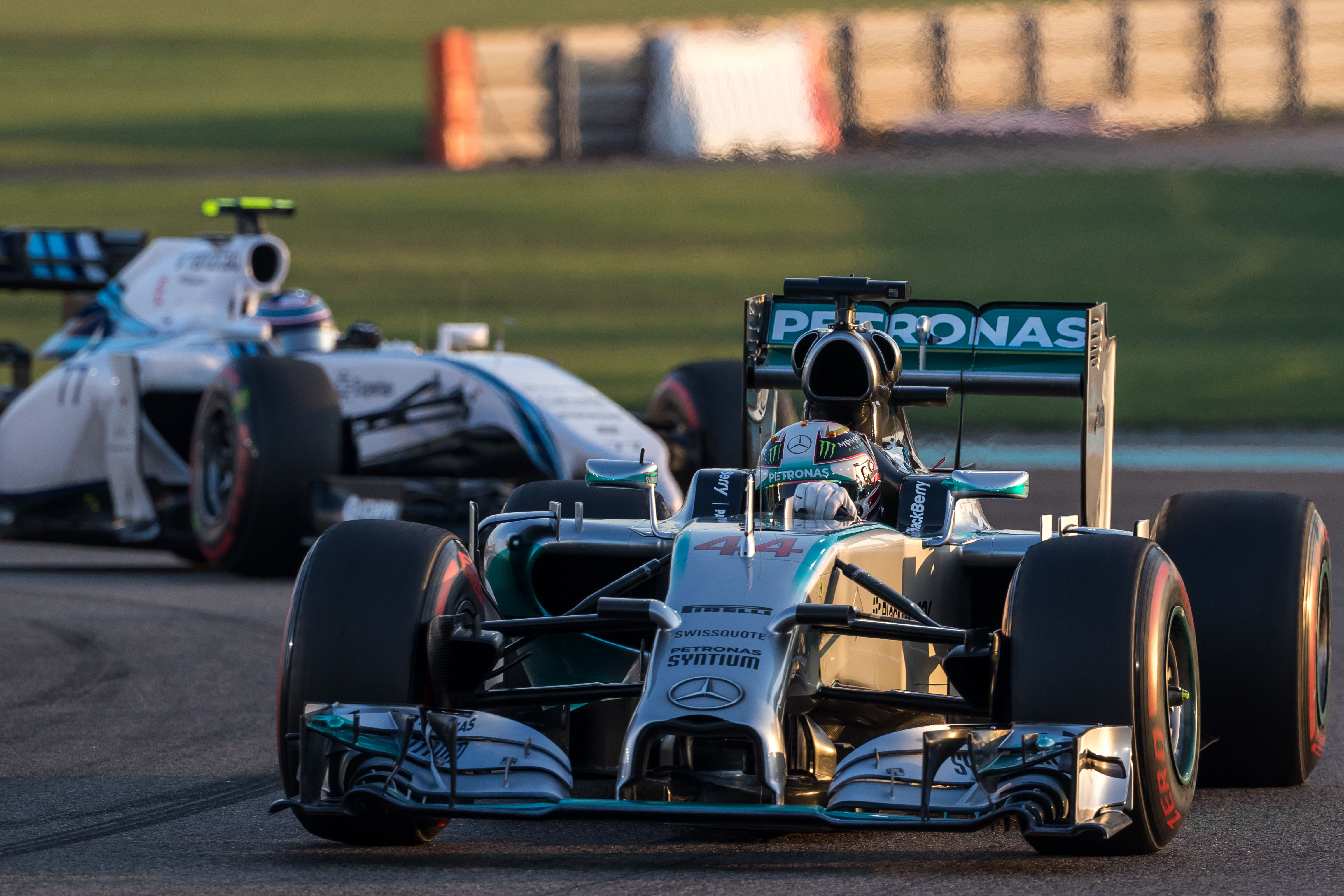
This inevitably led to some very different designs to comply with the regulations. Mercedes actually produced one of the most pleasing ones but at the other end of the scale, we had the hideous Caterham design. This had a high wedge shape and a single central tusk from which the wing was mounted.
The Caterham was even uglier than the picture below shows and you can see that with this front suspension geometry, the front track inevitably increased when the car compressed or went over a bump. Mid-corner, the outside front tyre is fully loaded and if you hit a bump or touched a kerb and the suspension gets compressed, that highly-loaded tyre will simply break its grip and slide.
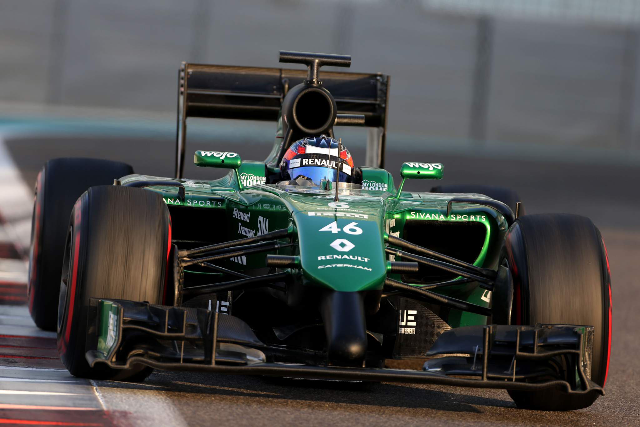
Lotus took what might have been called an innovative approach and created the ‘twin-tusk’ design. The left-side tusk as you look at the car was 50mm longer to comply with the nose impact position rules and required significant work to pass the crash tests.
Toro Rosso, among others, had a single protruding tusk to satisfy the rules. Some called it something different, but I’m not going to go there….
The rules were poorly written and the teams did what they had to and found the best way around those regulations. But the objective was still the same, get the maximum high-quality airflow possible between the front wheels by minimising the blockage.
But this was the start of the trend for narrower nose solutions to make up for the fact that it was no longer possible to have the high-nose designs. By having the protrusions to meet the regulations, it minimised the airflow blockage created by the nose. It’s not as good as not having the blockage, but it’s the best approach given the restrictions of the regulations.
With any design, it is never the ultimate solution and there is always room for improvement. That’s what development is, get the best out of what you have then go through the research and development process once again. With every cycle, you should expect an improvement.
Again, the regulation changes were questionable. Just look at the narrow high rear wing – those writing the rules certainly weren’t thinking about aesthetics.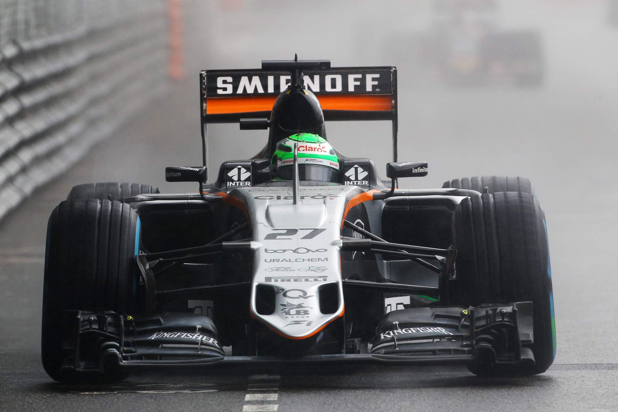
To combat the unsightly noses, a new rule was introduced to create a mandatory cross-sectional area behind the tip of the nose. This resulted in a return to wider nose designs.
Force India went through a fairly successful period with a wide nose and these snorkel openings that connected the central impact area position to the actual wing mounting pillars. These openings allowed airflow through into the underneath of the raised chassis.
In 2017, F1 went through dramatic regulation changes with wider, higher-downforce cars and wider tyres. The rear wings were also bigger and lower, making them look far more like a racing car should – big, purposeful beasts. Unfortunately, the tracks stayed the same so Monaco, to name just one, became even more of a procession.
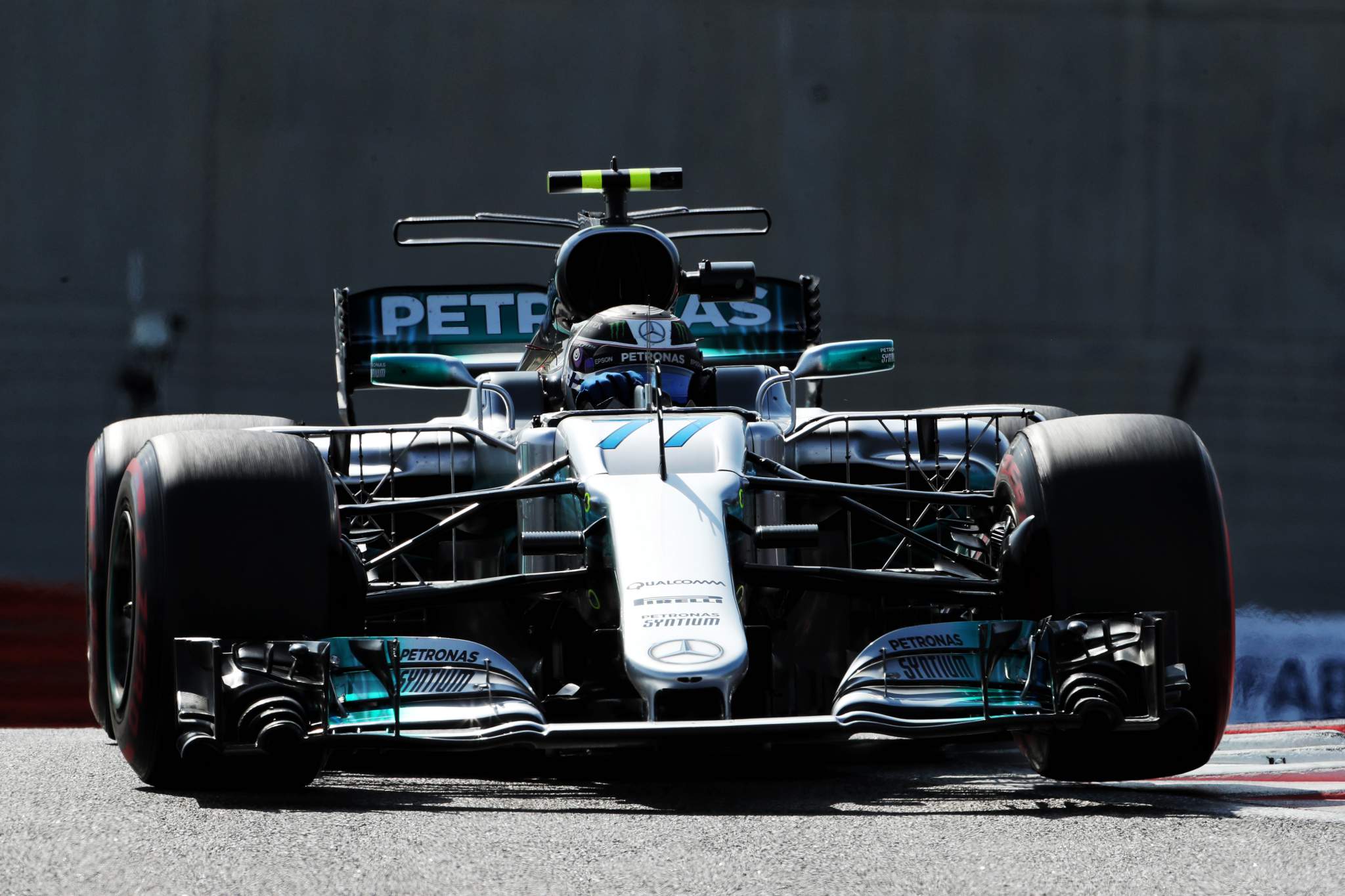
Mercedes also started the trend for narrow noses when it introduced its version at the 2017 Spanish Grand Prix. Complying with the impact test is no easy task and, as is the norm with most things, it was one of the best-funded teams that got there first.
The chassis section at the front bulkhead was not affected. You can see with this very flat top of the chassis going forward from the cockpit opening to the front wheel that the teams wanted to keep it as high as possible. There is a minimum size for the front bulkhead, so this meant there was maximum open space below it.
In order to make the best use of the narrow nose work, Mercedes also pioneered the cap design. This more or less horizontal cape hangs below the nose of a central fairing. As the airflow spills around the sides of the nose, the cape picks it up and optimises its flow direction to the leading edge of the underfloor.
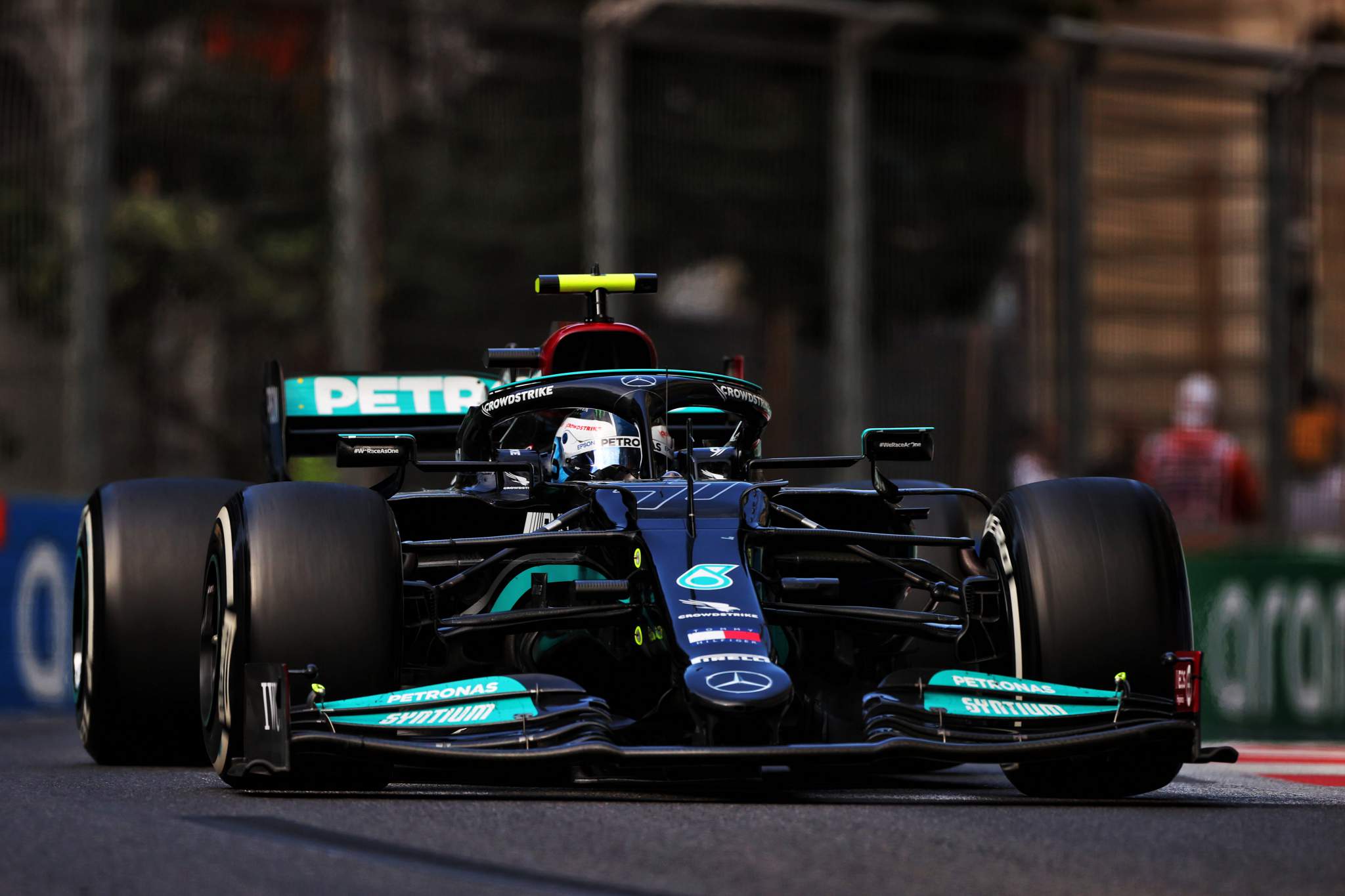
In 2021, the narrow nose is now the common design, usually with an s-duct to use the low-pressure area on top of the front of the chassis to pull airflow from underneath the nose between the front wing pillars. This reduces the lift on the top of the chassis that would normally occur with the airflow accelerating over that curve where the nose meets the chassis, and it also improves the airflow underneath the chassis’ central section.
The objective is still to get as much airflow as possible between the front wheels because this is the airflow that the rest of the car has to work with. All the bargeboard development in the world won’t have any impact on the overall performance if you don’t have that high-energy airflow, which is why most teams have now at least gone partly in this direction.
The one thing that we can also see is that the front suspension geometry is more in line with what the tyre might just respond to. If you compare the Mercedes to its 2011/12 cars visibly there is a big improvement.
I have said many times, don’t just complain about the tyres when you are simply using the wishbones to hold the wheels on. You have to optimise their usage with a sensible suspension geometry – then if they are still problematic you can complain.
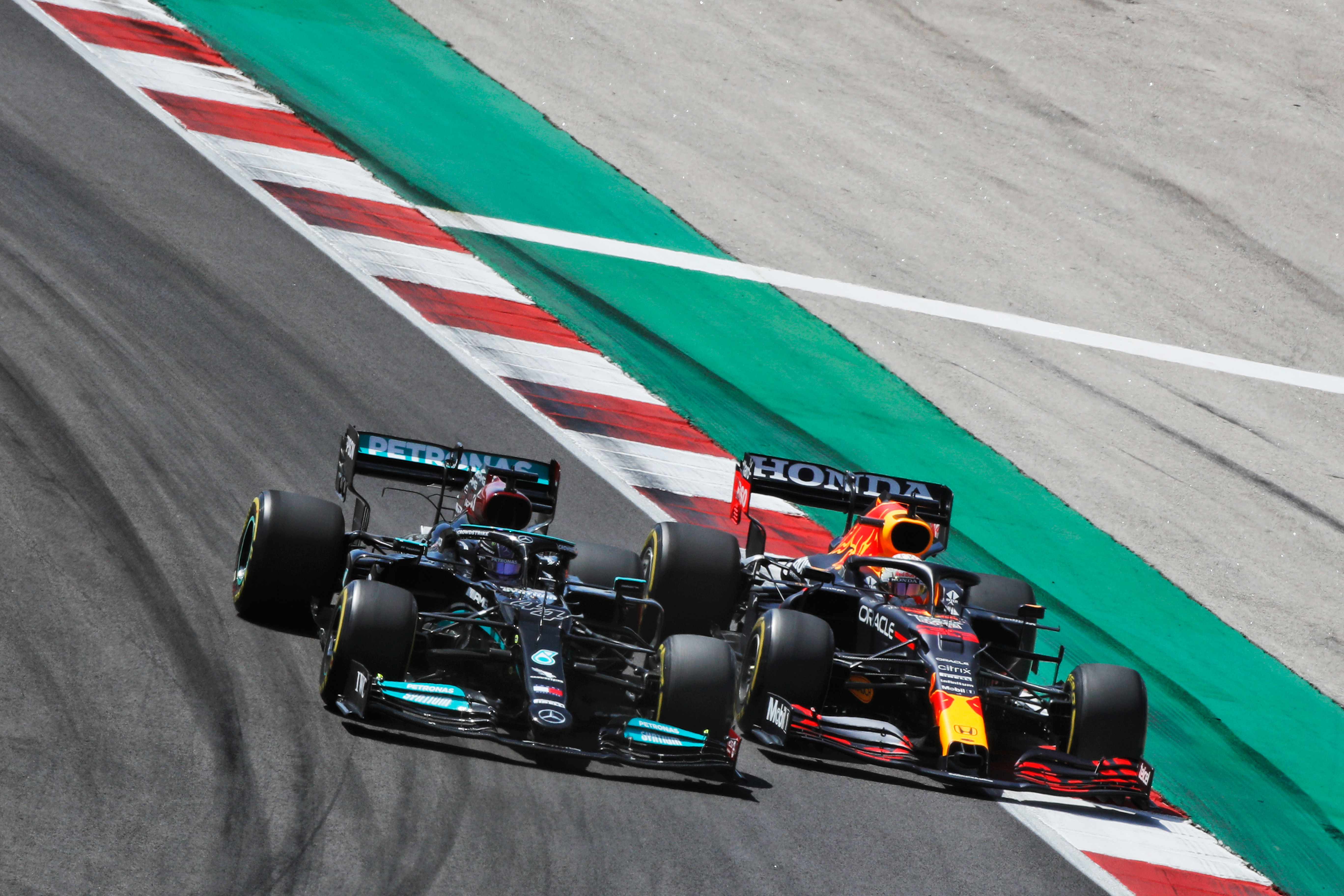
Mercedes and Red Bull are vastly different cars in every way – the rake, how they work the front wing, the wheelbase etc. But because the regulations are so constrained it appears visually to be only small detail differences.
As we can see this year, they both perform to a very similar level so it shows just how important those small details are to getting the best from your overall concept.
I’m pretty sure Ferrari would have gone for the narrow nose had it not been for the introduction of development tokens. You could only spend them once and Ferrari decided to spend them on the rear of the car to modify its suspension, meaning it could only slightly trim its nose within the existing design.
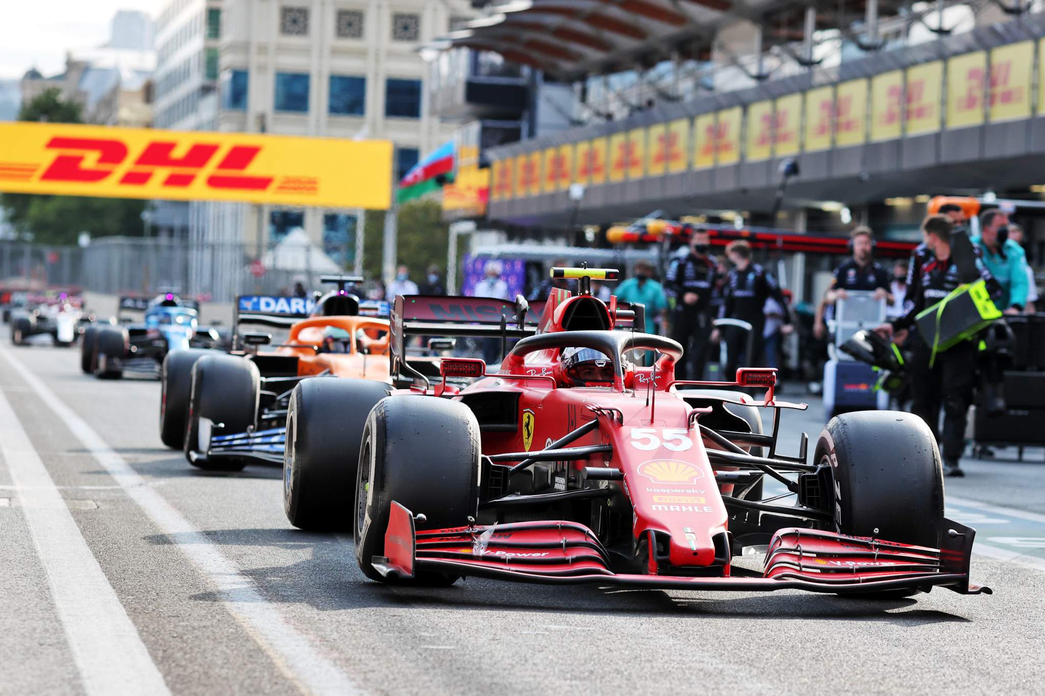
It’s all change for 2022 and we will start the cycle again. The objective is to make the racing better by being able to follow another car closer and for longer without losing grip and destroying your tyres.
Initial car renders and regulations – all 150-odd pages of them – suggest that the cars will be very similar to each other. The regulations are very prescriptive, leaving very little room for engineering inspiration, with a low nose the direction everyone will have to take.
The teams don’t like that and, to be honest, the jury is still out as to if that will be good or bad for the racing. After all, the regulations introduced for 2009 to improve overtaking basically did nothing.
Time will tell, but as the history of F1’s nose regulation changes shows us, things don’t always go as expected.


