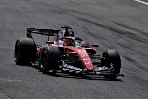
Gary Anderson compares F1’s top three designs
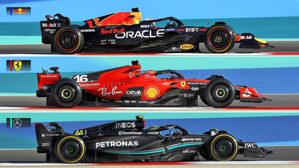
Red Bull may have done most of the winning in the 2022 Formula 1 season, but that hasn’t stopped its main rivals Ferrari and Mercedes sticking to their guns with their 2023 design concepts.
There are plenty of differences in the details of the top three teams’ new cars, especially when it comes to the sidepods.
They’ll all have their reasons for the directions they’ve taken, but when you look at the main visible elements of the three cars side by side, Red Bull definitely seems to have fewest compromises.
FRONT WING
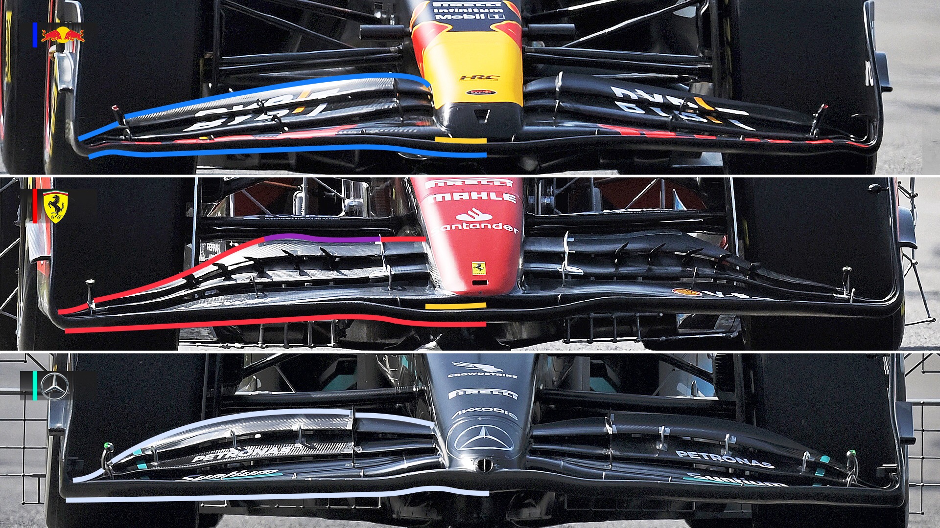
As I always say, the airflow that the car sees starts at the front and it’s the influence of that flow coming off the front wing that the rest of the car has to work with.
There’s a significant difference in front wing detail among the top three teams this year.
On the Red Bull, I’ve added blue highlight lines on the leading edge of the main plane and the trailing edge of the rear flap. They have fairly equal spans, with the loading dropping away as it goes outboard.
The short highlight is to show it has a slot gap between the nose and the most forward element. Having this central area of the front wing forward element lower means that it could suffer airflow separation under braking when it is at its lowest, but the slot gap will improve the consistency of the flow onto the underside of the nose – which is the area that feeds the leading edge of the underfloor.
The red highlights on the Ferrari show the leading and trailing front wing edges, and that the span loading doesn’t drop off as progressively as on the Red Bull.
The area where I have put the magenta line is where Ferrari has added a gurney flap. This is a small 90-degree strip that you fit to the trailing edge to increase the performance of the wing in that area. Its presence shows that Ferrari has been struggling to get enough load out of its front wing, especially at low speed which is where a gurney flap will give you more load than just an increase in wing angle.
The yellow line again shows a slot gap, there for the same reason as Red Bull’s.
On the Mercedes, the silver highlight shows the leading and trailing edges. Again, like Ferrari the trailing edge doesn’t drop off as progressively going outboard as on the Red Bull.
But for me the most significant difference on the Mercedes front wing is that it doesn’t have a slot gap between the forward and second element. Instead it has a raised central section. Under braking it will not suffer the same level of front wing airflow separation but that separation when it happens under braking can actually be positive as it reduces the front load and gives driver the feeling of a more consistent balance at just the time when the rear is feeling a bit nervous.
SIDEPOD UNDERCUTS
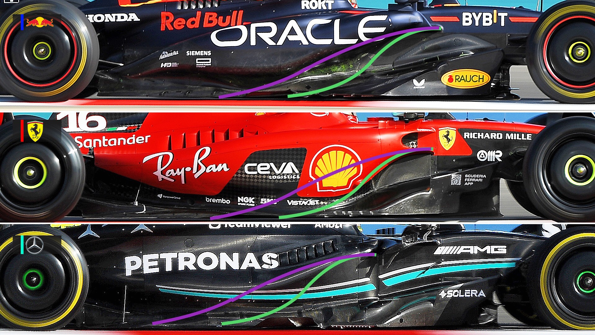
Looking at a side view of the Red Bull, Ferrari and Mercedes sidepod leading edge undercuts show the visual area where we see the biggest difference between these three cars and their concepts.
The magenta highlight is the basic undercut line on the Red Bull, starting at the lower leading edge of the radiator inlet and ending at more or less the floor edge.
I’ve then transposed that magenta line showing the Red Bull’s undercut profile onto the Ferrari and Mercedes so you can see the difference.
The green highlight is the basic undercut line on the Ferrari, starting at the lower leading edge of the radiator inlet and ending at more or less the floor edge.
I’ve transposed that onto the Red Bull and Mercedes for the same effect.
As the lines show, Ferrari turns the airflow outwards much more aggressively than Red Bull, which has a longer and more gentle undercut, however by having an upper surface on this undercut both of them contain this flow effect which means they can feed it back into the overall airflow structure where and when they want to.
The Mercedes doesn’t have any form of undercut so it’s impossible to put a line on its car to compare. But what this says to me is that it doesn’t have the tools (in the form of body profile) to allow it to manage the airflow in this area.
The airflow may go around the sidepods more efficiently with the Mercedes solution but if you can’t realign it as required you are simply stuck with what you have.
REAR WINGS
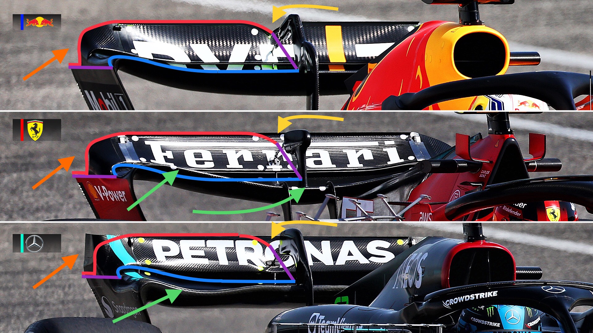
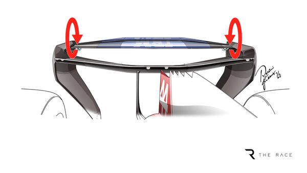
Just to give a comparison of rear wing concepts I have put some highlight lines on the rear wing leading edge (blue highlight) and trailing edge (red highlight) showing Red Bull’s shape and then transposed that onto the Ferrari and Mercedes.
The reference (magenta lines) are to allow me to position them as well as possible. Once fitted to the Red Bull wing there is as little as possible scaling on them to fit them to the other cars but because the pictures area not exactly at the same angle or scale I have had to do a little.
As you can see, neither Ferrari or Mercedes bother with this small centre line V cutout that I’ve indicated with the yellow arrow. Red Bull, which uses a single mount system, does it because the area behind the wing mount and DRS actuator means that the energy in the flow to that section of the flap is not as strong so it will separate on the undersurface earlier, meaning that a shorter cord is more efficient.
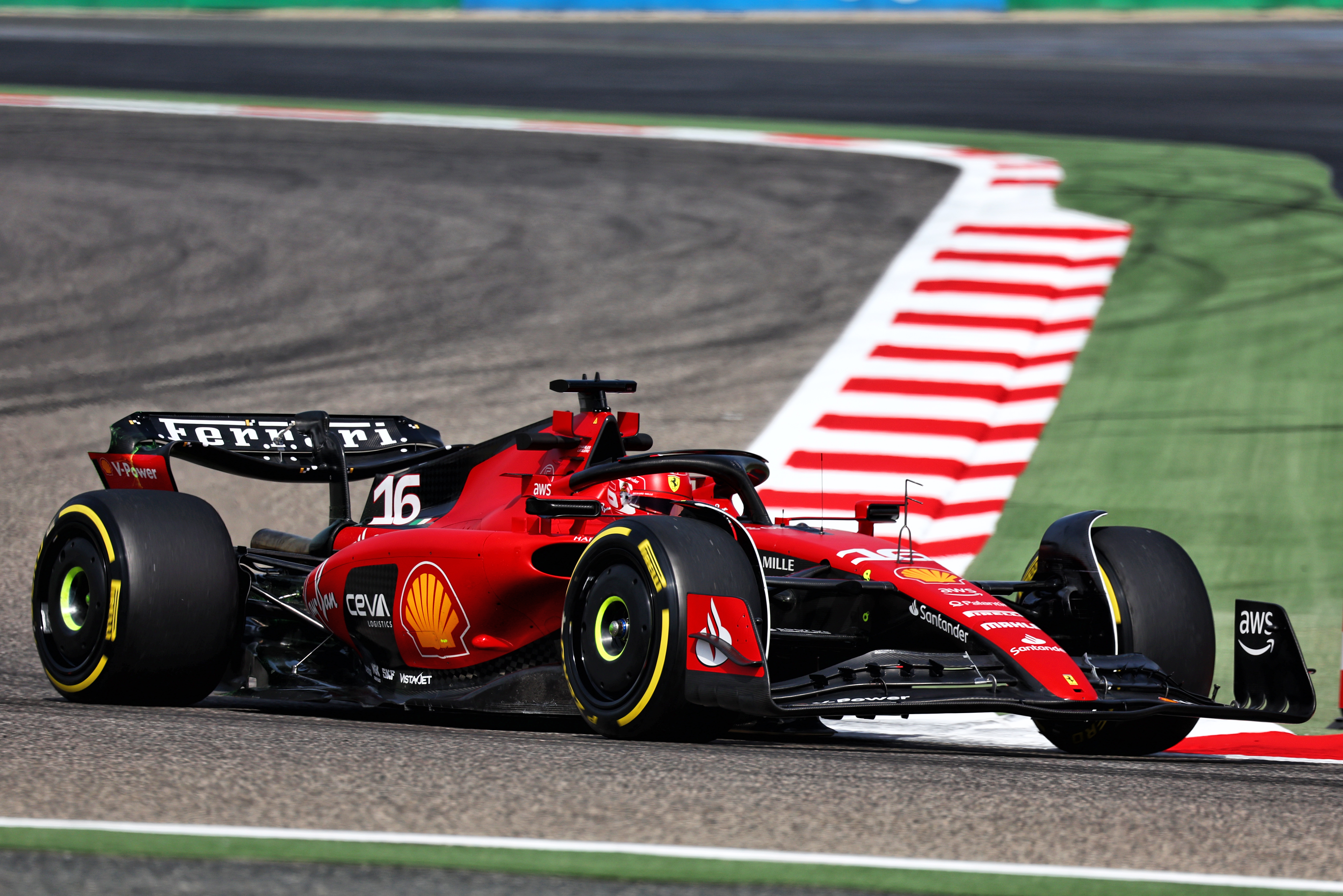
Ferrari tried a single mount system early on the final test day (pictured below) but the rear flap failed so it had to go back to its other version. But this still has the central DRS mount, so it will still have the same separation problems. Mercedes does use a single mount system but doesn’t bother with this detail.
On the Ferrari, the profile across the span is quite different (indicated by the green arrows). It reduces the load nearer to the wing endplate and adds some load nearer the centre of the car, so it’s a bit of a case of taking away with one hand and adding with the other, but overall there are no major difference in the visual level of downforce or drag.
Mercedes just adds the increased section near to the endplate (green arrow) so in general runs more rear wing downforce and with that drag.
On the upper rear corner of the endplate (orange arrow) both Red Bull and Ferrari use this corner cutout to the maximum. They also put a radius on the upper corner – both of these are drag reductions with minimal downforce loss.
The Mercedes retains a square corner. It will look better in damp conditions as the vortices coming off this corner will be much more pronounced but unfortunately with that comes a drag penalty.
BEAM WINGS
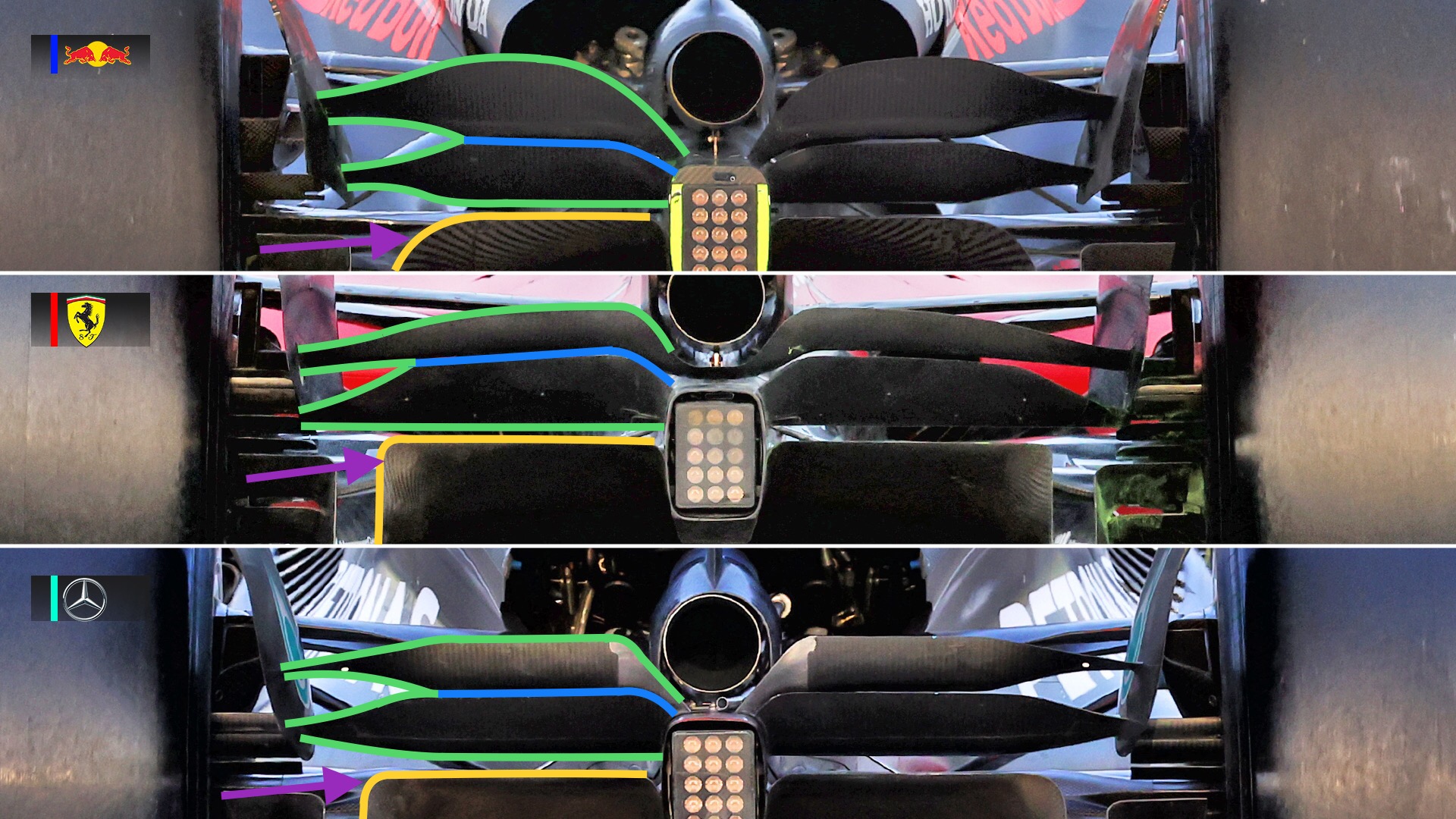
The rear beam wing on these cars is a major contributor to the performance of the diffuser, which is the main component that makes or breaks the ground effect underfloor’s performance.
Looking at these three, Red Bull, Ferrari and Mercedes are all quite different. I have highlighted the main working area of all three so you can see the Red Bull is the most aggressive, the Mercedes the least.
The green highlight is the surface area of the beam wing, which effects the airflow.
The blue highlight is the slot gap.
The yellow highlight is the trailing edge of the diffuser.
The magenta arrow is the upper corner radius on the diffuser.
I’m more of a fan of the Red Bull large radius as it reduces the potential for airflow separation in this area by allowing the different airflow speeds on the sides and top surfaces to come together more sympathetically.
There are ways to set about optimising any car around a set of regulations and these pictures show only the top three teams’ (from 2022) examples. There is a lot more to it than the visual side but the airflow over these surfaces needs to work in harmony with the airflow that we don’t see, otherwise the ‘overall flow structure’ that we often hear about wouldn’t really exist.
We are only days way from seeing who has made the best decisions. Let’s allow the stopwatch and the points in the championship post-Bahrain to answer that.


