MotoGP's new look: Our designer's verdict
Unveiled at the Museu Nacional d’Art de Catalunya in Barcelona as part of the 2024 prizegiving ceremony, the new identity for MotoGP forms part of a larger visual overhaul that permeates every level of how the audience will consume the premier class of motorcycle racing, from artwork, motion graphics, typography, visual and verbal identity.
Let's take a look at why it's changed, what works, what doesn't and investigate the inevitable backlash...
Why the change?
While Liberty Media may still be closing in on its acquisition of MotoGP, the decision to refresh the brand identity for MotoGP will have been taken long beforehand in preparation for a new era of promoting the championship with a visual direction more befitting of a leading global series in 2025 and beyond.
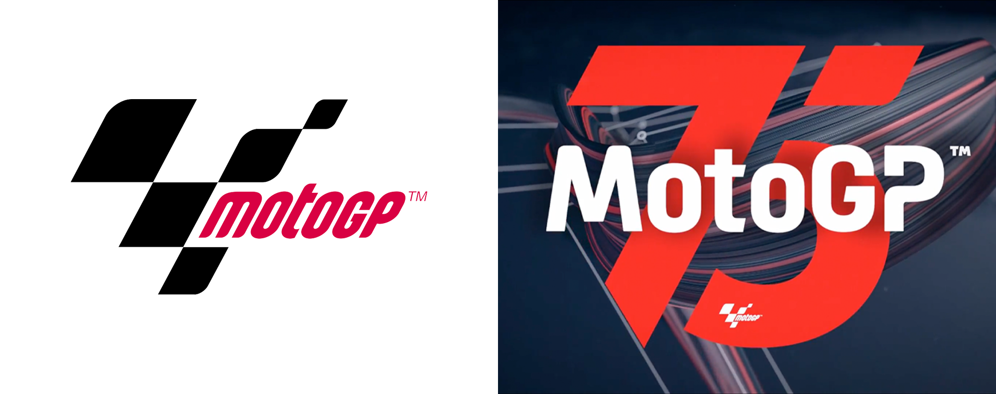
The last iteration of the MotoGP logo was launched in 2007 and to say the media landscape has evolved significantly since then is an understatement.
If our website analytics are anything to go by, you are highly likely to be reading this article in the palm of your hand, something significantly less common 17 years ago.
Consumption of the sport would be predominantly TV broadcast first; the first iPhone had only just been launched. At that time the height of social media sophistication was MySpace and Facebook was barely a toddler.
Fast forward 17 years to multi-platform, multi-format media consumption, where a recognisable logo has to work in everything from a near-microscopic profile avatar barely a few millimetres across, right up to multi-storey grandstand branding. This evolution has made the now-superseded logo unfit for purpose. This alongside the awkward relationship between the typography and logo further reinforced two visual elements not quite in harmony.
MotoGP isn't just competing for attention against other comparative motorsports. It's competing for your attention against the wider entertainment industry, as well as everything life throws at you, including that Sunday job-list pinned to your fridge.
Its rebranding partner Pentagram is an independent agency well versed in breathing new life into the brand identities of global businesses (its major clients in the entertainment sector include Amazon Prime, Warner Brothers and Channel 4 in the UK) and its brief will have been to present MotoGP as “the most exciting sport on earth”.
What Works
Scalability and legibility
While the form of the previous logo was a recognisable abstraction of a chequered flag and a visual reference to its Tower of Champions trophy, the MotoGP lettering got lost upon scaling.
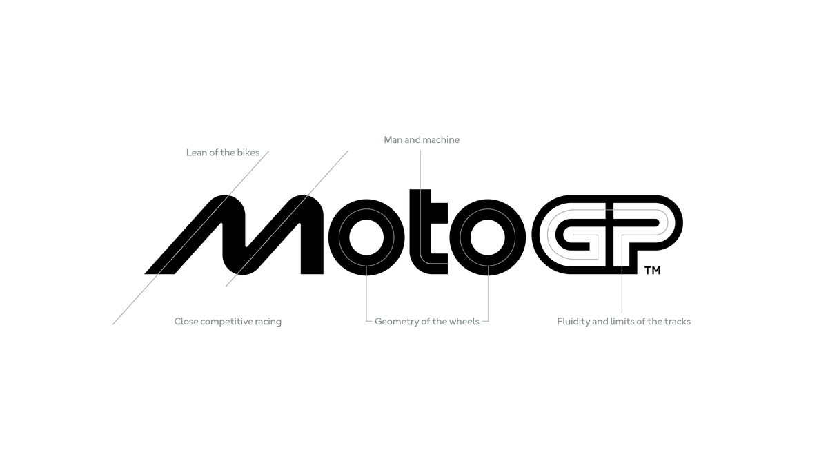
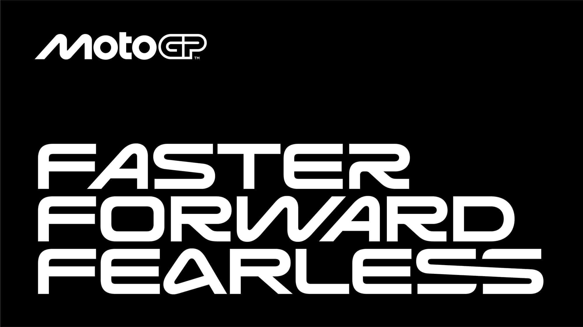
This new logo dispenses with graphic elements and brandmark to appear more-so as wordmark and as a result is much more flexible than the previous iteration. Scale the logo right down and you can still clearly read MotoGP.
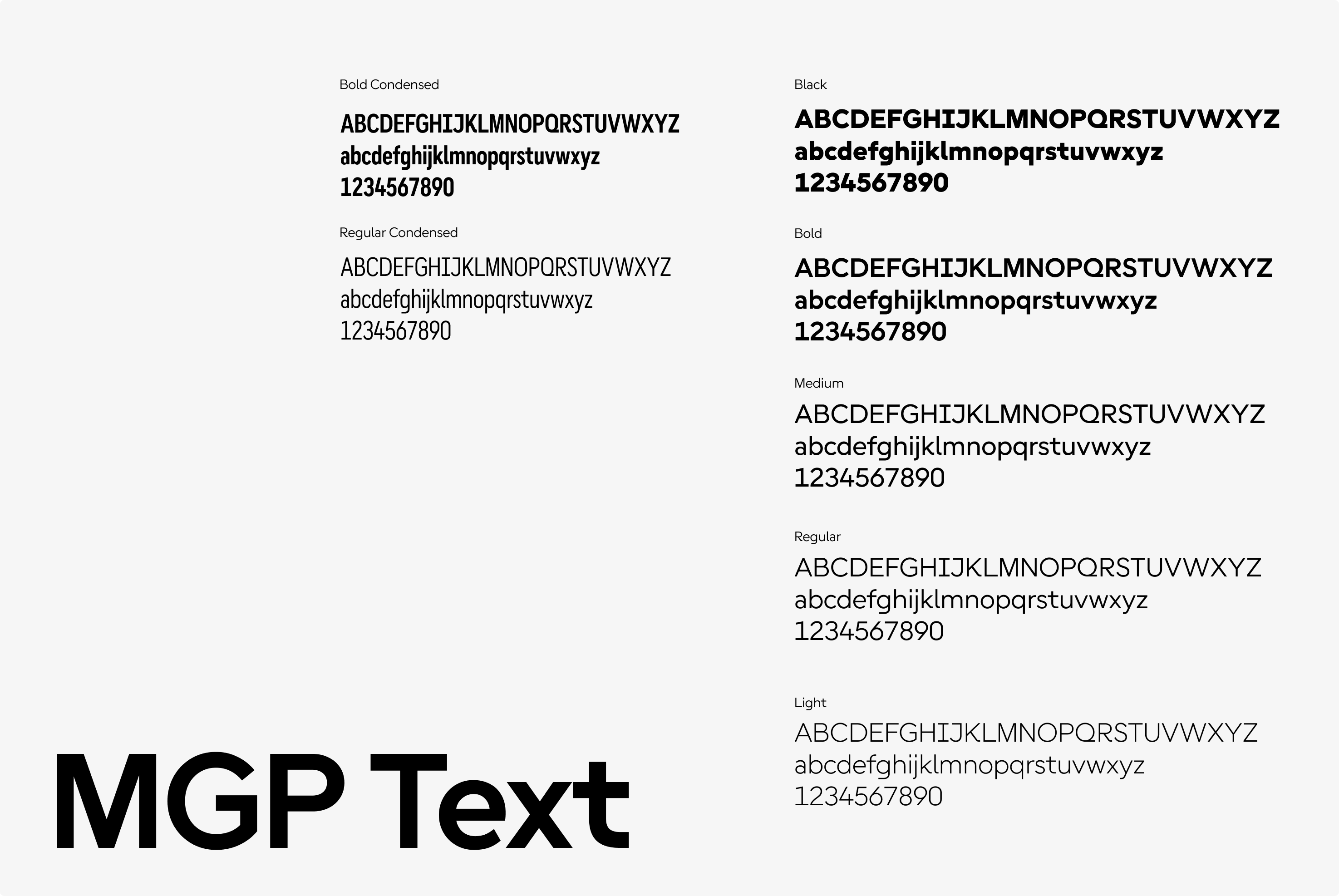
Overall, I do like the adaptability of the new title typography, which has a playful fluidity to it. Being adaptable to multiple languages with varying accents (known as diacritical marks) is also crucial for a sport reaching global audiences. The ‘MGP Text’ fonts (used across the longer form blocks of text such as the website) also make improvements from an accessibility perspective.
However, the titling fonts do sail quite close to the same resolution that agency Wieden+Kennedy (tasked with rebranding Formula 1 in 2017) found with their development of F1’s Torque and Turbo typography. This isn’t a matter of bad execution, just kindred solutions to similar briefs.
The wider show
The new identity creates a slightly better cohesion with Moto2, Moto3 and MotoE, in a way that felt slightly disconnected before.
All the series are now aligned and united as one recognisable visual package. There is potentially a risk that this close alignment reduces the visual value of the premier GP class, but this will be easier to judge when we see the graphics in anger on a race weekend.
Playing nicely with others
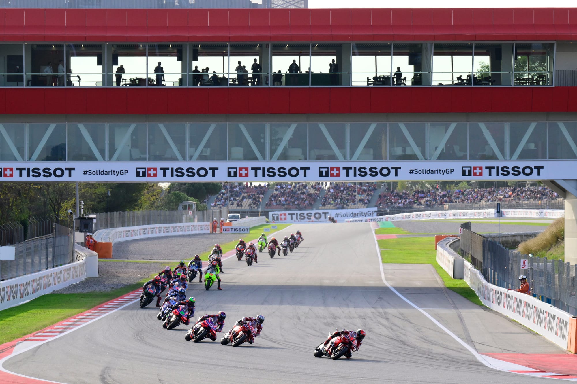
The six official sponsors of MotoGP are a logistics company, an airline, a German car company, a 0% beer, a tyre manufacturer and a luxury watch brand. These multi-million dollar commercial deals are hugely important to the funding and reach of the championships, and as such they need to be shown as partnerships on equal footing.
With the more stylised previous iteration of the logo, the smaller weighting of the wordmark put the MotoGP lettering as the smallest element. This new scale redresses the balance, meaning a partnership with a major brand will appear more proportionally harmonious.
What Doesn’t
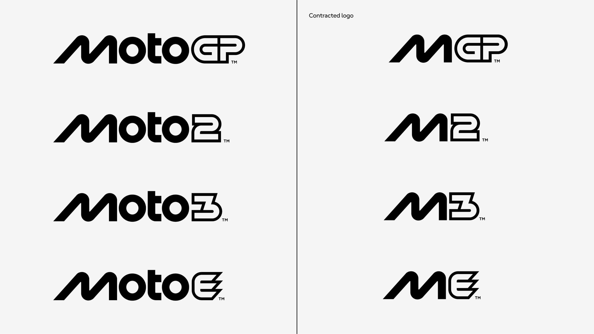
The move towards ‘MGP’ as a shorthand watermark and social avatar feels like a miss-step. I would never associate MGP with MotoGP and for the sake of saving one syllable and three characters, it feels like minimalism for the sake of it.
To me, MGP is the Manx Grand Prix, but this aligns with MotoGP’s oft blind spot towards the world of road racing. It doesn’t get much better in the support series, shortened to M2, M3 (hello BMW M partnership) and ME (Despicable might be too strong, but certainly not desirable or distinctive).
Visual tropes of motorsport can create some cliches.
Dispensing with the chequered flag feels like a sensible step, but more often than not the leaning form of the letters is where identities can become quite homogenised.
MotoGP has more of a legitimate claim to a lean-angle than other series, with the new M pitched at a 65 degree angle. However, in finding these flowing lines, the M has ended up where there’s a pinch of the W of World WCR, and a dash of the M of F1 Manager.
I do actually like the perfectly circular Os (said to have been inspired by wheel geometry) but they draw the eye like a spectacular target fixation more than anything else - meaning the eye is drawn to this first, then dashes left to read the logo in full. This is almost to the point where the oblique extended M feels disconnected from the rest of the wordmark.
In growing the audience there will be an objective to tempt the newer generation of F1 fans to look to two-wheeled racing, and this direction reassures them that yes, they are in the right place for top-level motorsport and that familiarity will be important.
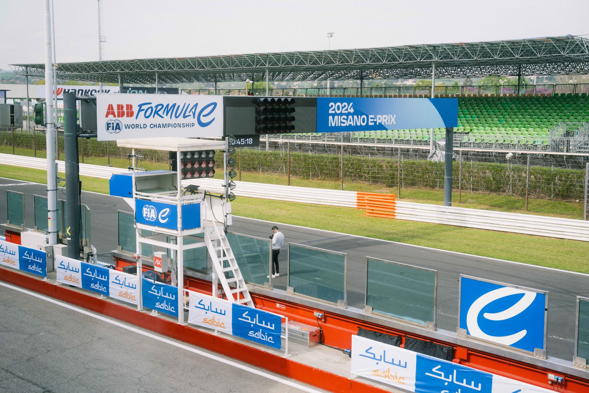
However, I’d like to have seen more bravery in breaking some of the visual boundaries and truly set the sport apart. Divisive as it was, the Formula E’s vibrant rebrand (thanks to a collaboration with lettering artist Rachel Joy Price) really stands out against a sea of neo-futuristic flowing typefaces.
The Inevitable Backlash
Fans are understandably attached to the old logo as it's been watermarked on screen throughout the best moments of the last 17 years. You first saw that logo when Casey Stoner won the championship, and every on-track scrap, overtake and trip to the gravel trap has been accompanied by the flag motif.
It’s positive visual association and burn-in, and that emotive connection is hard to unpick.
While the emotive and verbose launch video waxed lyrical about fans being an integral part of the story, this is branding that needs to succeed more-so in a social, broadcast and commercial sense more than any audience loyalty.
MotoGP. Faster. Forward. Fearless. pic.twitter.com/bXElTEpNVU
— MotoGP™🏁 (@MotoGP) November 17, 2024
If fans don’t warm to it, they are unlikely to boycott the series on account of a disagreeable series logo and any grumblings about it are measured as ‘engagement’.
I do like the old logo and how it reflected the championship trophy, but from a practical design perspective I see the logic in the new iteration working for an entertainment business.
What it has lost in distinctiveness it has gained in flexibility (a trend across every global company seeking a rebrand), which will be a saving grace to designers tasked with making the logo consistently recognisable across all platforms on which MotoGP will appear.
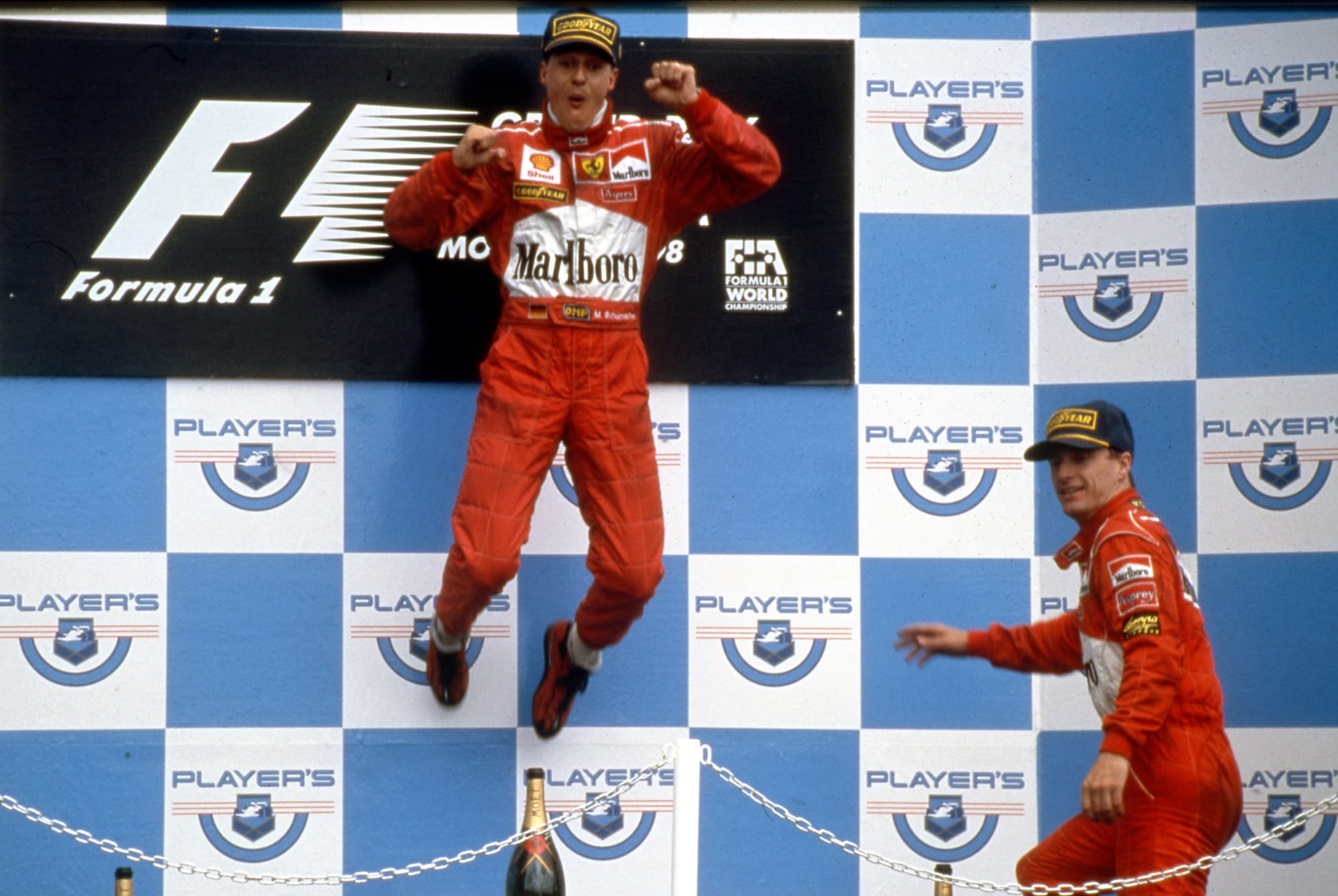
When I look back at the pre-2017 F1 logo, it now feels a little quaint and outdated, but still sits in a cosy nostalgic corner of my heart. I feel the same will be true of this new vision for MotoGP, and that’s fine; it’s what happens on track that truly matters.

