
After assessing the Formula 1 field's colours, we've again tasked The Race's Creative Lead Oliver Card with casting his design eye over the 2024 liveries produced by the MotoGP teams.
Beyond some very notable rider changes, the MotoGP field for 2024 also features a number of significant livery transformations.
Not all manufacturers have taken a huge leap - but with a new team and a new title sponsor coming to the grid, alongside riders retaining commercial contracts with big-name brands, there is a notable difference between the 2023 line-up and what we will see kicking off at the first race of the season at Lusail.
One of the biggest challenges livery designers face in this current era of MotoGP is the radical aero that adds convolution to an already demanding task. The contours provide significant obstacles for those wanting to create great-looking motorcycles that also fulfil the necessary sponsor requirements.
Sponsors want air time and visibility for their brands to reach global audiences - and pay significant money to do so. However, undulating bodywork and peculiar protuberances are now de rigueur within top-class motorcycle racing, so how do graphic designers overcome these obstacles to clearly display sponsors and accomplish liveries destined to become future icons of the sport?
Ultimately, the liveries don’t make the bikes faster. These are, after all, 360 km/h advertising boards. But money generated through sponsorship funds development, so it is always an important commercial balance that must be struck.
What is reassuring is that a glance at the 2024 line-up shows distinct visions for each team. There is very little to hate, but much to discuss on one of motorsport’s great subjective and emotive topics.
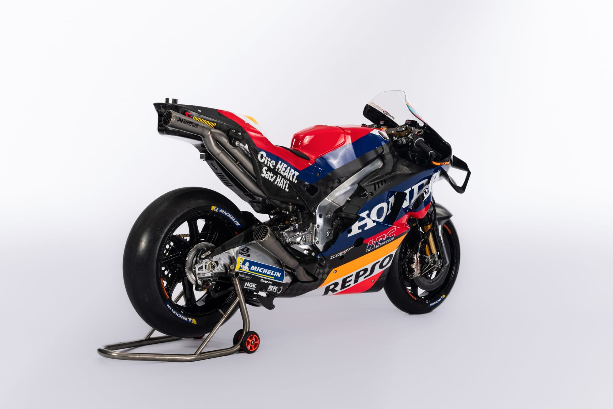
Honda
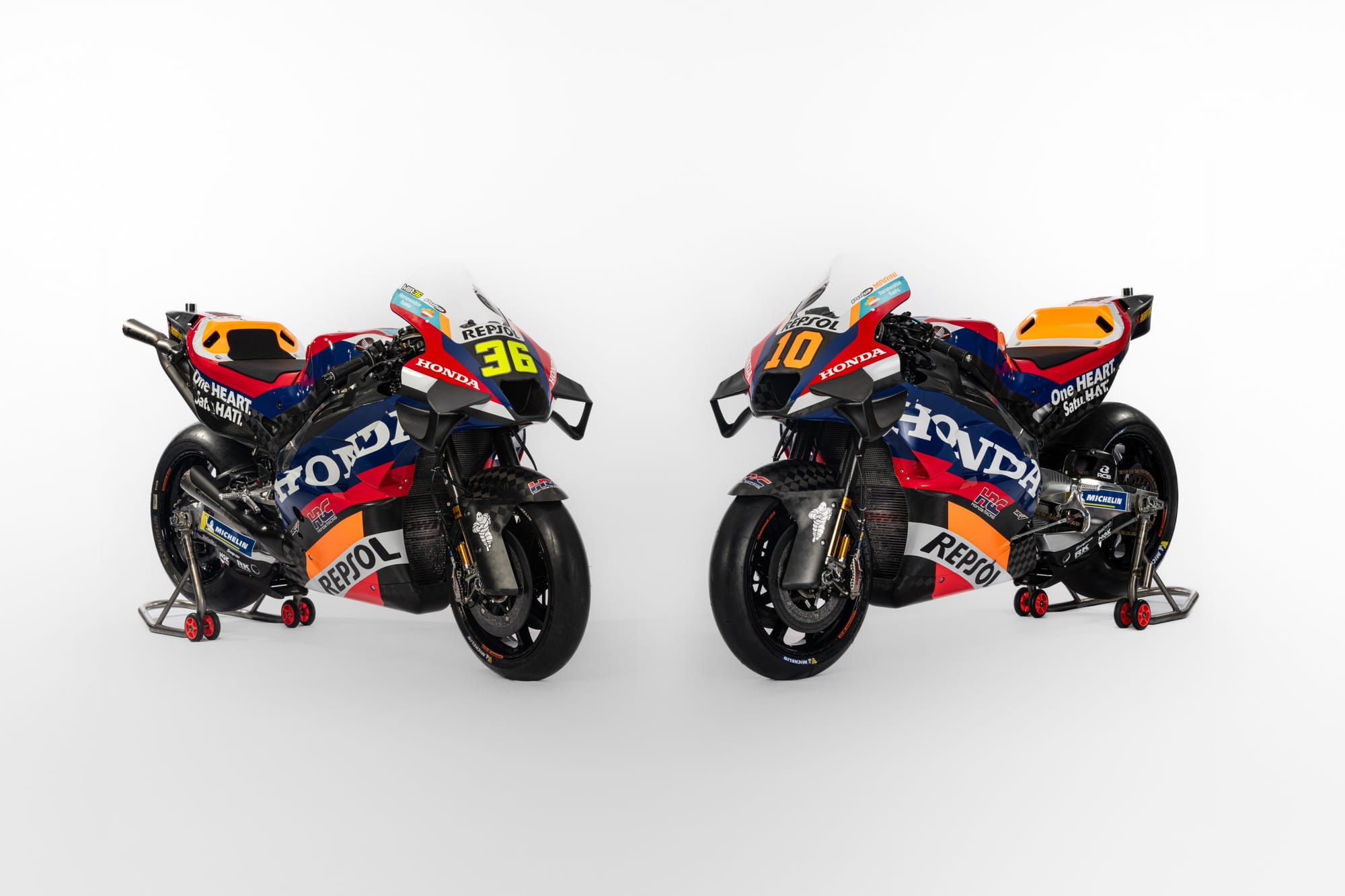
This is a Repsol Honda like no other, relying more on Honda heritage than the more familiar orange and red roundel of Repsol, a change reflective of this post-Marquez era for the Japanese manufacturer.
Brand emphasis has been swapped to give Honda more prominence on the RC213V. The wordmark is larger than ever, occupying the upper side fairings, but now clings around more complex bodywork. Repsol has now slid to the downside panels and is smaller than before.
As a result of being situated on simpler, less aero-focused panels, the Repsol logo is actually more legible than the Honda one. It’s a happy compromise that keeps the title sponsor visible.
The colour psychology of Honda’s colour palette is hugely symbolic for this new identity.
Take the HRC tricolour of red (reflective of strength and power), white (purity and clarity) and most prominently for 2024, blue (a calm serenity, most reminiscent of the sea). Power, purity and calmness are three key principles of successful racing and after a difficult few years for Honda, perhaps the increase in blue will help to bring calmer energy to what has been a truly turbulent bike to ride.
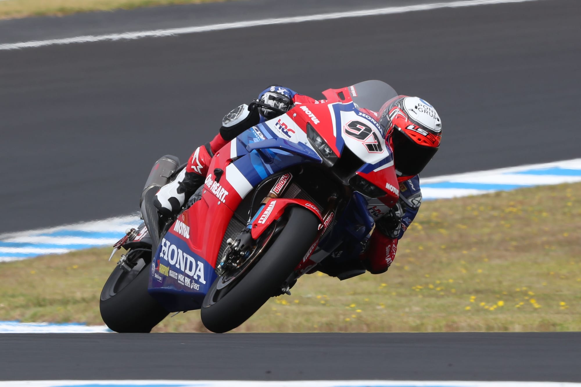
I’ve always had a fondness for the electric blue tone seen on the Honda Fireblade (seen above in Xavi Vierge's hands in World Superbike) - but employing a darker navy actually has a more practical aspect.
Our MotoGP writer Simon Patterson commissioned me to Photoshop the carbonfibre sections into white to illustrate a way to improve this livery.
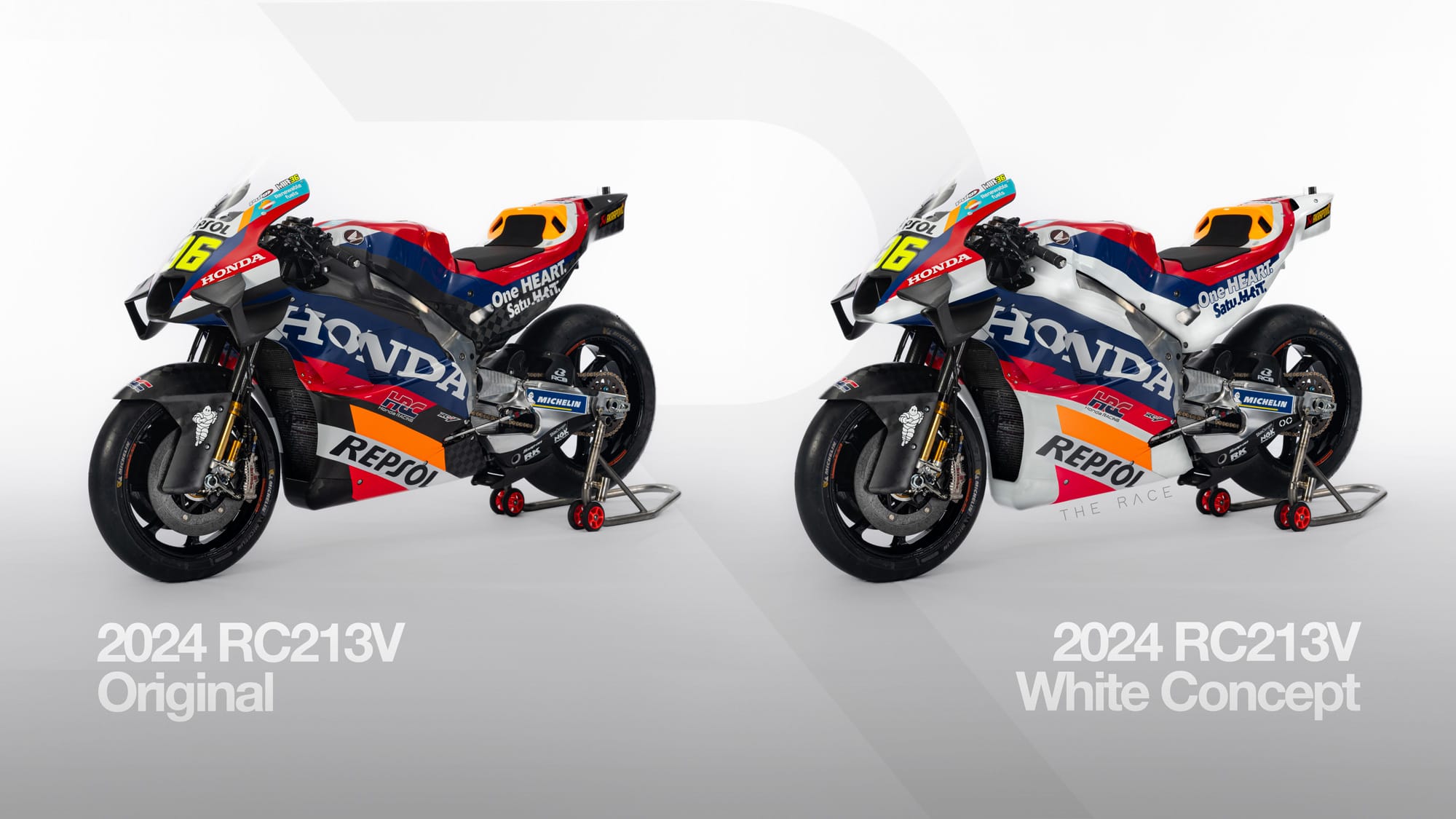
It was an exercise which proved to highlight how the darker blue masks and disguises the transition from carbonfibre into more complex body panels.
Yamaha
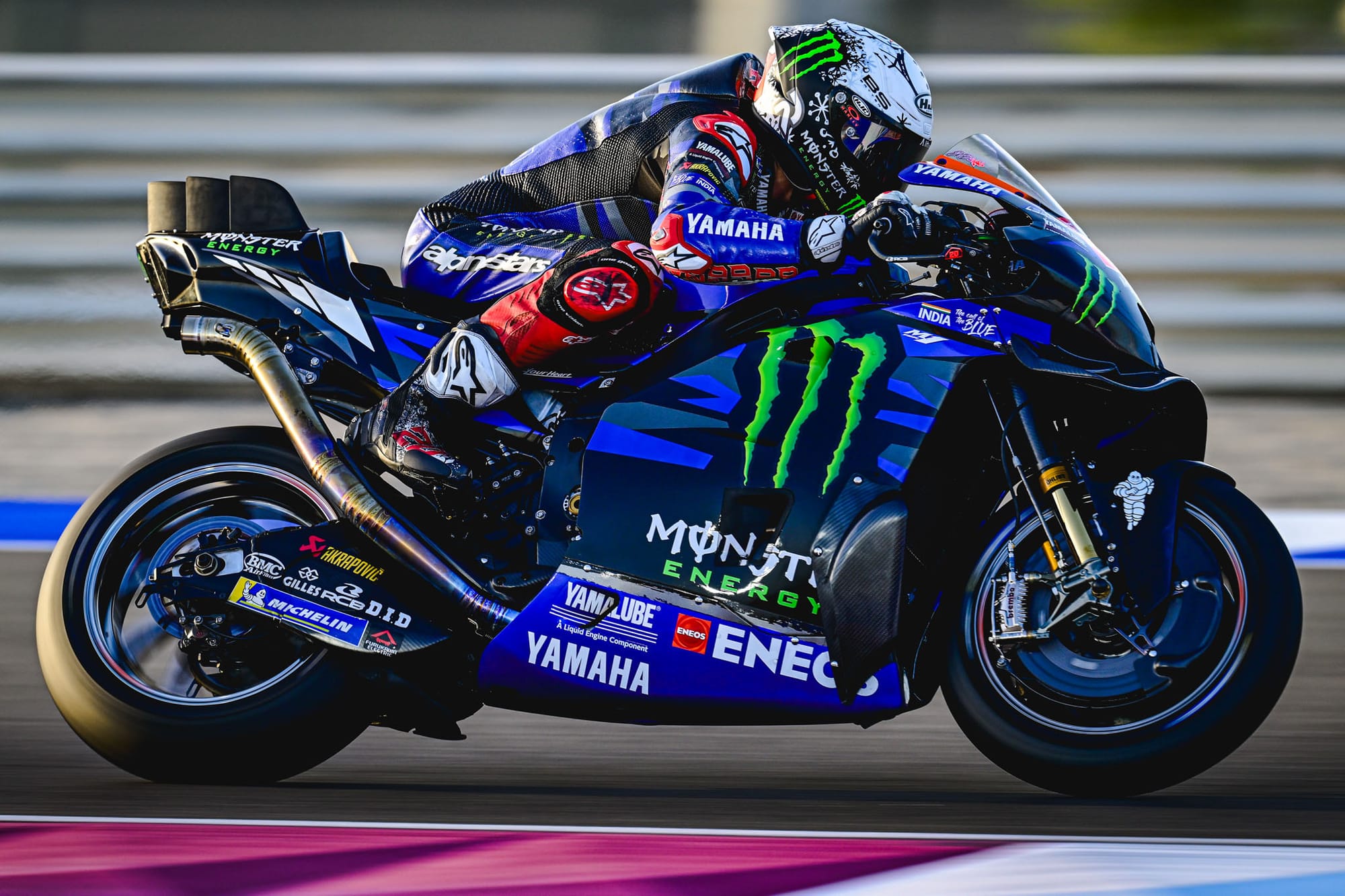
When it comes to Yamaha’s 2024 entry, it is clear that the winter has been spent focusing on performance more so than aesthetics.
There is very little change from its 2023 livery, which had a more significant graphic evolution.
The livery competently blends Yamaha’s brand colours with greys and Monster Energy’s claw identity, but I wouldn’t describe it as 'high impact'. Due to the segmented nature of tech-camo graphics, the result is a reduction and dilution of blue - which doesn’t help the bike jump out from the pack.
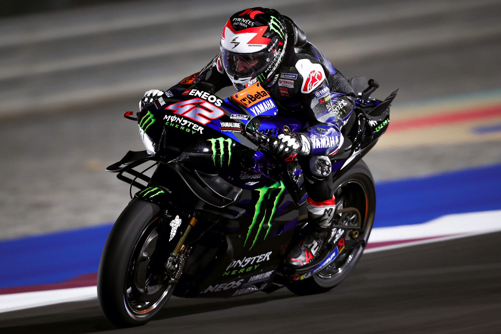
The requirement of the Monster Energy M to always appear against black doesn’t help matters, but I think overall the YZR-M1 would benefit from reintroducing blue back to the upper screen and bodywork.
With Suzuki no longer on the grid, there is little risk of clashing with any other ‘blue’ teams, so I’d like to see Yamaha be a little bolder in this regard.
Gresini Ducati
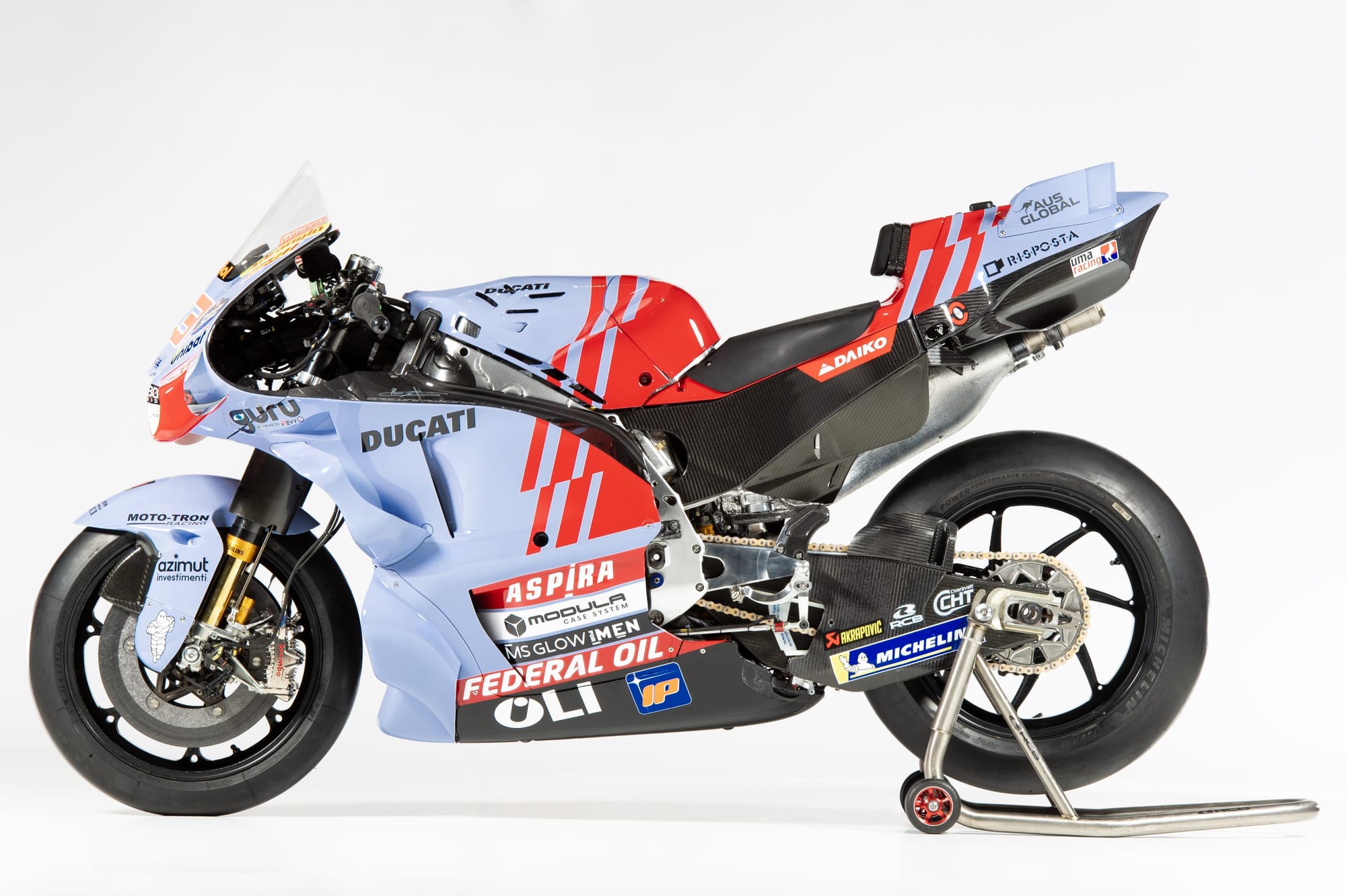
With the arrival of Marc Marquez at Gresini, there was a great deal of speculation about how the six-time world champion would blend with the Ducati satellite team. How transformational would it be integrating one of MotoGP’s megastars and how many, if any, of his wider package of personal sponsors would make the leap?
It came as a surprise to see Gresini display continuity without too much impact from Marquez’s fleet of sponsors. The livery itself includes a repositioned Ducati logo, now isolated on the upper body panel to give it more prominence, and the red stripes disrupted with a marginal offset.
This is a Ducati bike, but the team prides itself on doing things differently.
I greatly respect the approach of Gresini declining to put all its eggs into Marquez’s basket and instead electing to retain its own identity.
After all, it is a lovely livery; periwinkle blue is not one of the most traditional motorsport colours, but Gresini wears it well and the interjection of Ducati red ties it nicely to its partner manufacturer, while still setting itself apart from the rest of the field.
Pertamina Enduro VR46
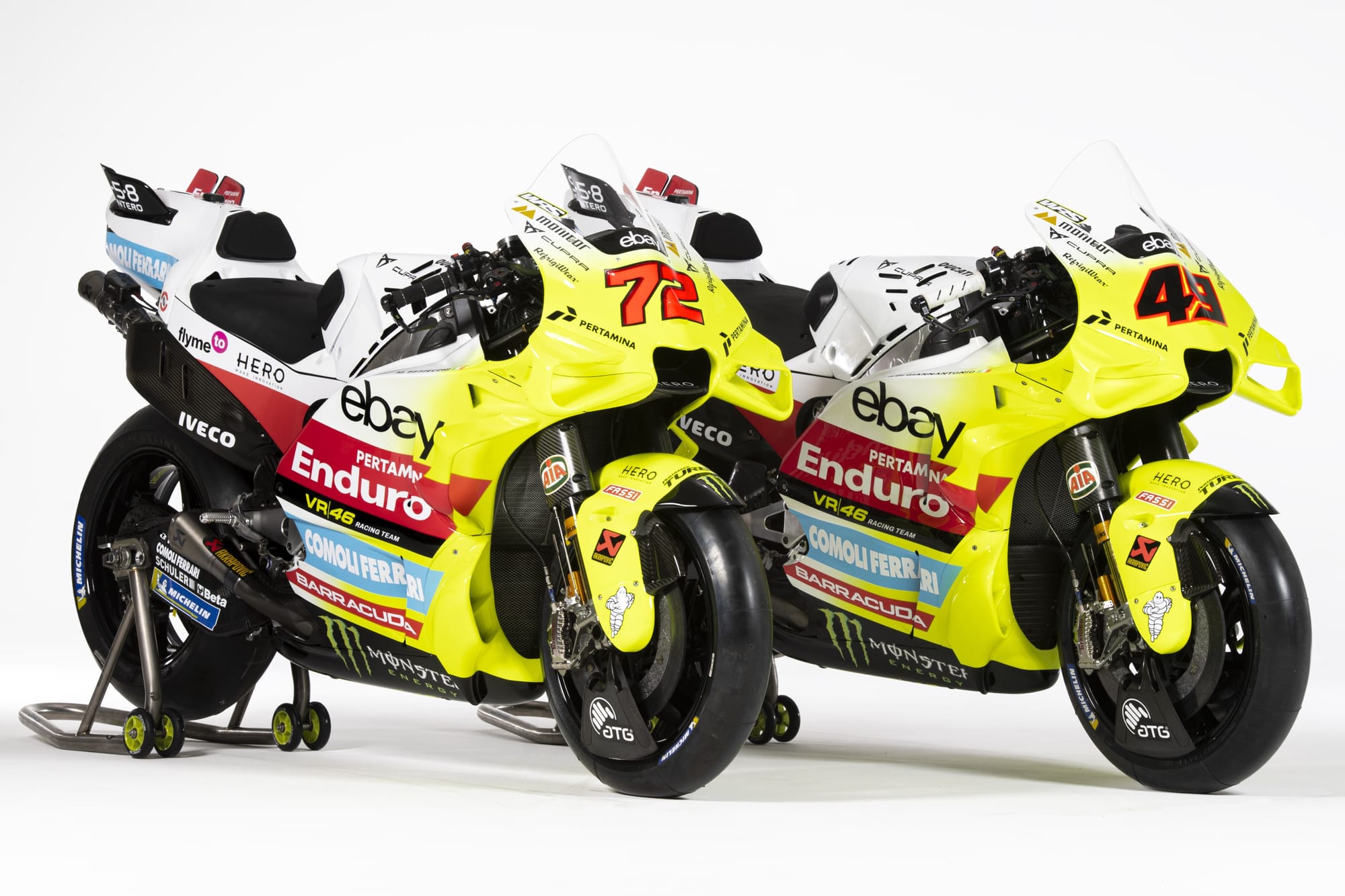
The 2023 Mooney VR46 was one of my favourite liveries, so it was quite a shock to see such a different concept for 2024. The team has flipped the switch from night to day for 2024, as white becomes the dominant tone.
I say dominant; there are a lot of elements fighting for your attention, perhaps most obviously the new nose accent, which sees the bike plucked by its tail and dipped into an enormous vat of flow-vis paint.
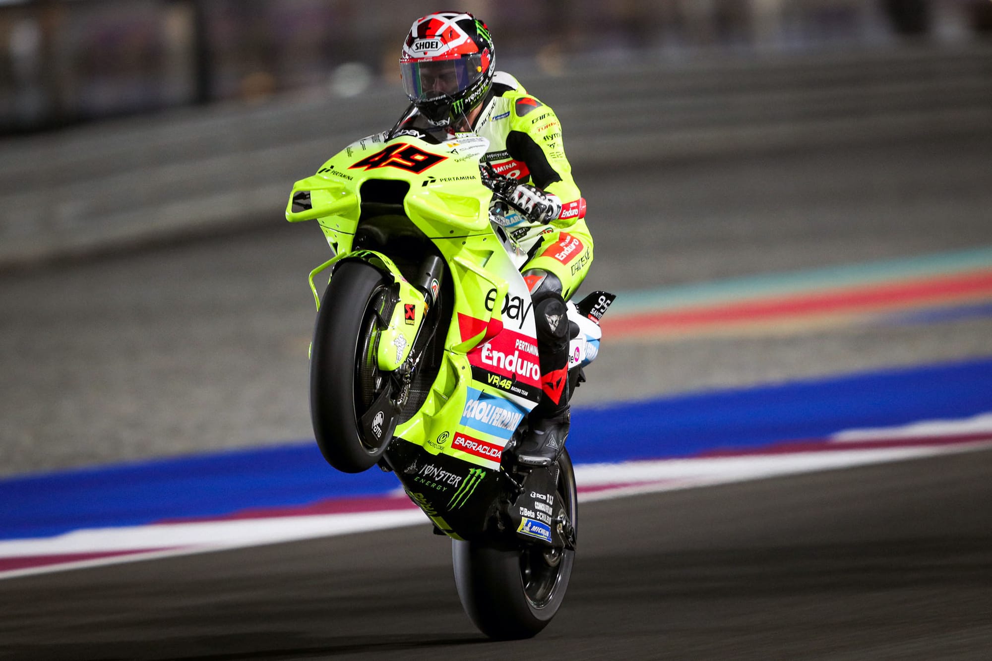
Alongside this is a prominent red stripe, drawn from new title sponsor Pertamina (promoting its Enduro oil products) and a secondary blue for Comoli Ferrari. There is a lot going on in this livery.
It’s unmistakably striking and I respect the ambition to do things differently. I want to absolutely love it, but it is very busy and what’s holding me back is the execution of the gradient.
White and fluorescent yellow is such a great racing combination (over in F1, Brawn GP became iconic with this combo in 2009) but this iteration feels a little too front-heavy.
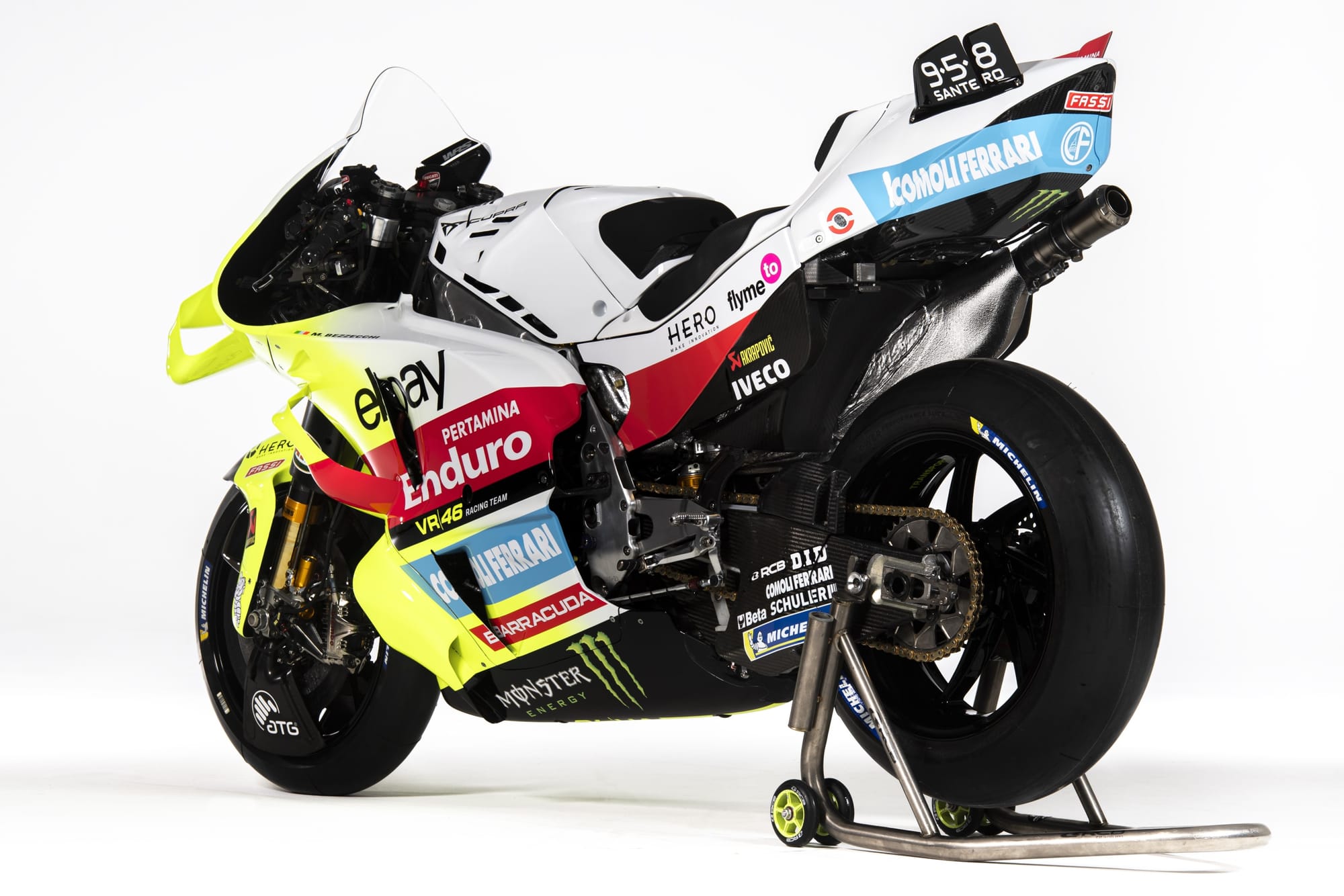
Extending the gradient further down the length of the body would give more of a complete livery and feel less like VR46 ran out of paint. Alternatively, forgo the white all together and paint the whole thing neon to be truly bold.
One thing is for sure, no one is going to miss this bike when it lines up on the grid.
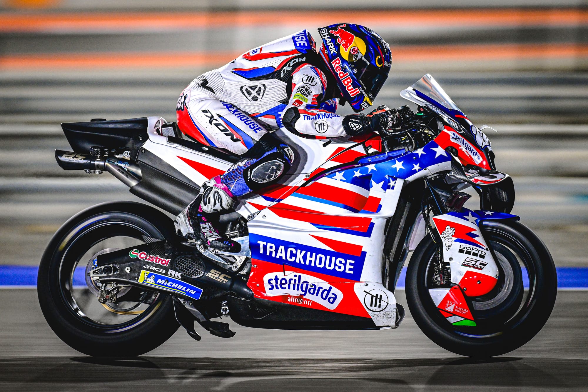
Trackhouse Racing
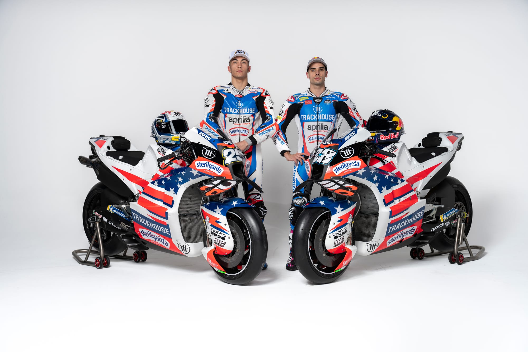
If you weren’t aware of where Trackhouse is based, a cursory glance at the 2024 bike gives a hint as subtle as a 200-strong marching band flanked by 50 golden eagles. And rightly so. Wear your heart on your sleeve and your flag on your tank.
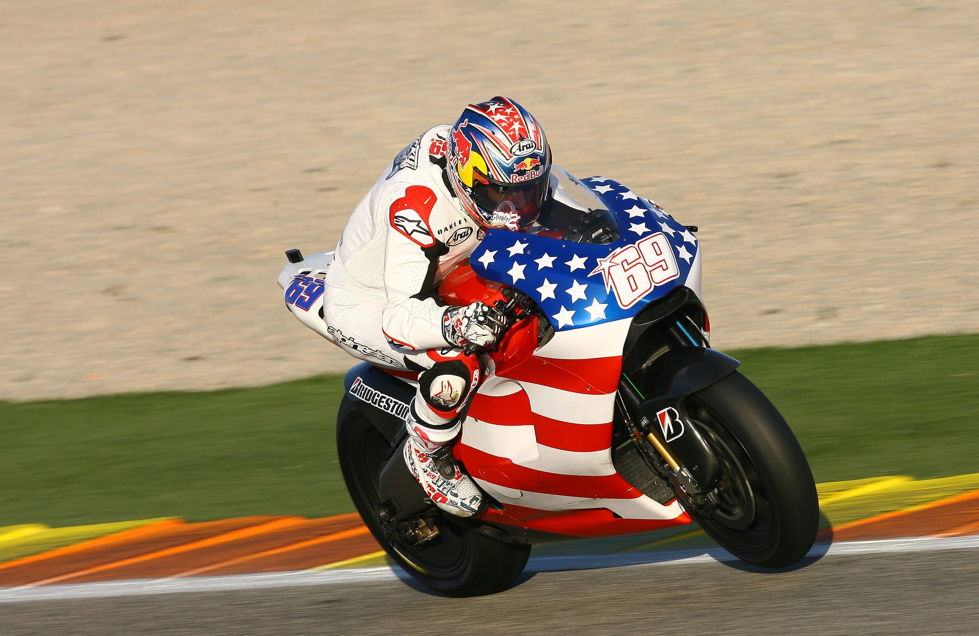
Trackhouse Racing (taking over from RNF Racing to run Aprilia’s satellite operation) arrives in MotoGP with the stars and stripes proudly emblazoned on the RS-GP, in a design akin to that of late MotoGP champion Nicky Hayden’s post-season testing livery for his 2008 debut with Ducati.
This time however, the flag is a less conventional interpretation, featuring stars in multiple scales and some enjoyably chunky 90s-esque block shadowing on the stripes. Unmistakably American, but far from old-fashioned.
It is unsurprising the team has achieved such an eye-catching motorcycle livery at its first attempt. It is, after all, owned by Trackhouse Entertainment Group, ‘Entertainment’ being the operative word.
Trackhouse is here to make a statement, and it has clearly won fans over already.
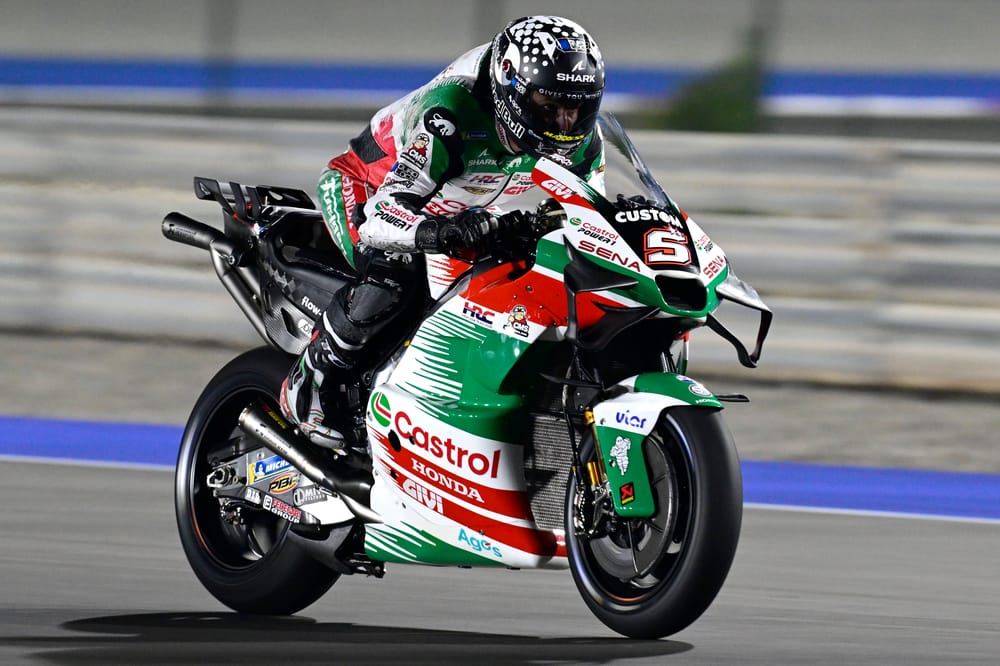
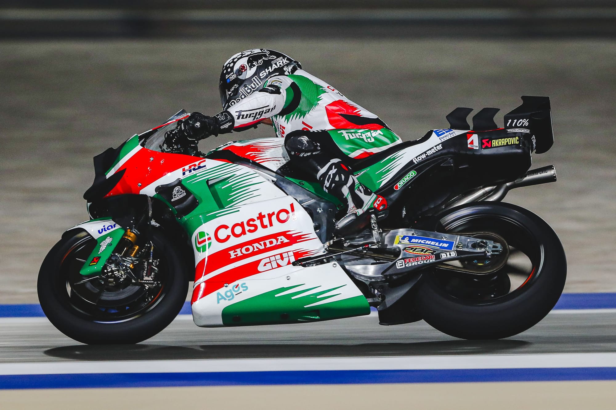
LCR Honda (Castrol livery)
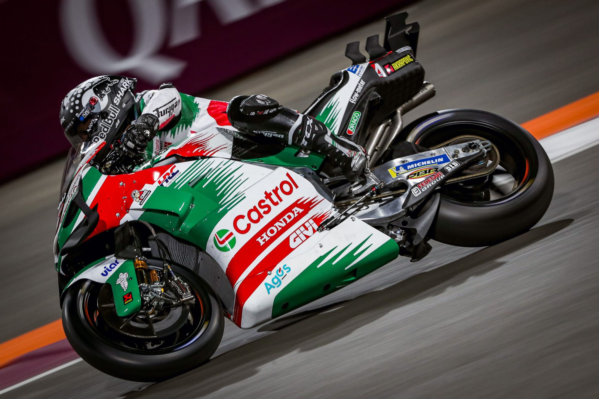
To remain nostalgic at all times is to live in the past. To choose opportune moments to reflect history can be truly iconic.
Even if Johann Zarco’s Honda R213V doesn’t have the same pace as his Pramac Ducati from last year, it certainly is an upgrade in the looks department.
This fan-pleasing tie-in with Castrol most overtly references the 90s-era Honda RC45 (ridden by WSBK rider Aaron Slight) complete with green and red accents streaking with gusto down the bodywork.
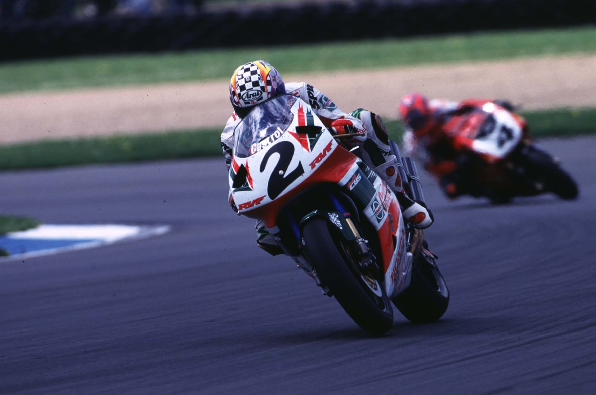
Even with the current generation of complex aero, this retro livery sits brilliantly and is unashamedly evocative of a by-gone era.
If I could tweak anything about the design, it wouldn’t be the bike itself but the race suit, which doesn’t quite align to the stripes as well as has been done in the past, but I’m nitpicking.
The 2024 LCR Honda Castrol design demonstrates an understanding of the true value of a commercial tie-in, whereby a brand transcends the product it is trying to sell to create an emotive connection with the fanbase.
Who knew people’s heartstrings could be so deftly pulled by an automotive lubricants company?
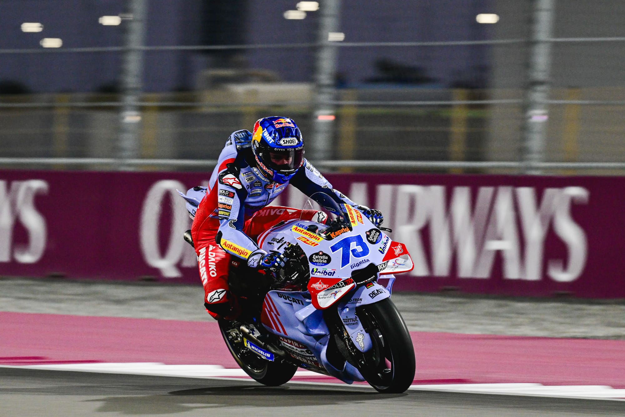
Ducati
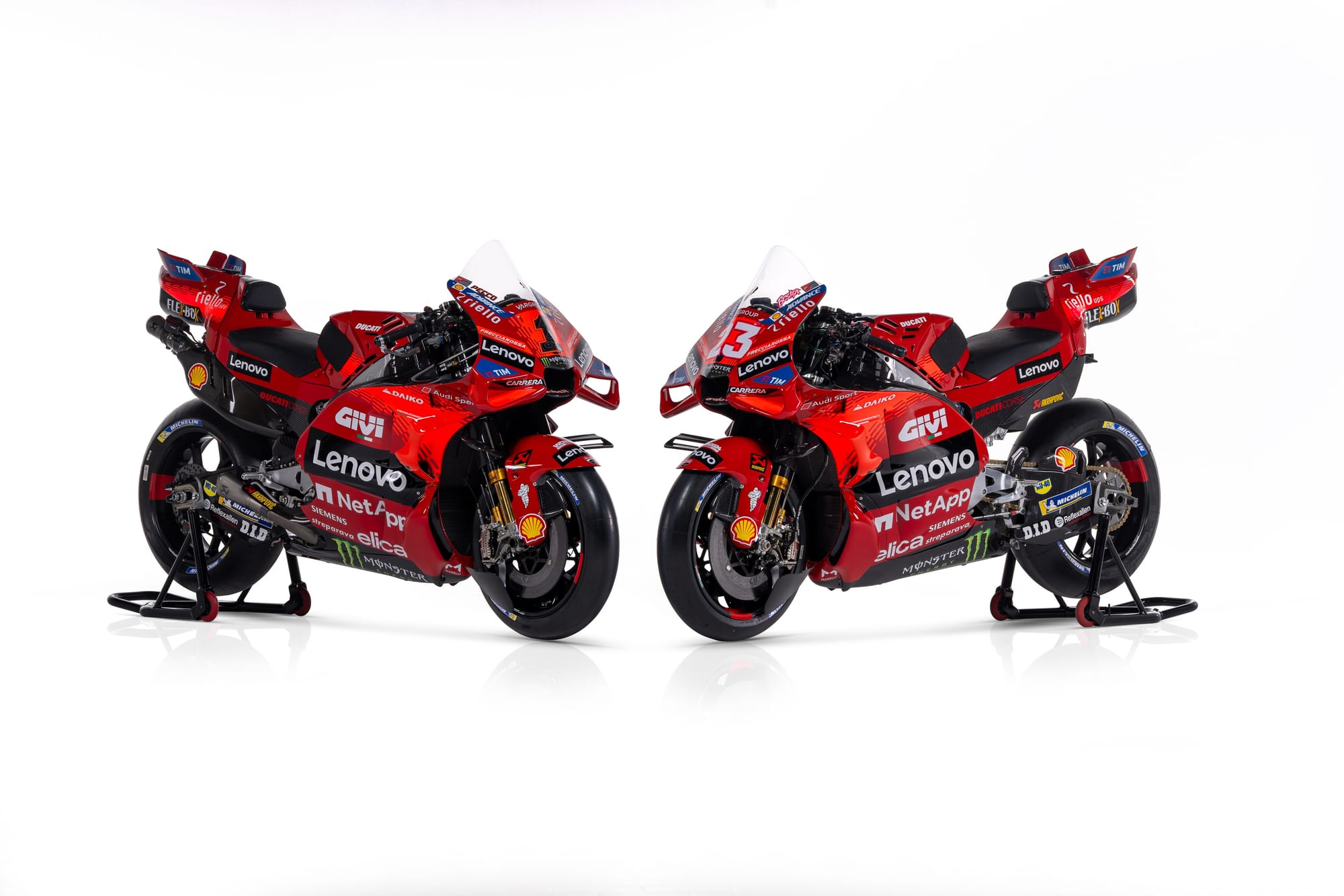
You would've forgiven Ducati for sticking with exactly the same livery as 2023 to ensure that nothing disrupts its current dominance, but there are a few tweaks to the GP24.
Most notable is the expansion of the lighter scarlet accent (last year framing the Lenovo logo) which now reaches like an abstract racetrack from the front fairing to the rear section over the richer blood red tone of the bodywork.
The nose section itself has flipped from black to red to accommodate this, but as a result the rider number is less distinct, something which I feel is often overlooked on MotoGP bikes.
I’d also like to see the large Lenovo branding represented as a strip that extends the length of the panel (rather than a rectangular block) as I feel this would give the livery more flow, but this will be down to brand guidelines from Lenovo.
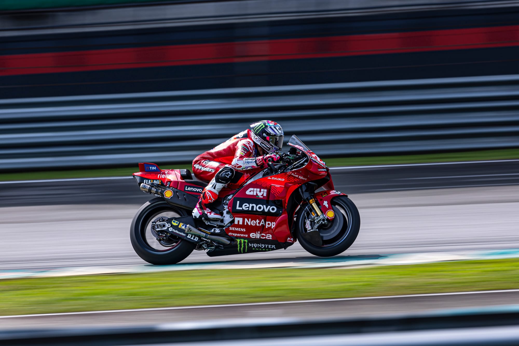
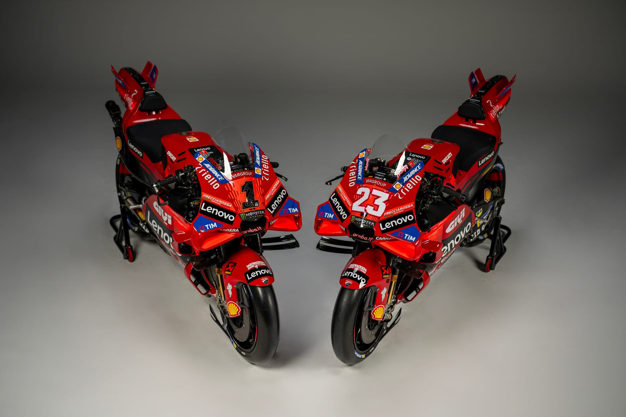
While it would be easy to criticise a lack of significant revolution with Ducati’s livery, this is pure motorcycle consumer marketing. Which motorcycle just won the world championship two years in a row? The red one.
Which motorcycle do I buy to be the fastest? The red one.
The team wants to make sure as many Monsters, Panagales and Multistradas leave the showroom as possible, which just so happen to be available in that iconic Ducati rosso.
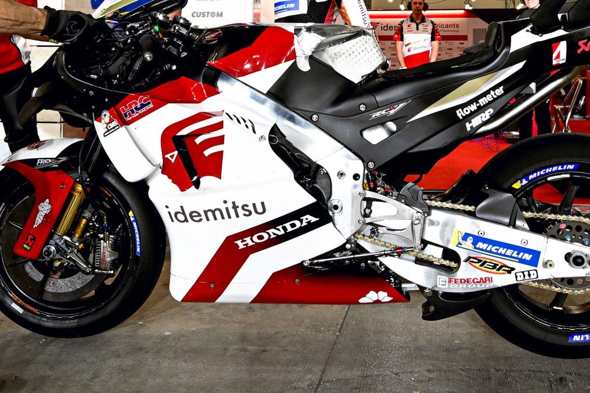
LCR Honda (Idemitsu livery)
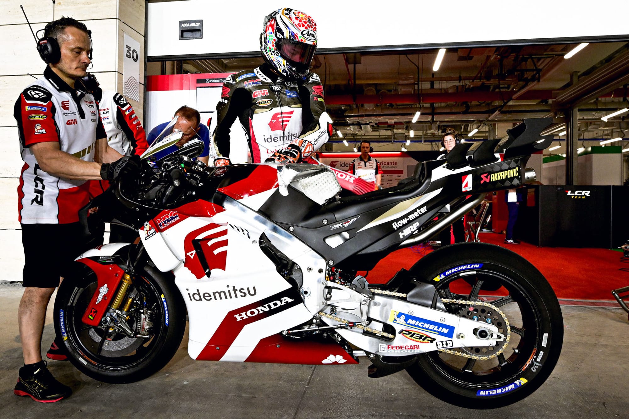
There’s nothing to hate but little to love in this most corporate feeling edition of the Idemitsu livery for LCR Honda.
Shrinking the primary Idemitsu logo hasn’t helped enhance the identity. Idemitsu’s Apollo-inspired icon shares a similar feel to Honda’s own Wing marque (itself a direct reference to depictions of Greek goddess Nike’s wings). I’d like to see this enlarged to give the bike ‘wings’ and horizontal movement.
Look at the way, for example, Red Bull is playful with the scale of the bull on the KTM. Sure, we’re talking about energy drinks versus petrochemical companies, but the design principles are transferable.
Additionally, aligning the Idemitsu wordmark with Honda would make the two identities feel less disjointed and at odds with one another.
From a colour perspective, more white on the screen is an improvement from 2023. But towards the back of the bike, the red to black gradient feels more like a scorch mark from an overheated engine.
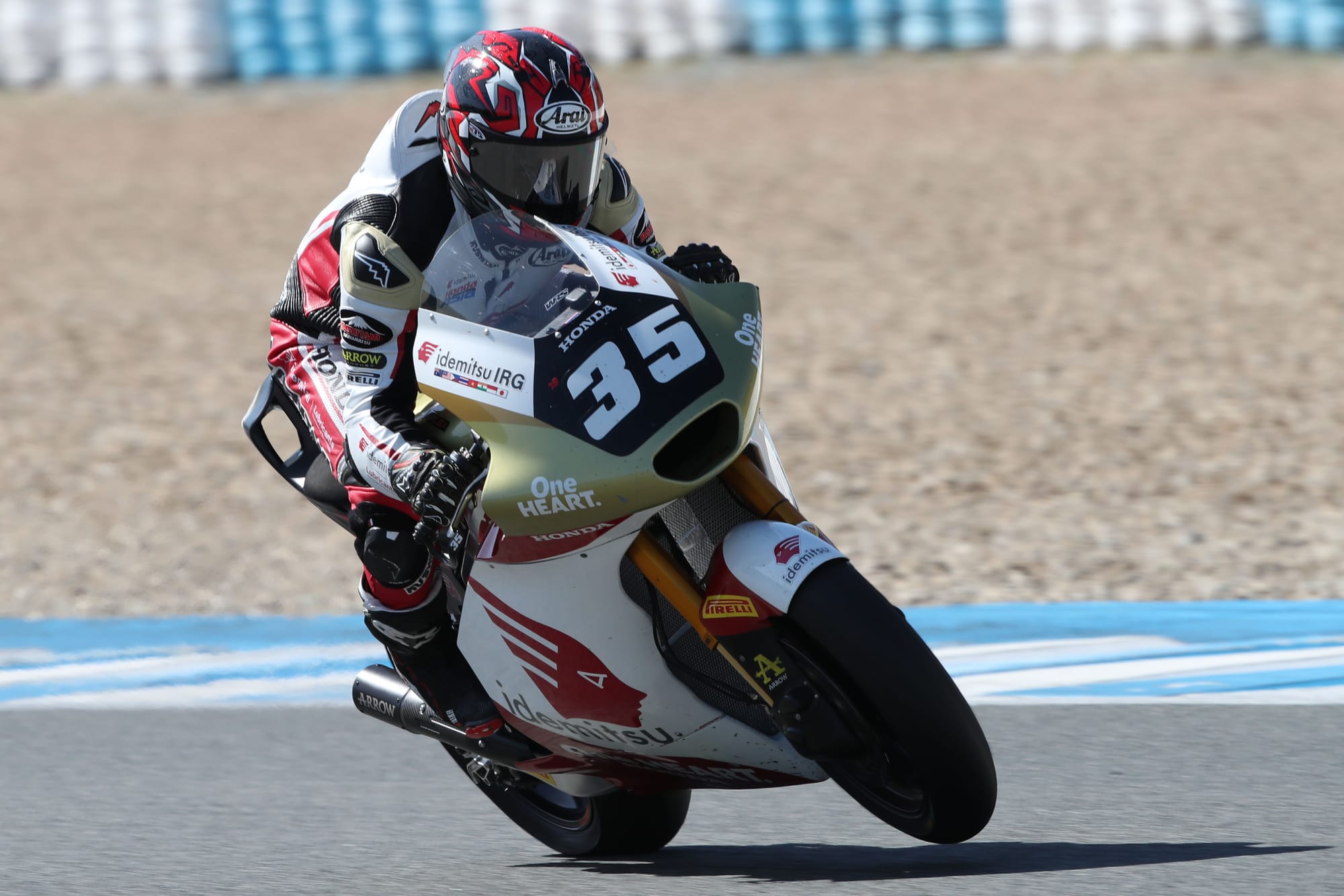
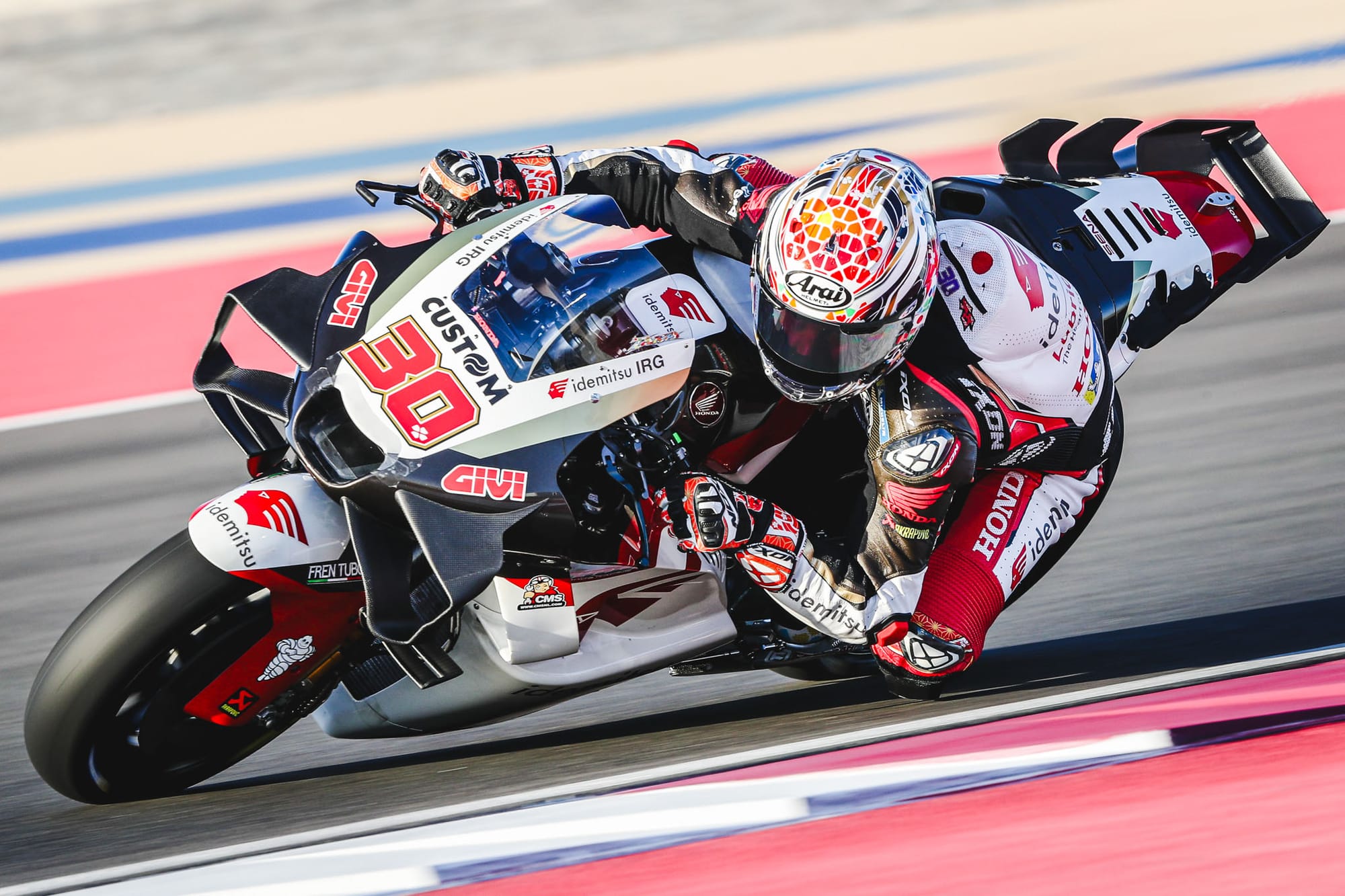
The Idemitsu liveries used in more junior categories (like what the above-pictured Somkiat Chantra is campaigning in Moto2 this year) create striking visual statements with more prominent use of gold.
This MotoGP iteration could do with a little of that flourish; filling the belly pan with gold would lift the lower section and draw the eye up to the all important title sponsor.
Tech3 Gas Gas
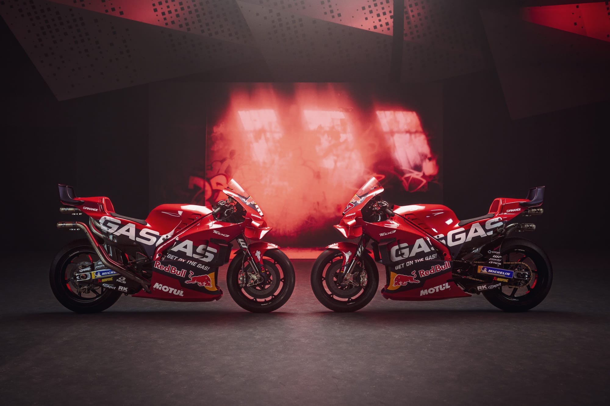
This feels like a nice evolution from last year's livery, which features most contrasting elements that stand out more and steps away any confusion with the all-red Ducati’s factory bike.
This year, the French Tech3 team and the Spanish Gas Gas brand it represents have integrated a darker stripe which splits the bike into three horizontal colour panels.
This accommodates the most significant change for the 2024 livery, which is the implementation of Red Bull branding that appears in tandem with the much-anticipated arrival of Pedro Acosta.
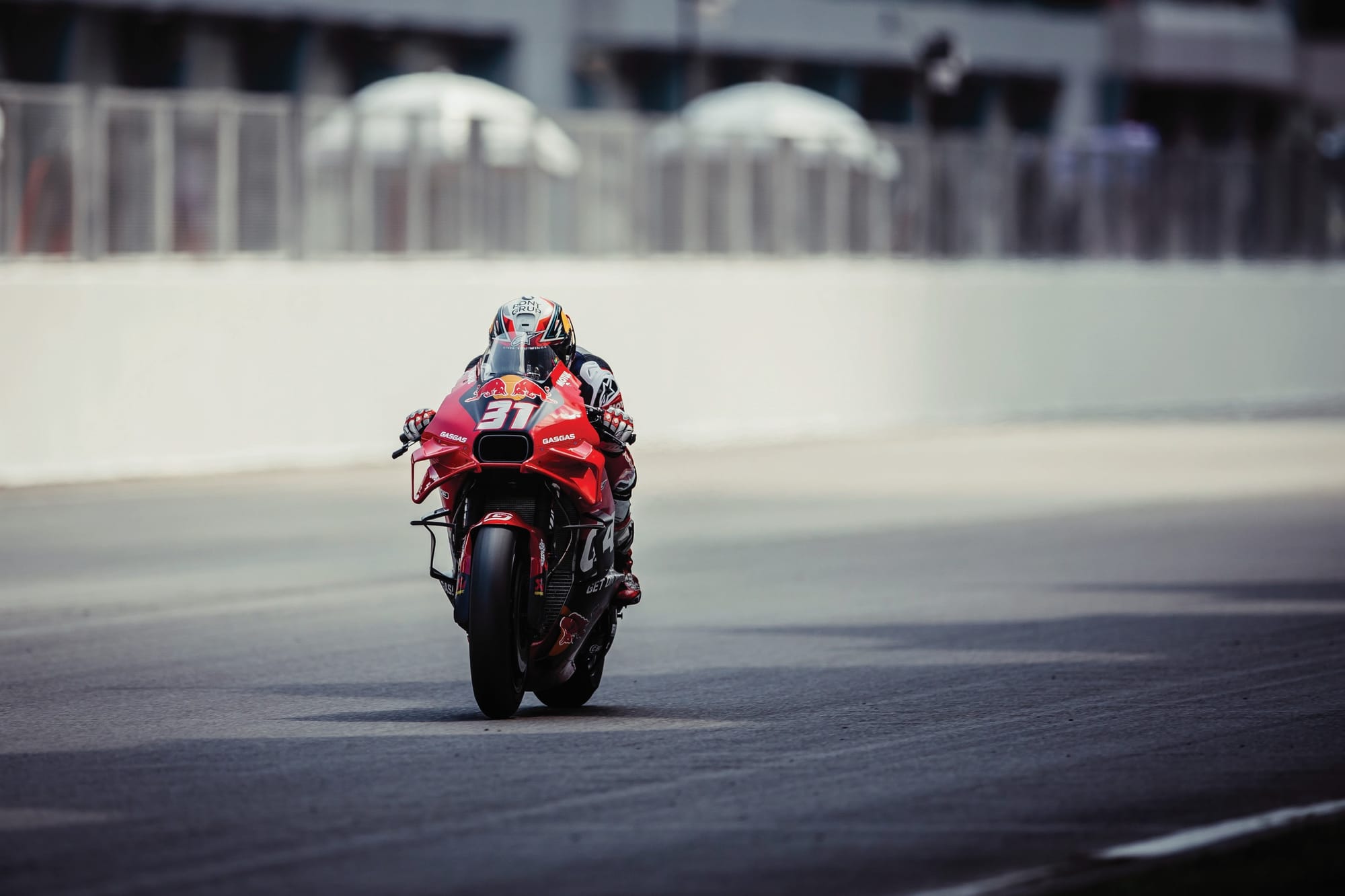
I was expecting Red Bull to dominate and drown the look but, upon seeing the final result, it has been well-executed and is almost understated.
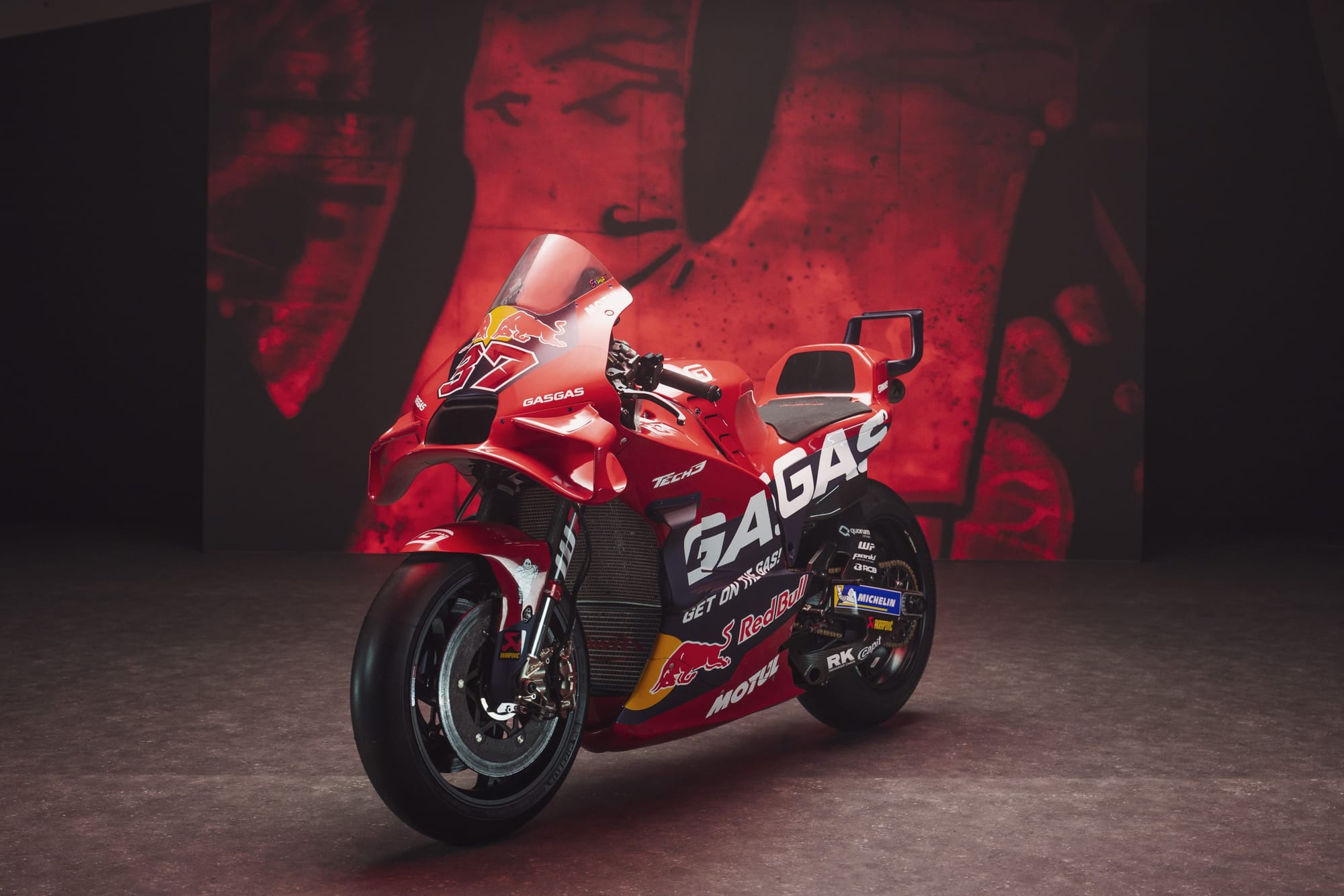
I like the big bold GasGas logo, which is almost as much of a horizontal pattern as a wordmark.
It is always going to be a logo disrupted by the rider's leg position, but it now makes more of an impression against the darker backdrop brought in to frame Red Bull’s appearance.
Aprilia
Unveiled in quite possibly the best launch video of the entire grid, Aprilia’s 2024 livery is an intelligent evolution of 2023, with logical steps taken to refine rather than revolutionise its approach.
It takes a brave designer to combine black, red and purple without it looking too much like a bruise, but Aprilia succeeded in this regard in all its iterations of this palette over the last few years.
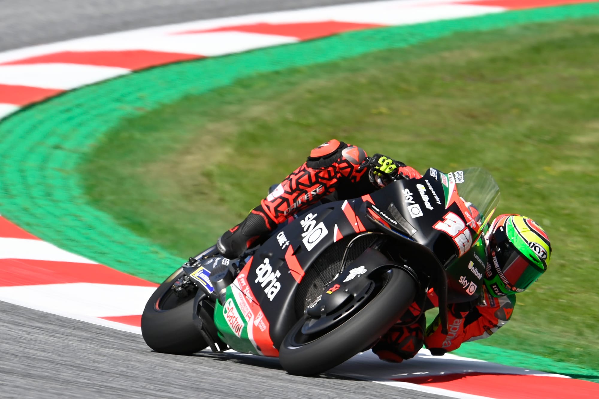
I do miss the boldness of the pre-2022 Italian flag motif (pictured above), but Aprilia makes the purple work well and it complements Aleix Espargaro’s joyfully vibrant pink-accented helmet.
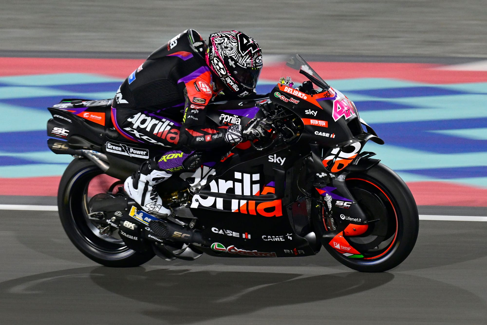
The primary Aprilia logo has been improved from the 2023 version, which had the iconic lowercase ‘a’ in black, framed in a red block.
This year, the logo has been lifted and sits more harmoniously with the flowing lines of the RS-GP 24, with the letters now split into white and red (versus more contrasting black and white), which improves brand legibility.
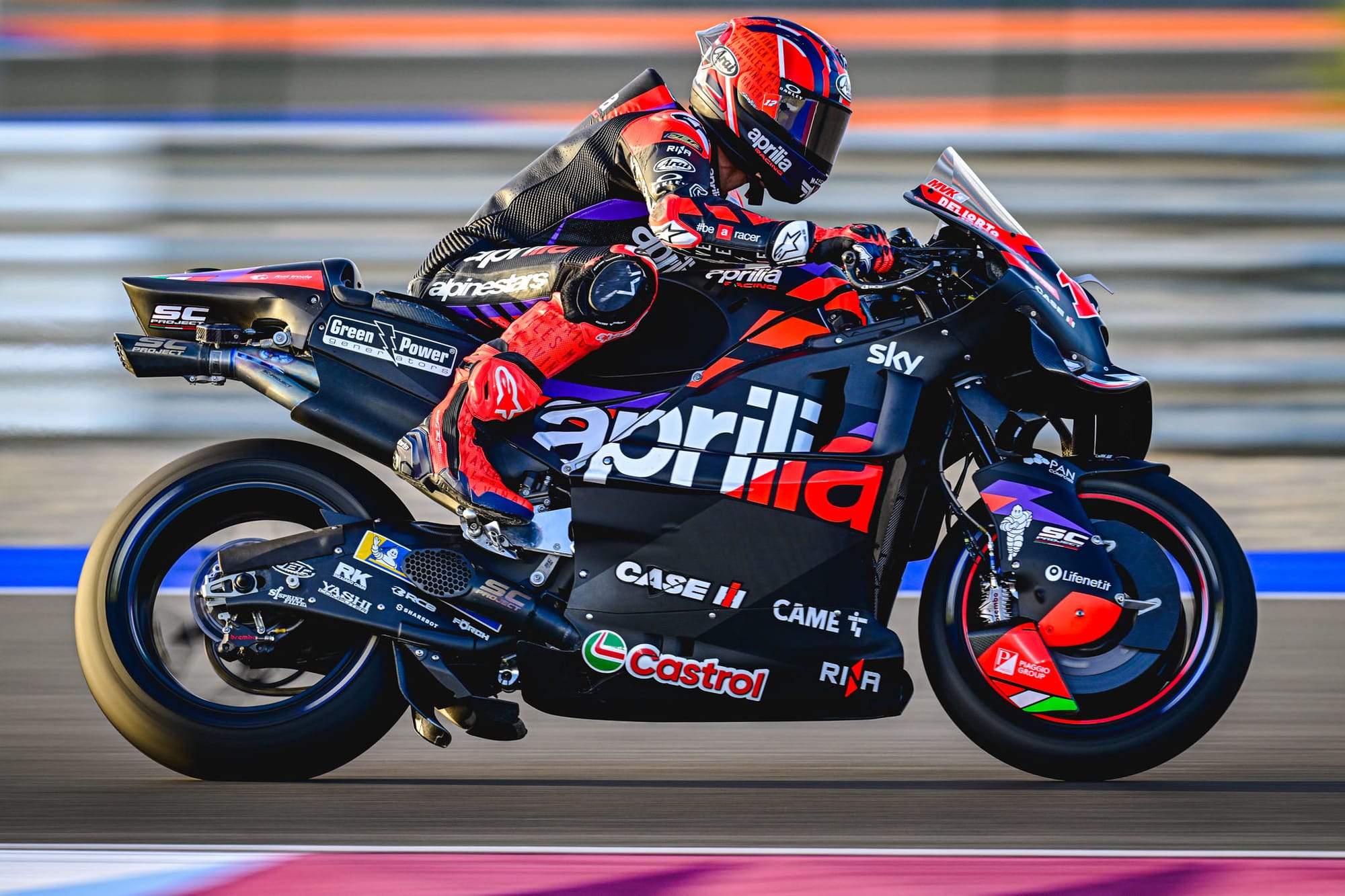
To account for these changes, the longer flowing purple racing stripes have been segmented into shorter, sharper fins. This gives a more aggressive feel overall, and sets the tone for a team ready to take more of a bite out of Ducati’s dominance.
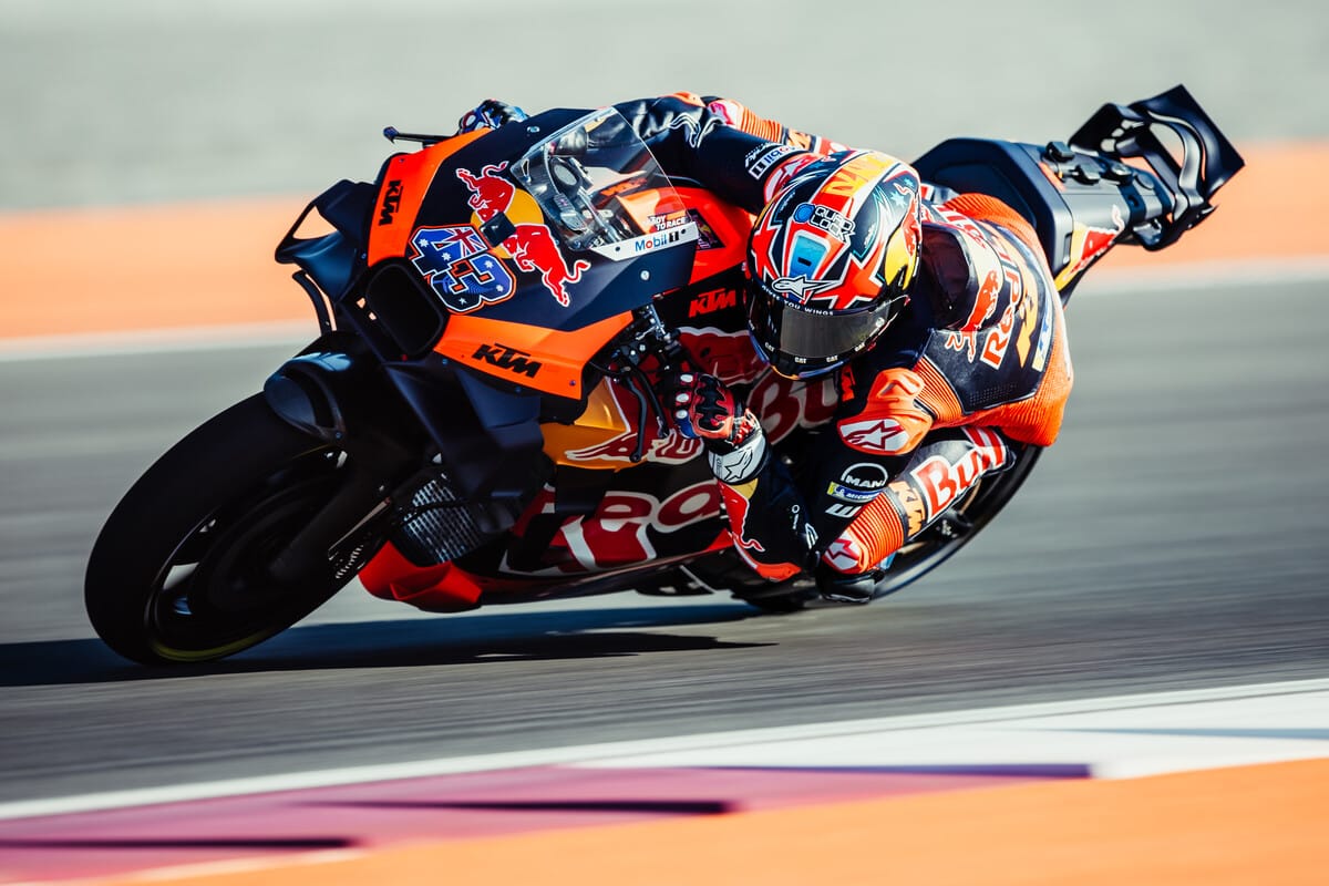
KTM
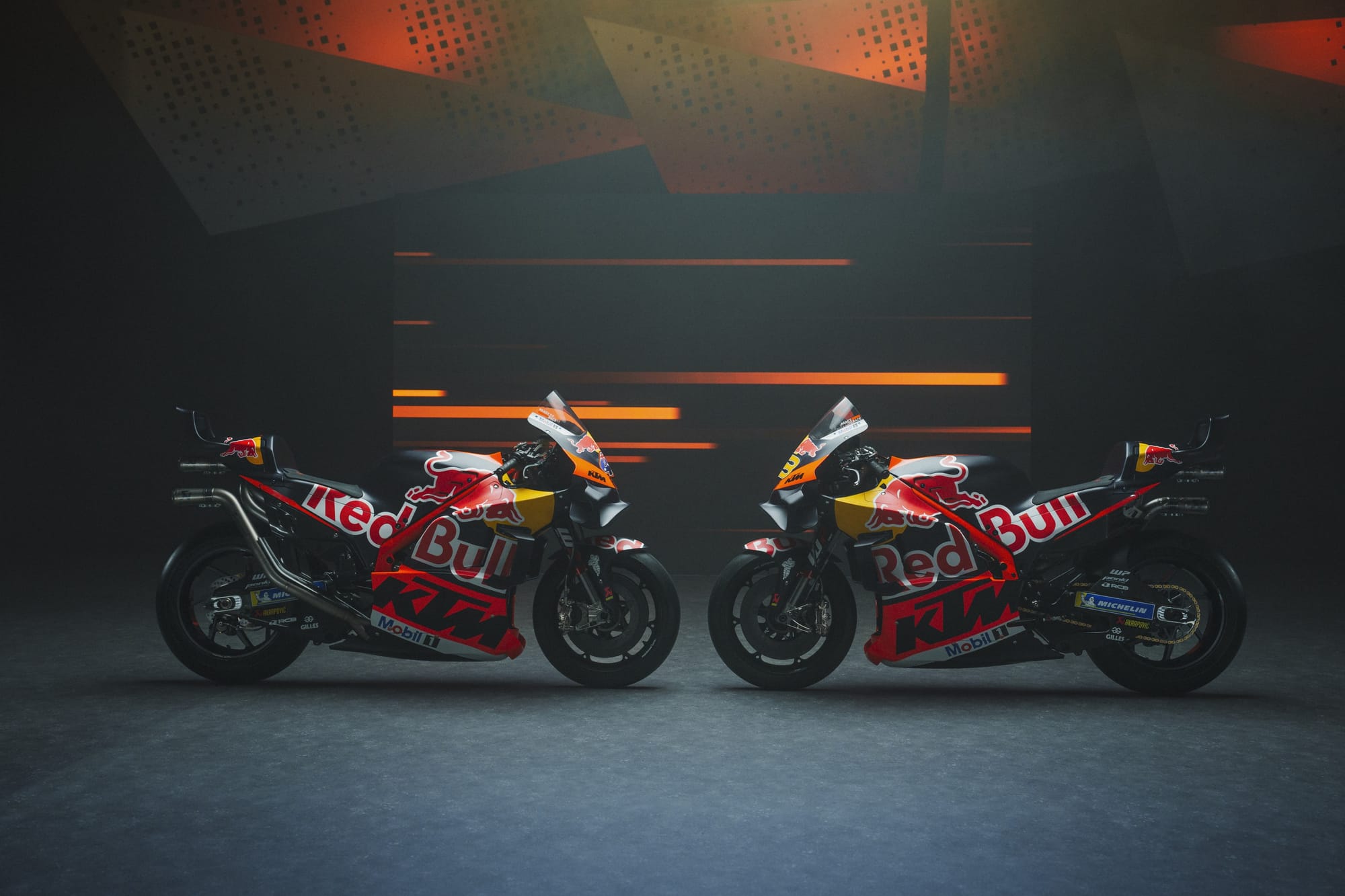
The name of the game for the 2024 KTM livery is continuity. With a continued title sponsorship from Red Bull, this is hardly surprising.
The Red Bull branding commands attention over KTM, but the two brands work harmoniously enough to click together. KTM’s orange sits neatly in the colour spectrum between the yellow and red of Red Bull.
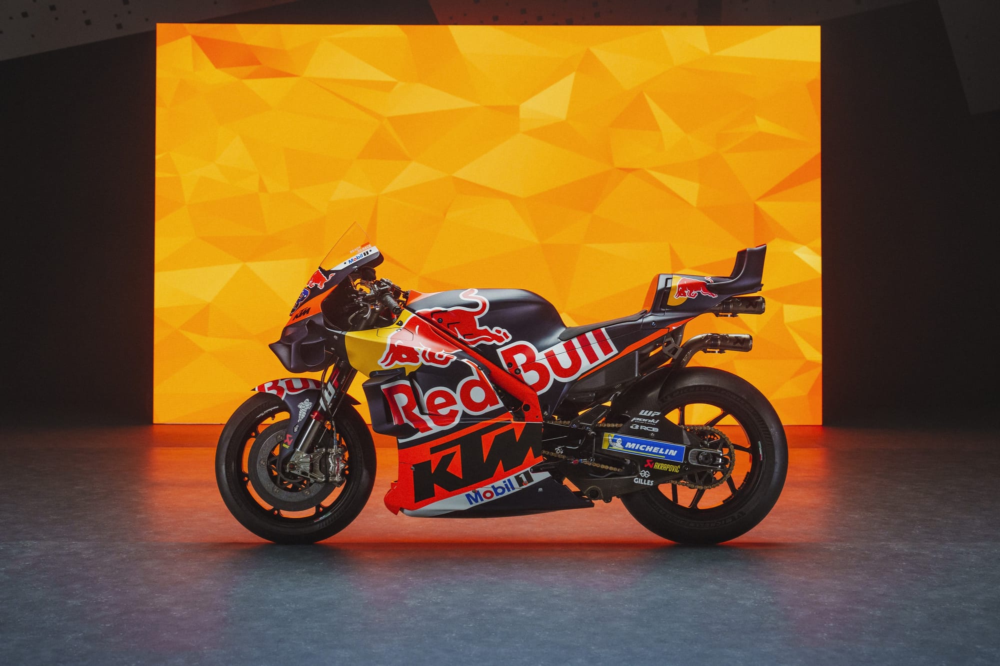
It is a distinct look, very well-executed, and evokes a seamless partnership.
What is interesting to me is Red Bull’s wider trend in recent years to make fewer livery design changes. Over in Formula 1, the Red Bull Racing car has remained largely untweaked since 2016.
It takes a certain confidence to not feel the need to revise anything to stick out from the crowd and get social media buzzing. But in this case, Red Bull and KTM know exactly who they are, so why change?
The bigger question is how many more years will we see this style before accusations arise of Red Bull lacking imagination?
Pramac Ducati
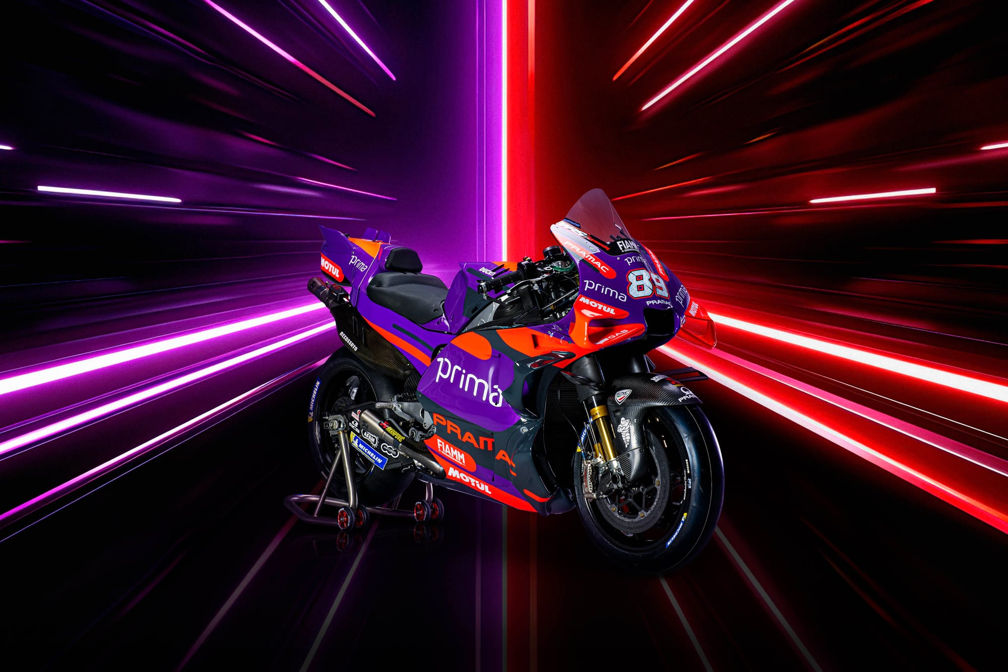
Under its floodlit launch in Bahrain at the opening of the F1 season, the Prima-sponsored Pramac Ducati emerged with a significantly different look and feel to 2023.
White has been expunged from the 2024 livery, resulting in a much darker tone overall.
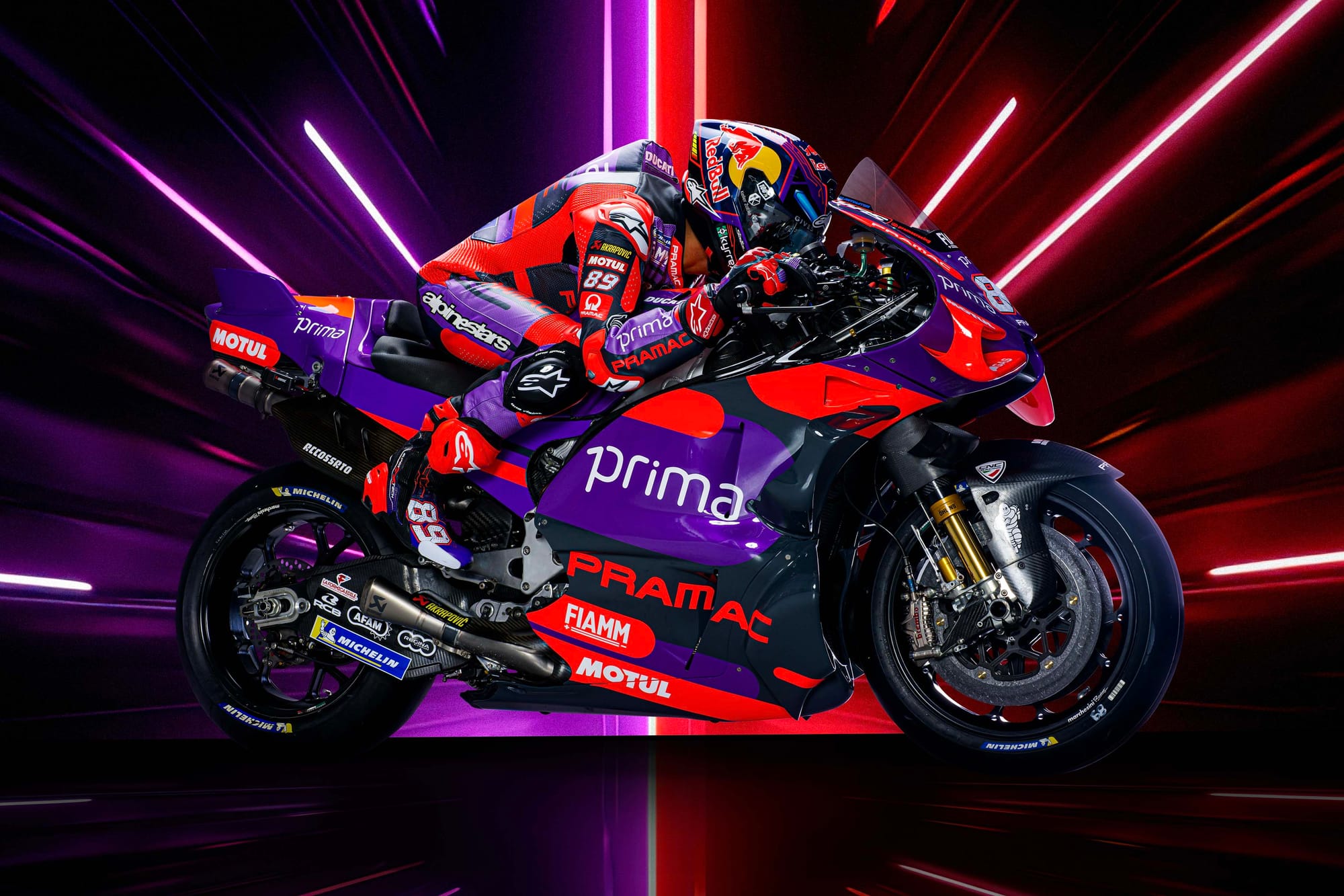
As a consequence my first impression was that it lacked the punch of last year’s design. Replacing white with an inky black in the palette reduces the colour contrast compared to its predecessor.
Adding fine white detailing to delineate the primary Prima branding on the mid-section could break up the expansive dark areas and give a far greater sense of velocity.
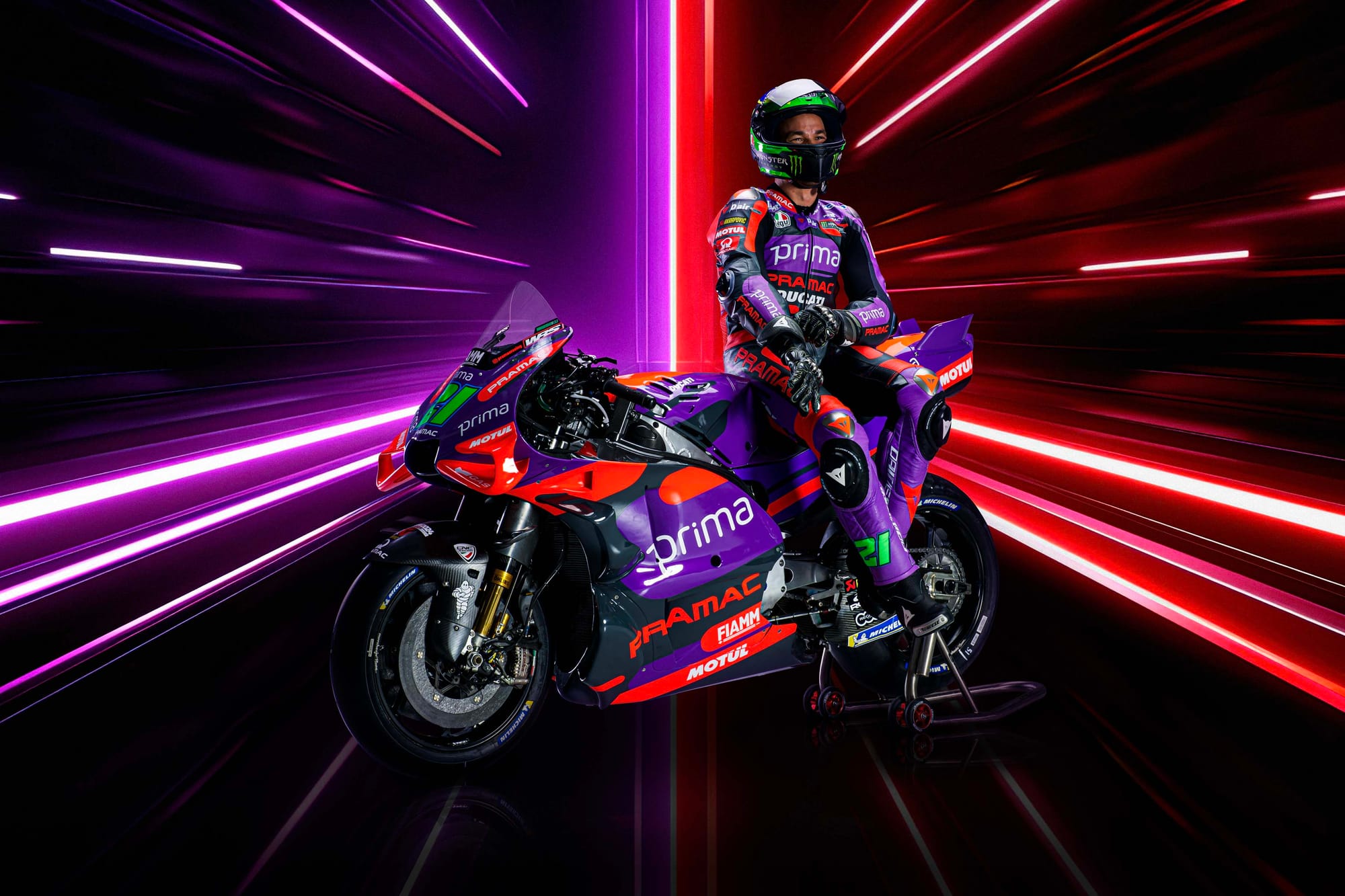
But flipping the dominant tones from white to black and purple has resulted in the purple looking oddly flat on screen. What works really well on the leathers doesn’t translate quite so successfully to the bike itself.
It also nudges the identity closer to Aprilia’s brand and makes the Pramac feel less distinctive than before.
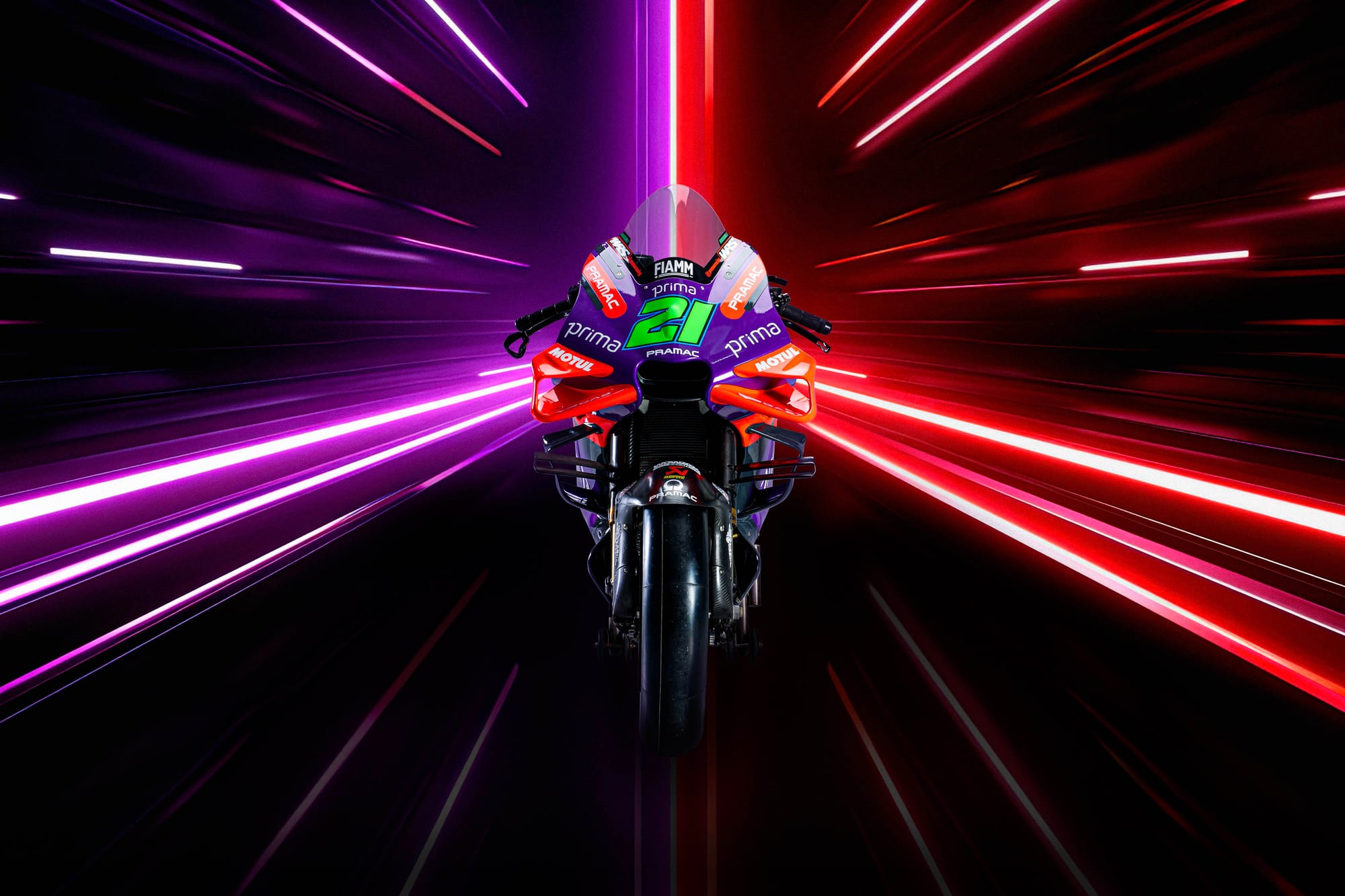
However, a flourish I do really enjoy is Franco Morbidelli’s flash of luminous Brazilian green, which gives an enjoyable and much needed lairiness that elevates the appearance of the bike into a Joker-esque colour palette.

