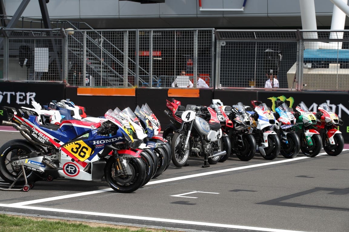
Every MotoGP team will run a 'retro' livery for the British Grand Prix at Silverstone on Sunday as part of the series' 75th anniversary celebrations.
Which makes it very good timing for the The Race Media's creative lead Oliver Card to be at Silverstone recording a special behind-the-scenes MotoGP Extra podcast for The Race Members' Club.
Here's his take on all the liveries, whether they truly live up to the retro brief, and how well they've blended that and the requirements of modern sponsors and aero shapes.
In motorsport, we often talk of the “curse of the one-off livery”, where a race team running a different paint job finds itself having a weekend of unusually high misfortune. For a sport so focused on technical precision and engineering prowess, superstition still has a foot in the door.
But what happens when an entire grid mixes things up?
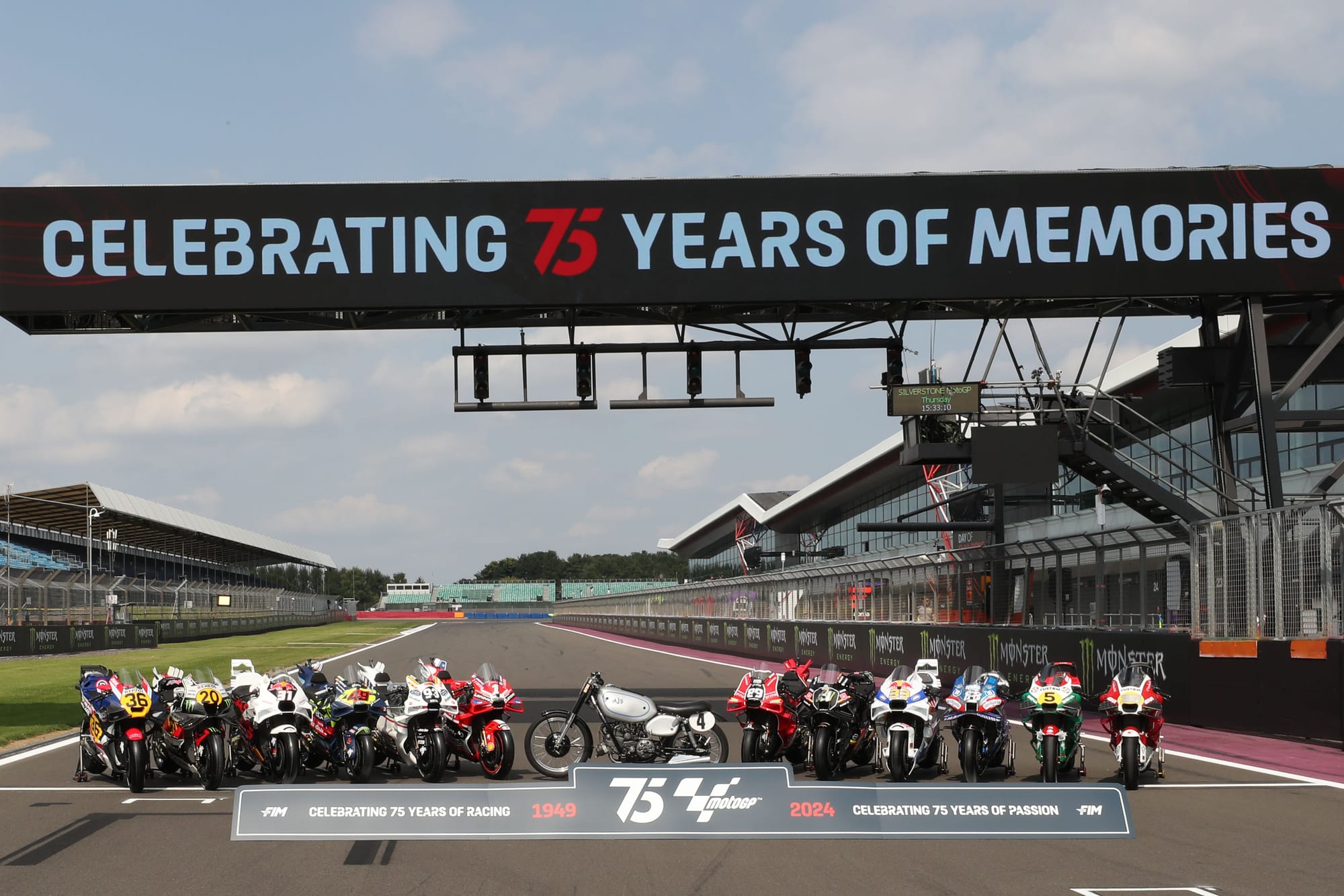
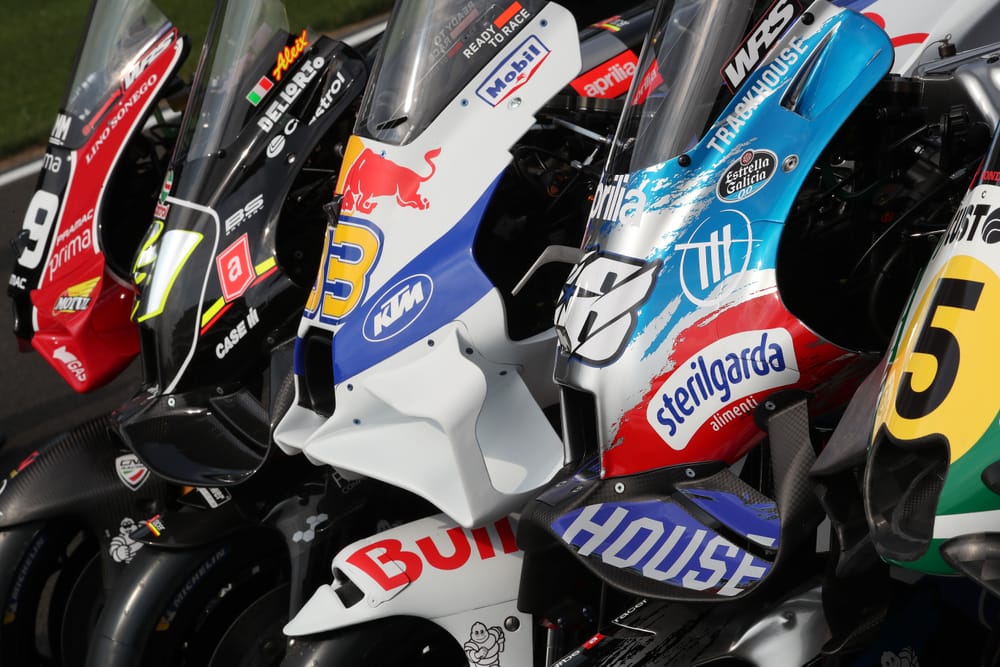
This weekend at the British GP at Silverstone, for the first time ever every team on the MotoGP grid is running a retro-inspired livery as part of the series’ 75th anniversary celebrations. It seems the livery curse now shifts to the commentators, who are given an extra headache of identifying a visually upended field.
For fans, liveries are evocative and emotive, but from a commercial perspective, exposure is king, so there is a tightrope walk to appease both parties. Keeping current sponsors happy whilst achieving a look that feels suitably retro is a tall order. But ask your average MotoGP fan which design they’d like to see on the grid, and chances are it will feature dominant cigarette branding.
On Thursday, as part of the Day of Champions events, the retro schemes that will be used in Sunday’s grand prix (but not practice, qualifying or the sprint) were unveiled in the paddock and it’s fair to say there is quite a variety of interpretations of the ‘retro-inspired’ brief. There are some absolutely stunning results but also concepts which are somewhat undercooked.
Yamaha
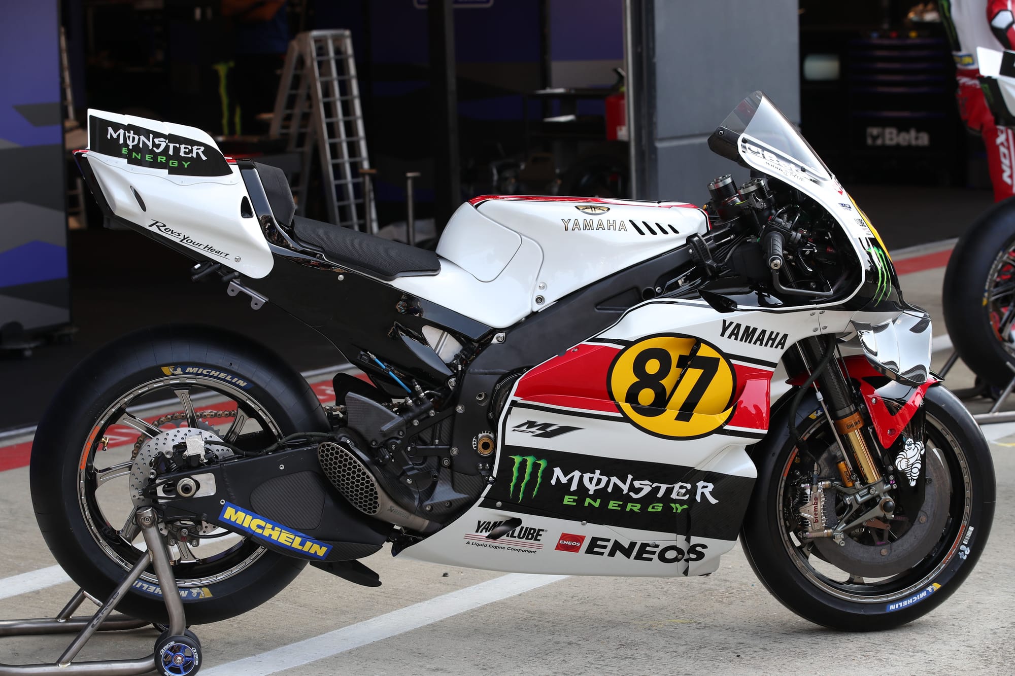
Going into this weekend, the question for Yamaha was always going to be: will it be red or yellow?
Evoking memories from its early golden era, it’s opted for red, referencing the classic early 1970s 500cc colour combination.
It’s been appropriately adapted to account for the more lairy and immovable sponsors (such as the green Monster M) which have been integrated into black panels without disrupting the overall look.
Yamaha has been quite canny here from a track to biker perspective, as the colour scheme can also be found on its road bike line-up in the form of the Yamaha XSR900 GP edition.
It is quite restrained, but it gets bonus points for excellent rider number visibility.
Honda
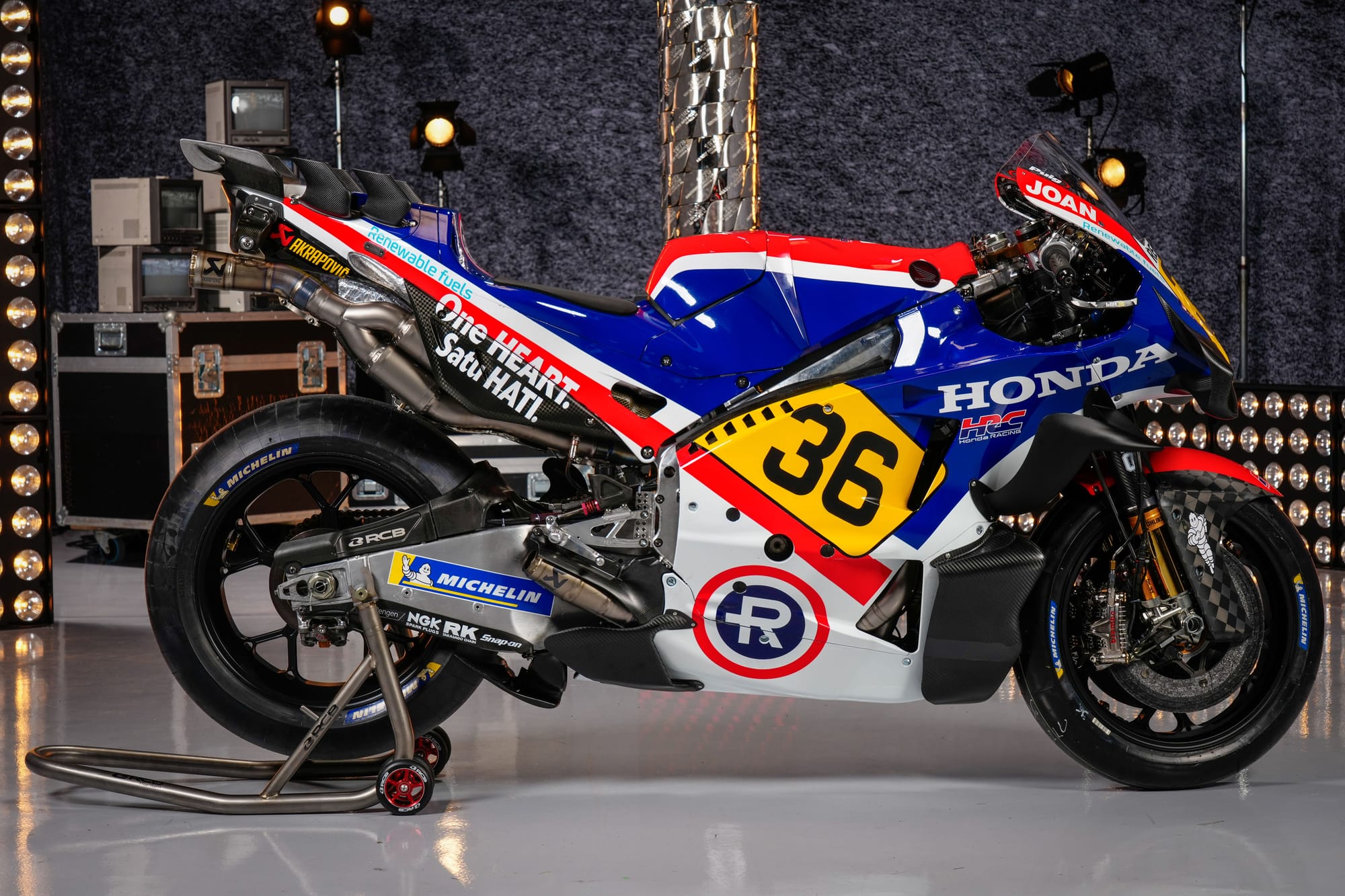
Repsol is rumoured to be ending its iconic Honda sponsorship at the end of this season after 30 years, so maybe this is part of the swansong.
The factory Honda pays homage to the colour scheme of Freddie Spencer’s bike when he took his first 500cc title in 1983. Gone is the orange, and in its place the original red/blue logo of Repesa (the company founded in 1951 that created the Repsol brand which later adopted the R).
It’s a gleaming, gorgeous design that comes with the luxury of fewer sponsors, resulting in a perfect blend of contemporary and retro interpretation. If the Repsol partnership doesn’t end, I’d love to see this approach for 2025.
Ducati
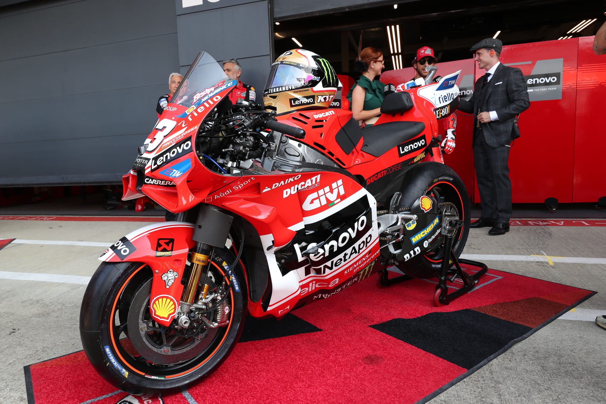
We are told this pays homage to the 2003 Ducati and its first MotoGP race winner, but give this a quick glance and you’d be hard-pressed to truly pin it down.
Sadly, this is a design compromised by inflexible sponsor brand guidelines that refused to allow deviation for a tweaked approach just this once.
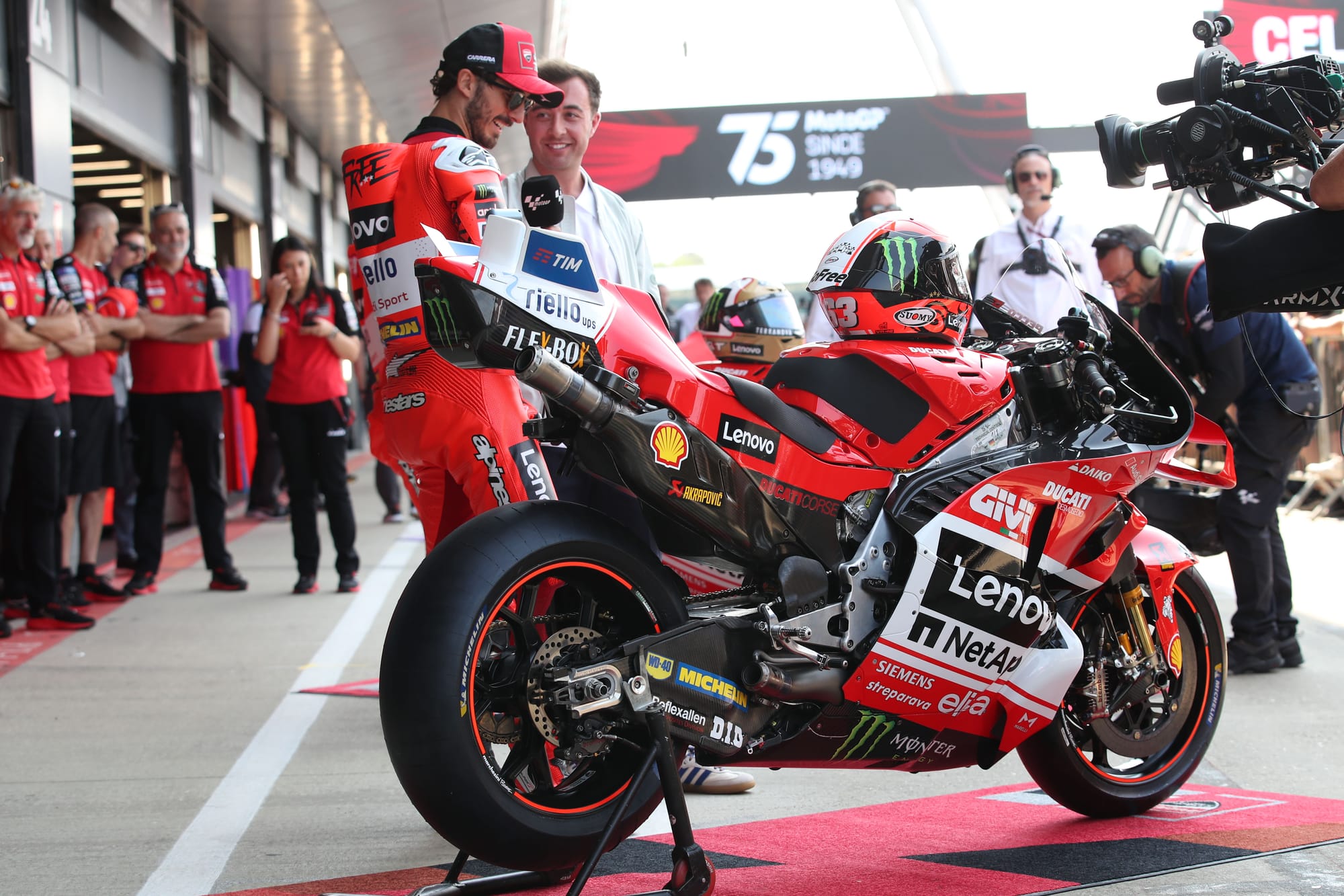
During the Thursday press conference, Pecco Bagnaia even admitted as such, openly favouring the approach of Yamaha and Honda.
The most distinctive aspect of the GP3 livery is the angular Marlboro logo, which for obvious reasons cannot exactly be replicated. But if only Lenovo was to agree to flip to black wordmark from its heavy white on black box version, it would go a long way to fixing the lack of connectivity between old and new.
Aprilia
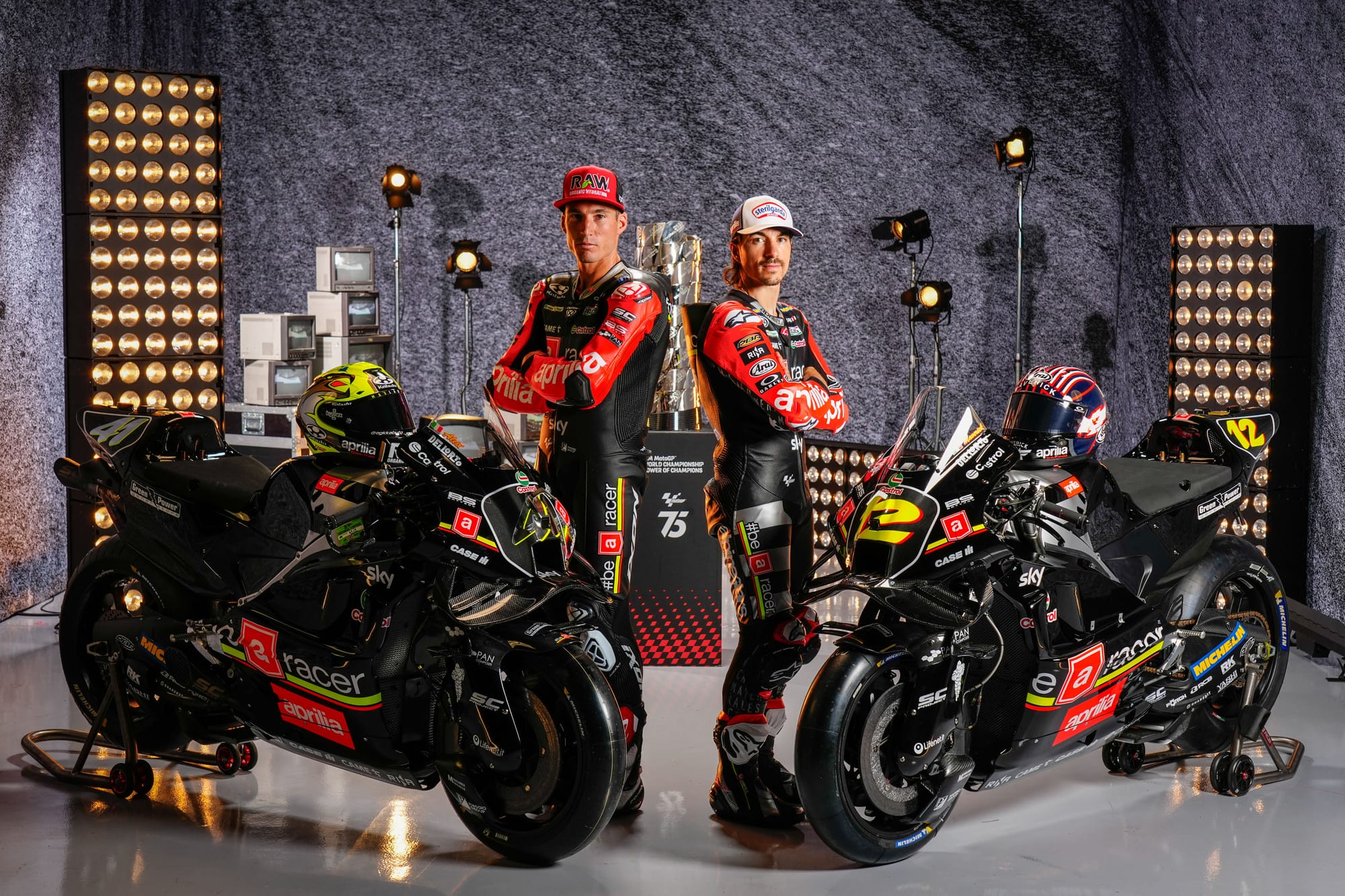
This is more like it. Aprilia has some rich pickings from its history but opted for a ‘black pearl’ concept, which references the Max Biaggi-era motorcycle on which he won the 1994, 1995 and 1996 250cc titles.
The rich, almost piano black blends the carbon elements perfectly with just enough punch fluro cut-through to break things up.
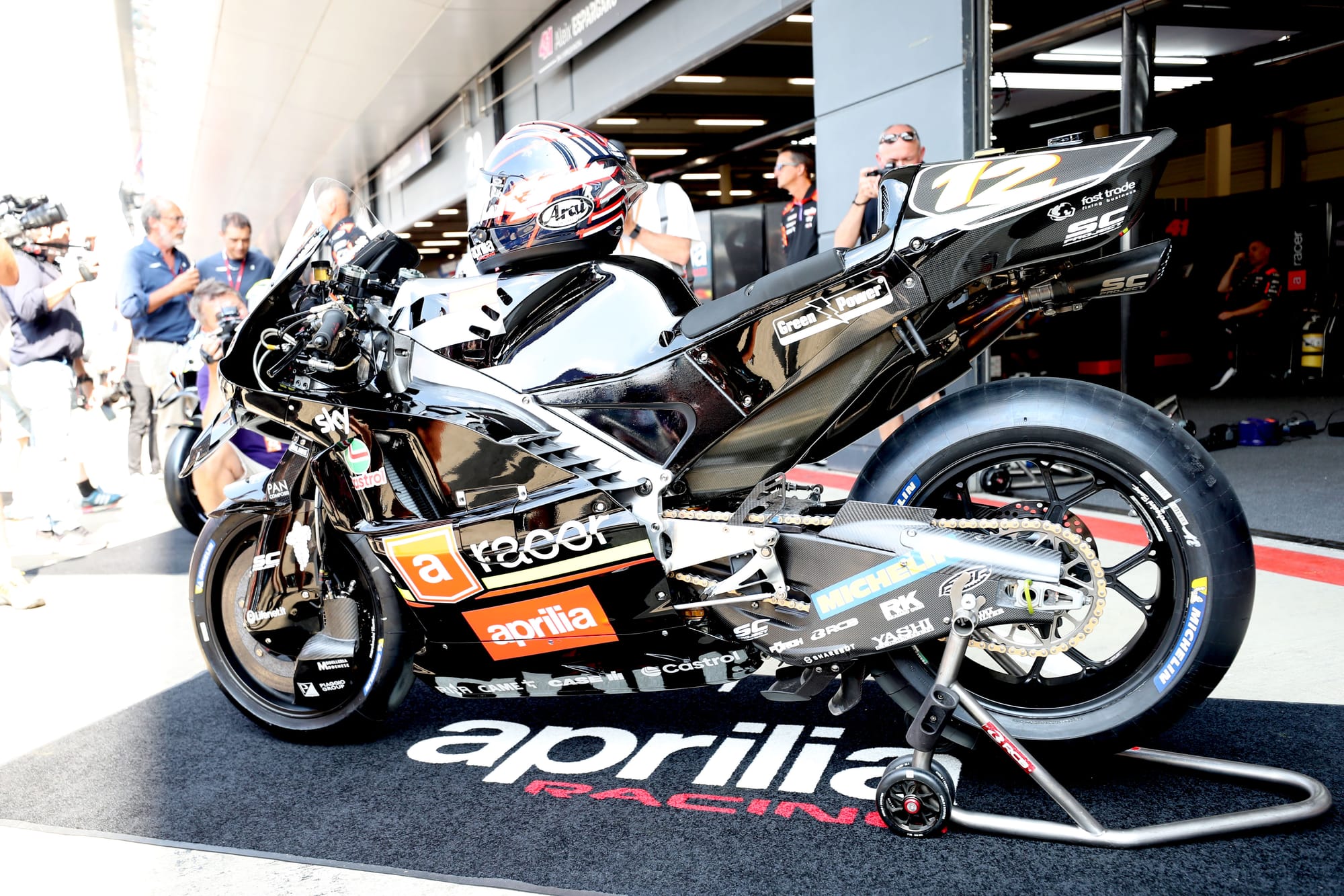
It isn’t an exact copy, but it has the feel of Biaggi’s machine and the final result is classy and intimidating.
KTM
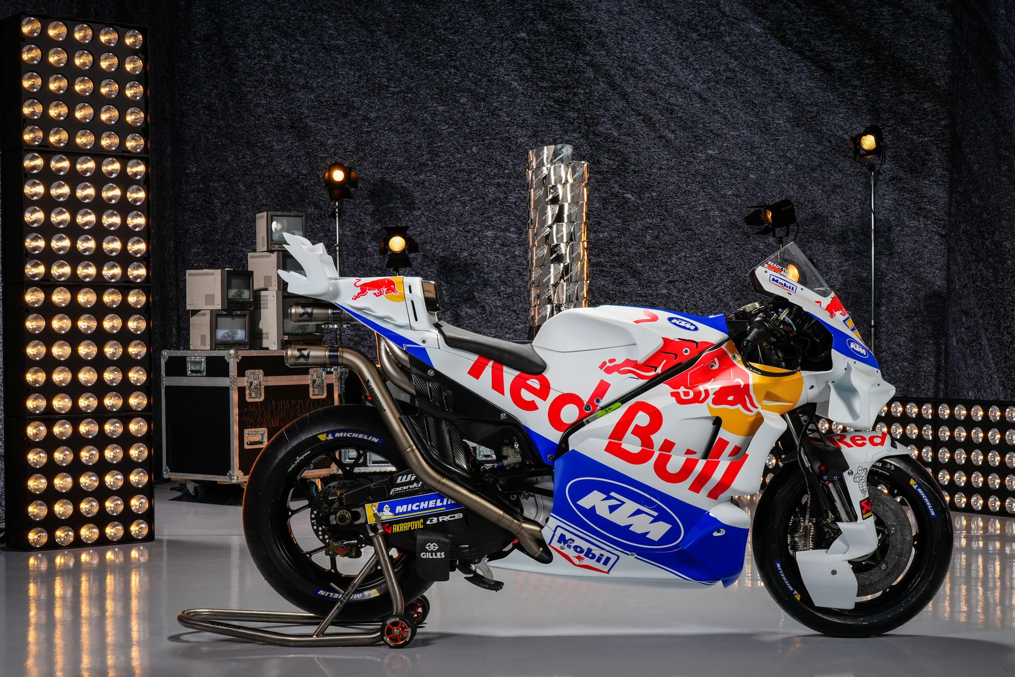
Another very strong contender, both a history lesson and a lesson in the art of achieving bold elegance.
KTM leans so heavily into orange as its brand accent that it’s hard to imagine it being represented in any other way. However, this design is a throwback to the KTM LC4, the company’s very first road racer created by Wolfgang Felber in the late 1980s.
For a team that hasn’t rushed to change its livery design in any way over the last few years, this feels crisp and refreshing, while still giving the Red Bull title sponsor appropriate dominance over the bike.
Gresini
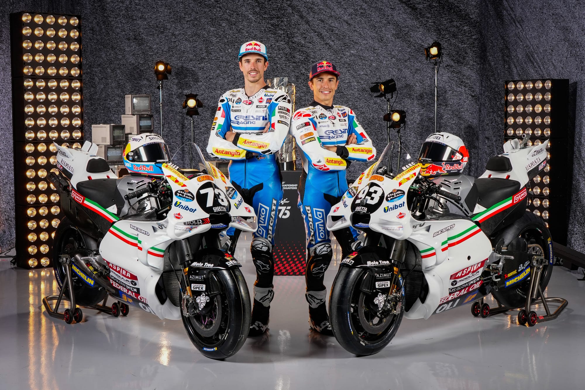
It was no great surprise to see Gresini pay tribute to its late founder Fausto Gresini, but it still manages to make a beautiful impression.
“Arrogance on asphalt” the team called it on social media, but I’d argue this one of the most elegant interpretations of a historic livery. Not only for the bike itself, which will tug at Italian heart strings with minimal ‘il Tricolore’ motif, but also with the timeless race suits, that adopt the blue accent of Fausto’s helmet into the leathers. Bellissimo.
Pramac
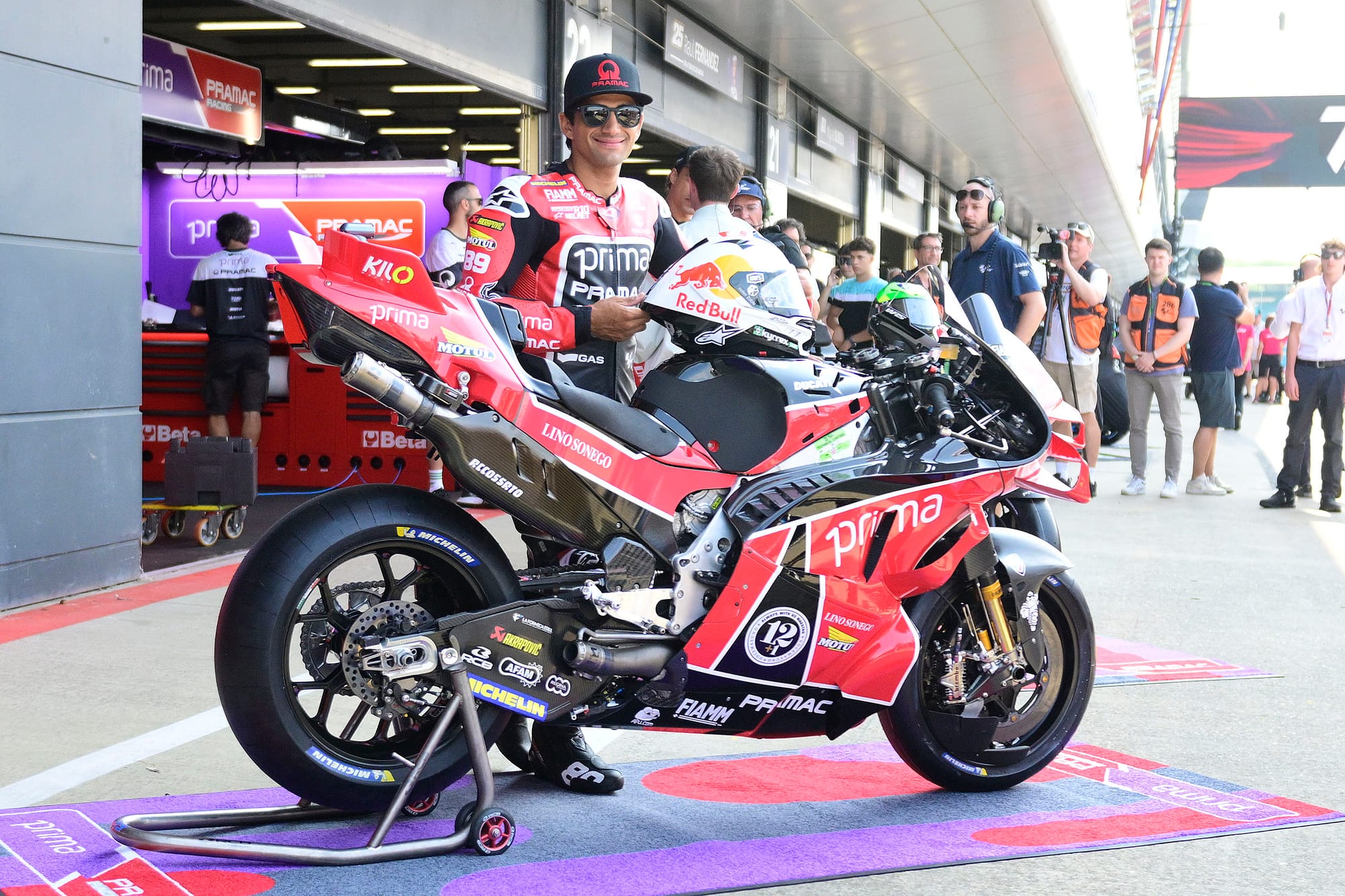
A fitting tribute to Angel Nieto (uncle of team manager Fonsi Nieto) and the bike on which he won the 1983 125cc title.
Title sponsor Prima’s purple makes way for a dominant red with white pinstripe detailing, and the result is simple but highly effective. Overall, I think Pramac has struck an excellent balance with this approach.
However, I can’t help but notice a certain cruel irony to putting Jorge Martin in red leathers that wouldn’t look amiss on a factory Ducati…
VR46
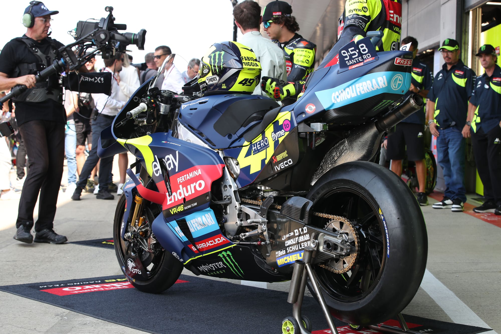
The visual archive for Valentino Rossi is bursting with reference material, but many of his iconic looks are tied up with other teams.
As such, it makes sense to go quintessentially Rossi with this brief, which VR46 has done with a satin blue finish and one of Valentino’s most recognisable symbols: a fluorescent sun motif most notably featured on his 2018 helmet.
At least, that seems the intention, but the execution is, like the works Ducati team, compromised by sponsorship. I’d love to have seen the sun expanded and splashed across the whole front half of the bike. But again, the pre-existing sponsor logos dent the impact somewhat.
LCR Honda
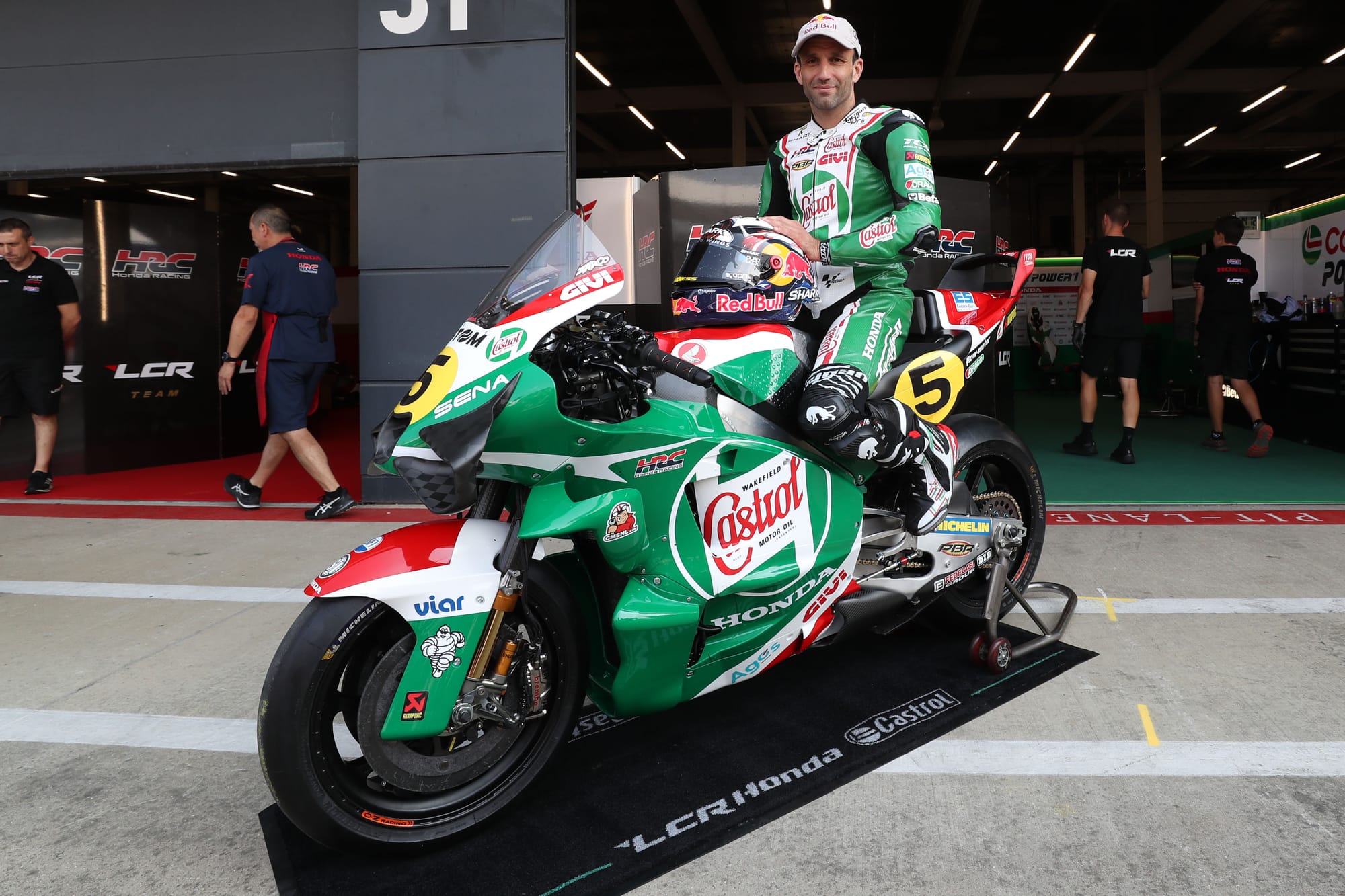
You’d be forgiven for thinking that Johann Zarco had been running a retro livery since the start of the season, such is the well-executed nostalgia his Castrol scheme captured when it launched earlier this year.
However, LCR found a new way to represent Castrol for Silverstone, using heritage branding and a colour configuration that references Mike Hailwood's bike from the 1960s.
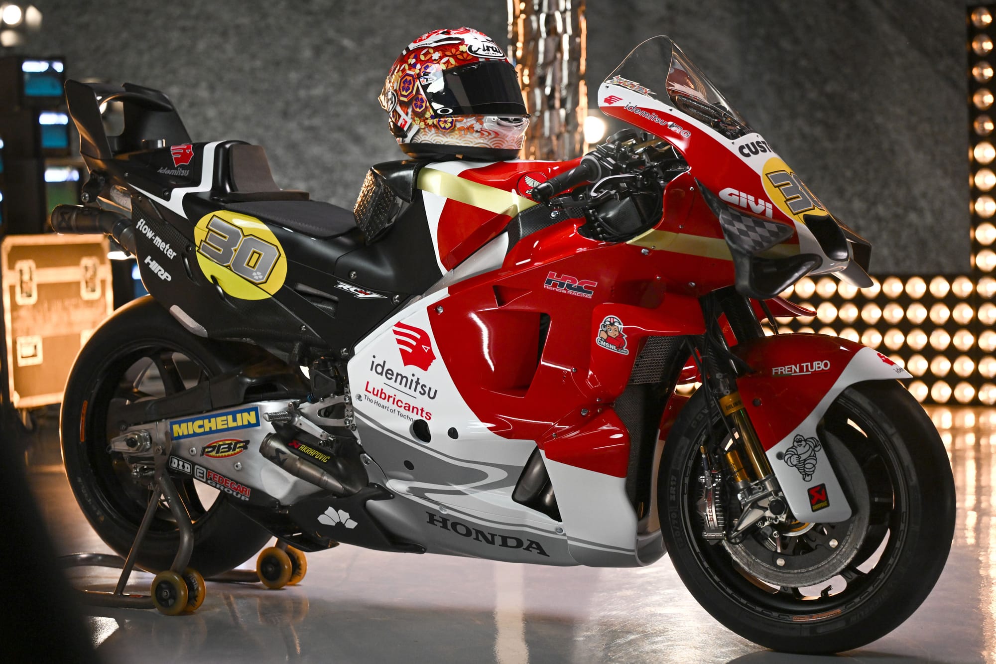
On the other side of the garage, the Idemitsu-backed bike of Takaaki Nakagami is emblazoned with a Japanese flag which, although innocuous, doesn’t exactly scream ‘retro-inspired’.
In fact, with modern aero, it struggles to even whisper Japan, such is the deformity of the red circle through the bodywork from certain angles.
Trackhouse
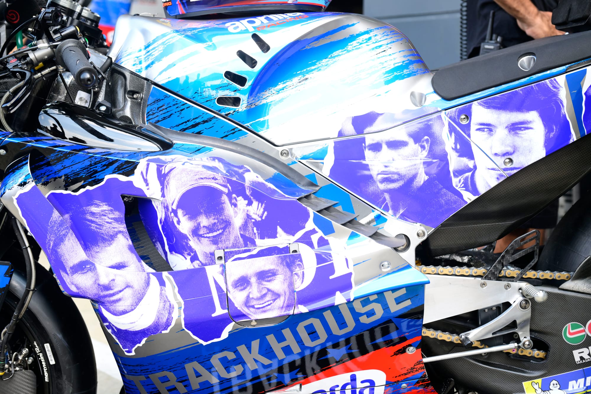
As Trackhouse was only established for the 2024 season, how does a team lacking decades of heritage achieve a retro livery?
The answer, which was seemingly teased across social media in recent weeks, is to celebrate American motorcycle icons.
I really admire how the team resisted the temptation to run a Nicky Hayden tribute like that already seen at the launch of Trackhouse Racing earlier this year.
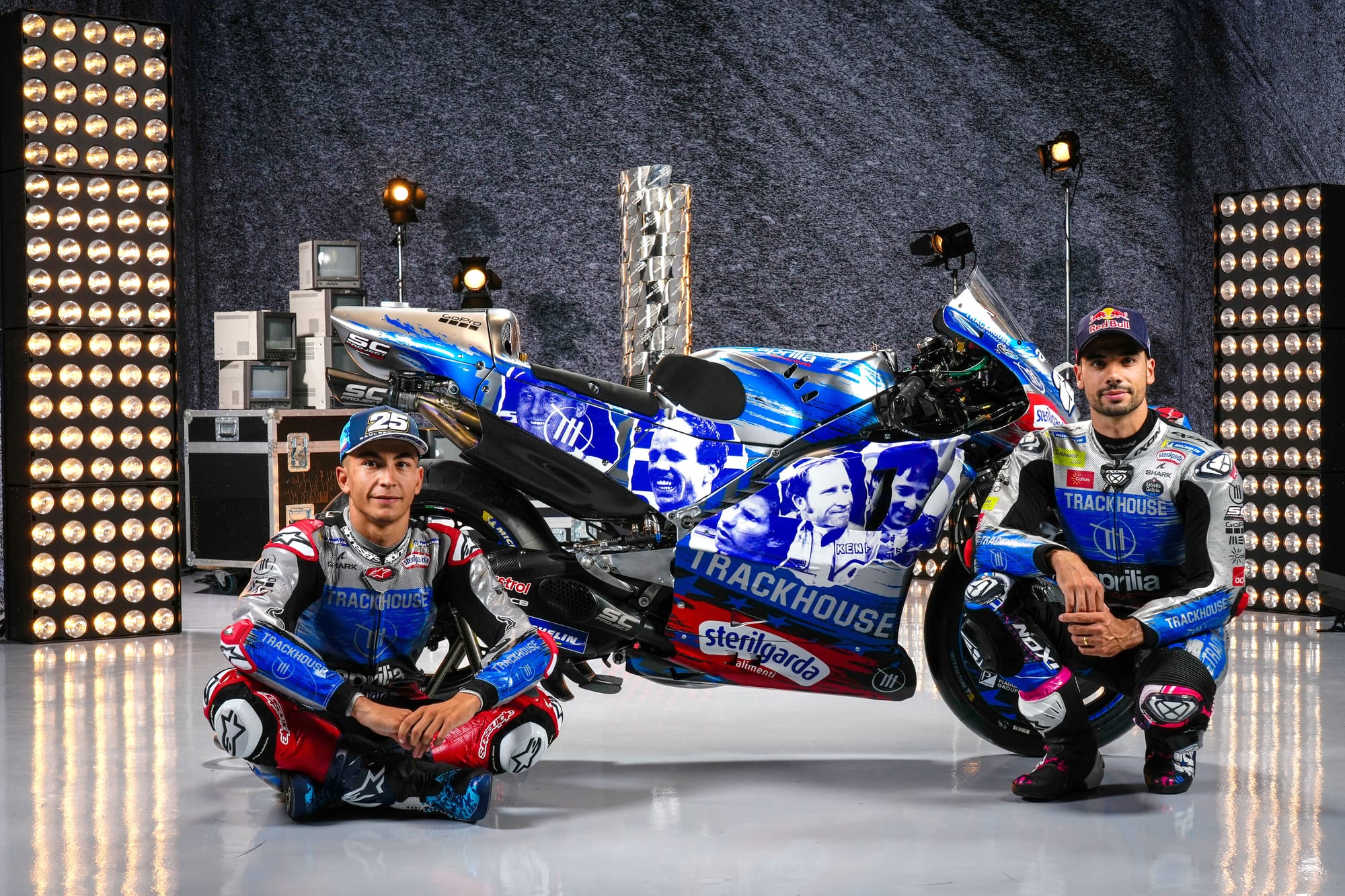
The silver and blue colour scheme across both leathers and bikes is truly harmonious, but I’m not the biggest fan of the torn up scrapbook effect they’ve utilised.
Opting for a high contrast duotone blue and white look blends all the icons together, and the placement of some of the riders will be hidden from view or barely visible.
However, I do love the intention behind this concept and applaud Trackhouse for being creative.
Tech3
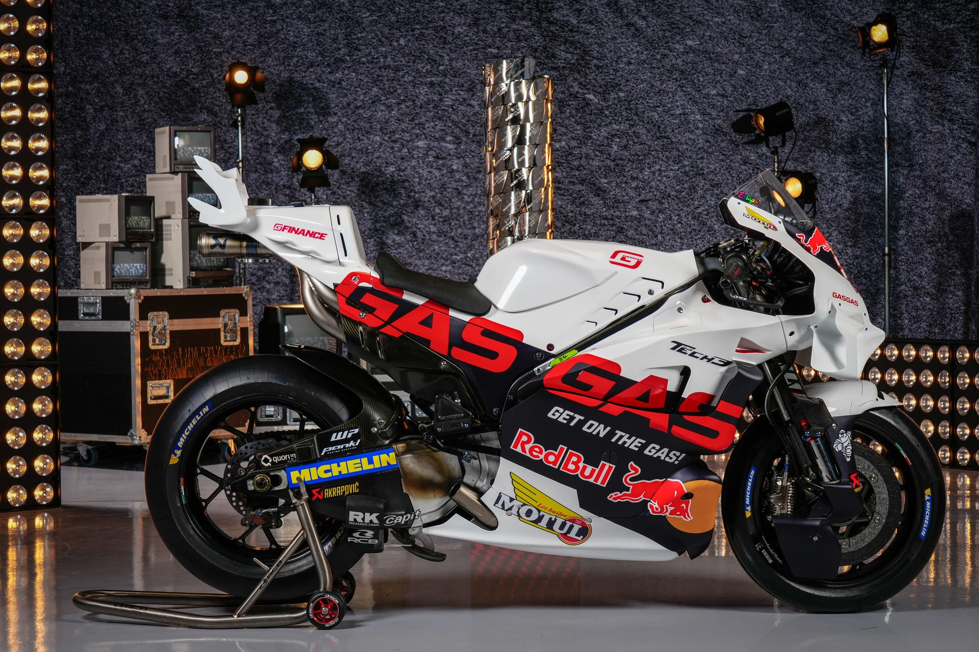
As one of the ‘newer’ brands, the Gas Gas Tech3 scheme is more in the camp of retro-inspired than simply retro.
But more accurately, it sits in a bit of a no-man's land between properly retro feeling and contemporary. I would have loved to have seen something more playful here but, bar painting the top half white, it lacks an evocative feel. The resulting high contrast renders the Gas Gas logo much harder to read.