
All 11 MotoGP teams have now revealed their liveries for the 2025 season, so we asked The Race’s creative lead Oliver Card to give his verdict on them - considering not just the pure aesthetics but how they’ve integrated sponsorship necessities and whether they are maximising opportunities to make an impact on fans.
We also ordered him to rank them from worst to best - though ‘worst’ is a relative term rather than implying outright that any of these bikes looks genuinely bad as this year no one has delivered a clanger of a colour scheme. It’s more a story of the brands that have come and gone (Repsol) and those yet to arrive properly (Gulf).
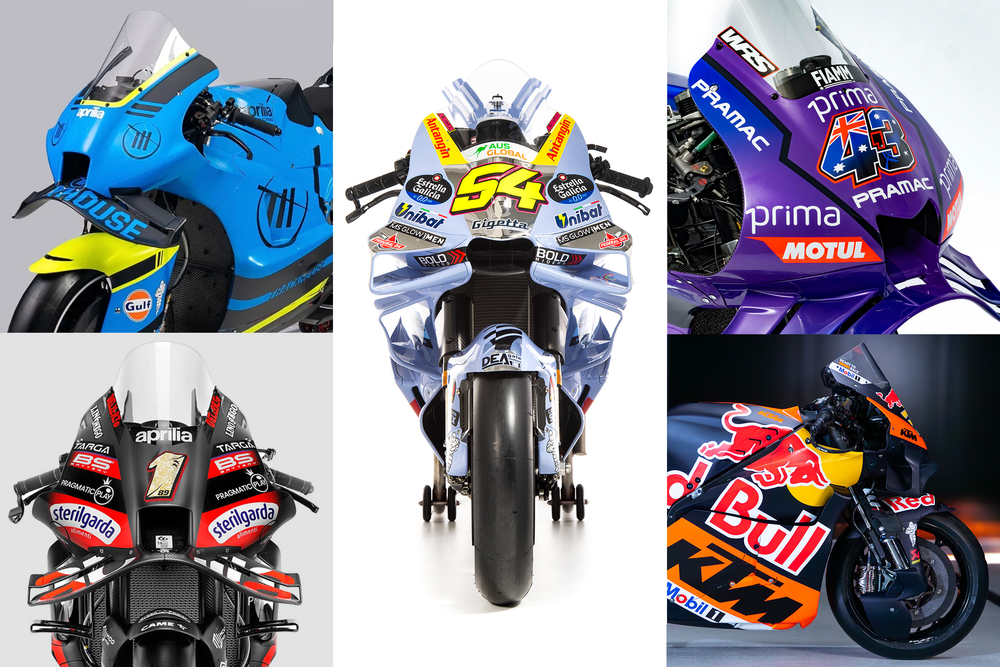
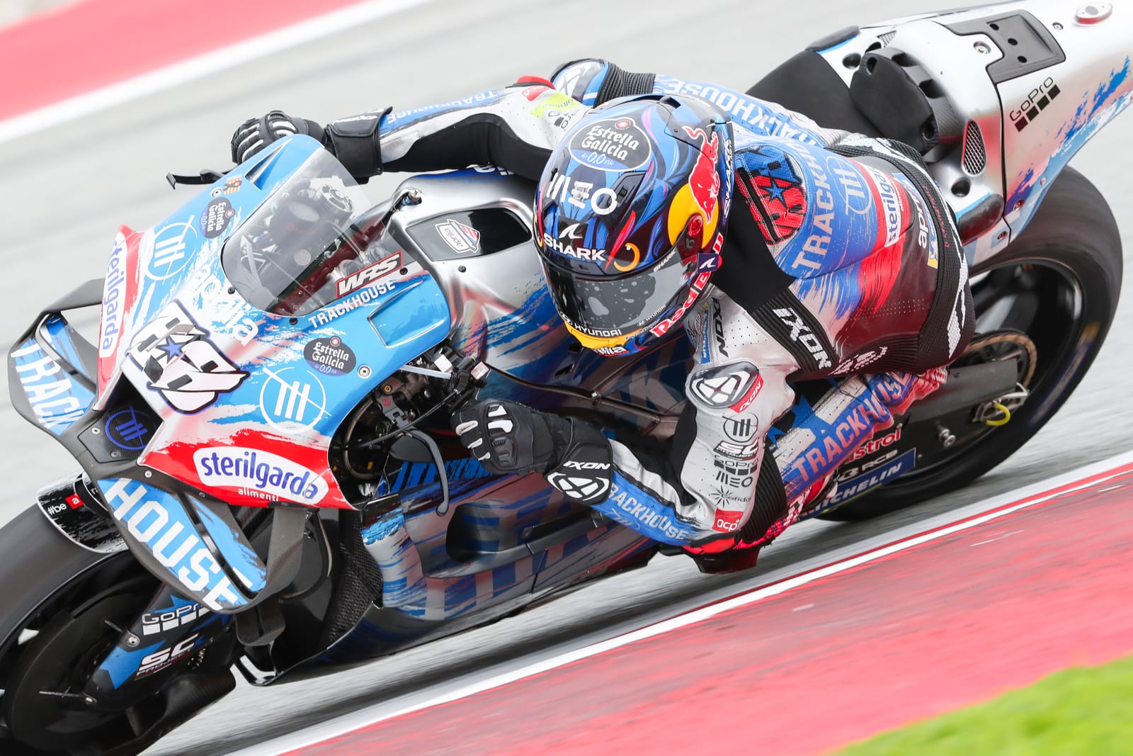
11. Trackhouse
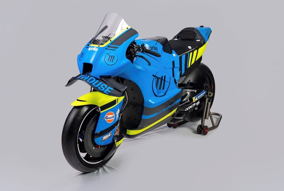
Trackhouse has already rattled through a number of different looks in its inaugural season as it found its footpegs in MotoGP. Now in its second year, how is the team setting itself out from the crowd?
Binning the Suzuki-lite look from the latter part of 2024 (which for all its familiarity was a well executed design), Trackhouse has embraced an electric blue/black combo, accented with yellow which ties neatly to its NASCAR team’s identity for 2025.
At the bike launch in North Carolina, team boss Davide Brivio alluded to mixing things up throughout the season, saying of the livery: "This is one version, we'll have other versions."
For this version, Trackhouse has reinvented itself once more but accidentally ended up looking a bit like Suzuki again. That’s not a bad thing per se, but I’m sure that's not the intention.
What screams more is the large areas eagerly awaiting sponsorship placement, which is surprising for a team like Trackhouse that - through its social content at least - is a fantastic storyteller that could bring some interesting new brands to MotoGP.
When the Gulf Oil International partnership was announced in December, anticipation of a Gulf-liveried MotoGP bike created a genuine buzz amongst fans, so it's a shame the deal translated to a small sticker on the front wheel. My prediction is that Gulf will debut as one of Brivio’s "other versions" later this season.
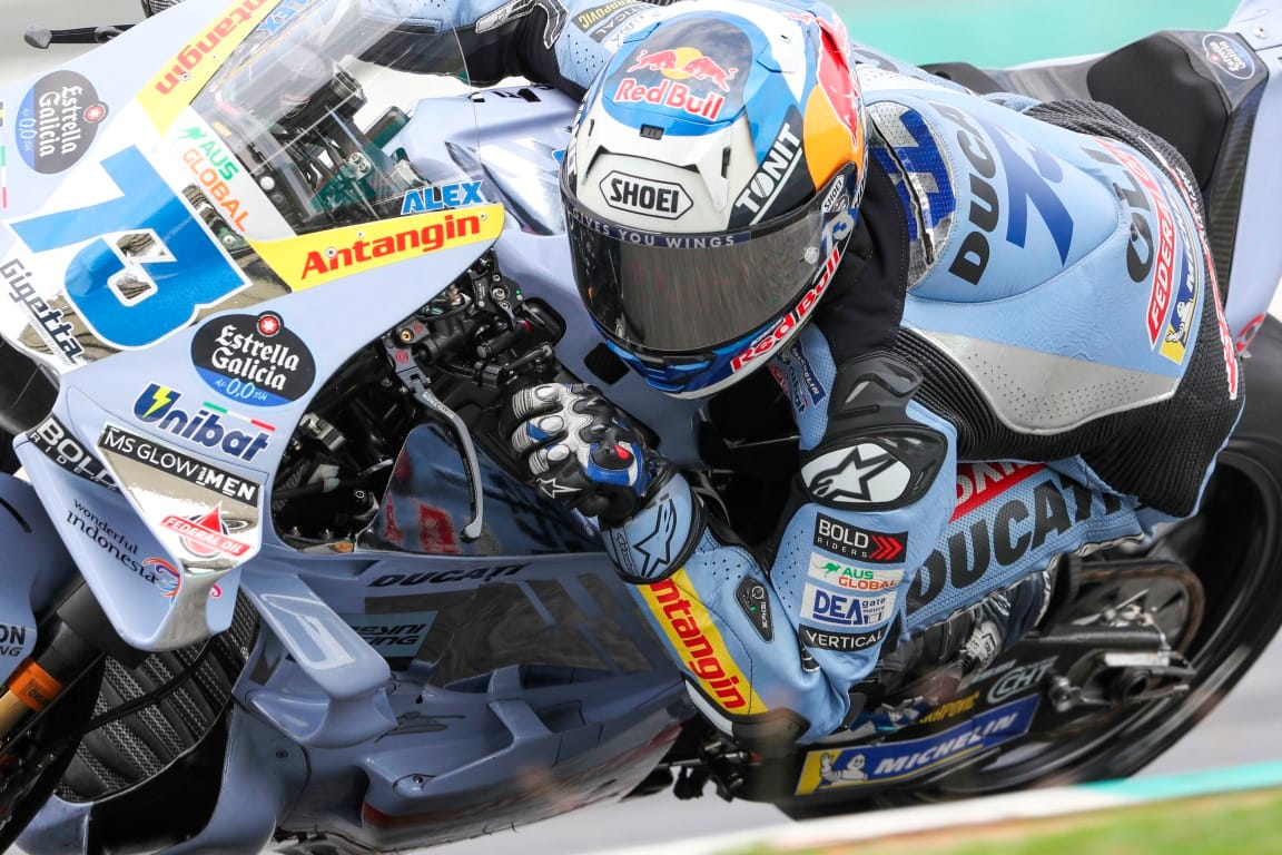
10. Ducati
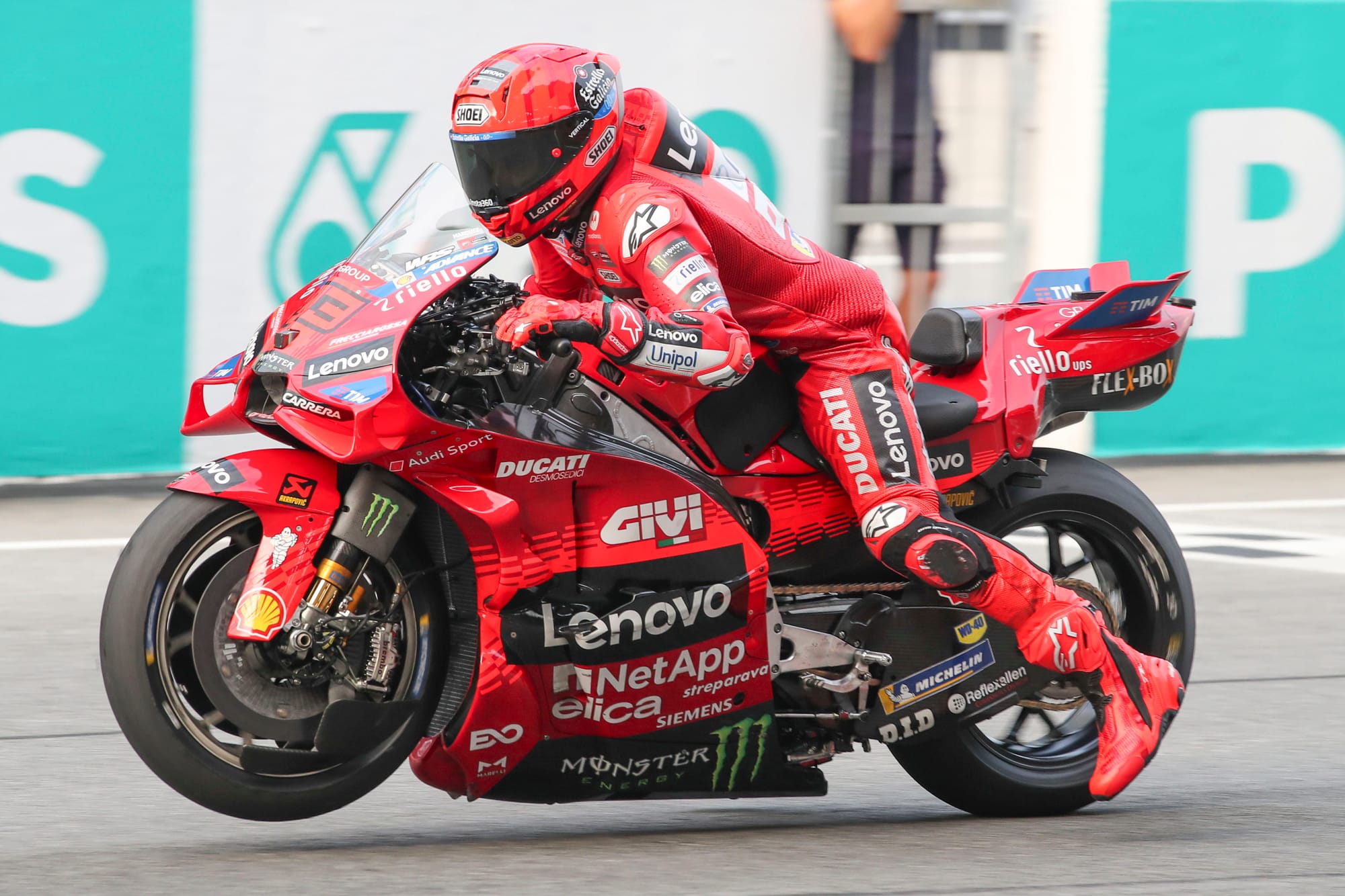
You'd think with everyone talking about Marc Marquez joining Pecco Bagnaia, Ducati wouldn't feel the need to mix up the livery too much, but visual continuity doesn't mean the team kept their feet up over the winter break.
It's a big challenge for the designers to allow a Ducati identity to poke through such a blizzard of sponsors (The Volkswagen Group accountants are much less bothered by such tribulations). This is especially challenging with title partner Lenovo and its rigid brand guidelines that prevent flexibility in how its logo appears.
However, it is Ducati, it has to be red and for 2025 the ratio of the two reds has been inverted, resulting in the dominant tone being darker for this year. As a result, it's a little more menacing, appropriate for the total domination it could unleash over the season.
Another revision tweaks the racetrack motif. Rather than rising to the engine as per last year, the duo-tone elements now reach from the front wheel fairing throughout the whole bike for a more cohesive look. I still don’t think it's Ducati’s finest look, it doesn’t really elicit joy, but with such a bursting trophy cabinet, few of the team’s fans or bosses will be complaining.
9. LCR Honda (Idemitsu version)
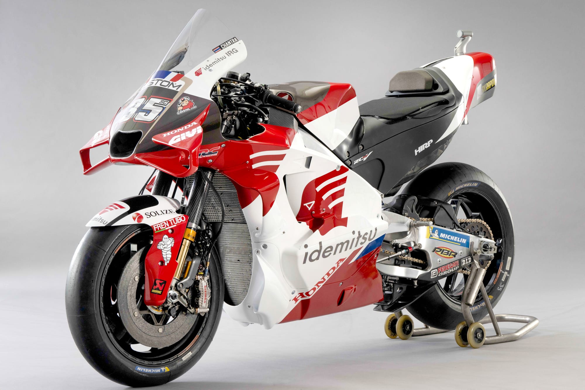
You get the feeling that you could paint the bike any which way and rookie Somkiat Chantra would still be smiling from ear to ear, but this year's Idemitsu Honda is a reason to be cheerful.
Gone is the black gradient that looked like the engine was burning through the bodywork and a larger change starts to capitalise on the potential for more ambitious Idemitsu brand integration (something I proposed in last year's livery rundown). This comes in the form of the Apollo wings which now integrate into the red panels. LCR and Idemitsu could go much further and be playful with scale, but it's a start at least for a company that has a conservative brand identity.
I prefer the 2024 configuration of the nose artwork as it's a shame to see a reduction in eye-catching gold (now reduced to subtle pinstriping). Additionally the white/black number panel that runs perpendicular to the lines of the bike are a bit disruptive to my eyes, but on the whole it is a step in the right direction.
8. Yamaha
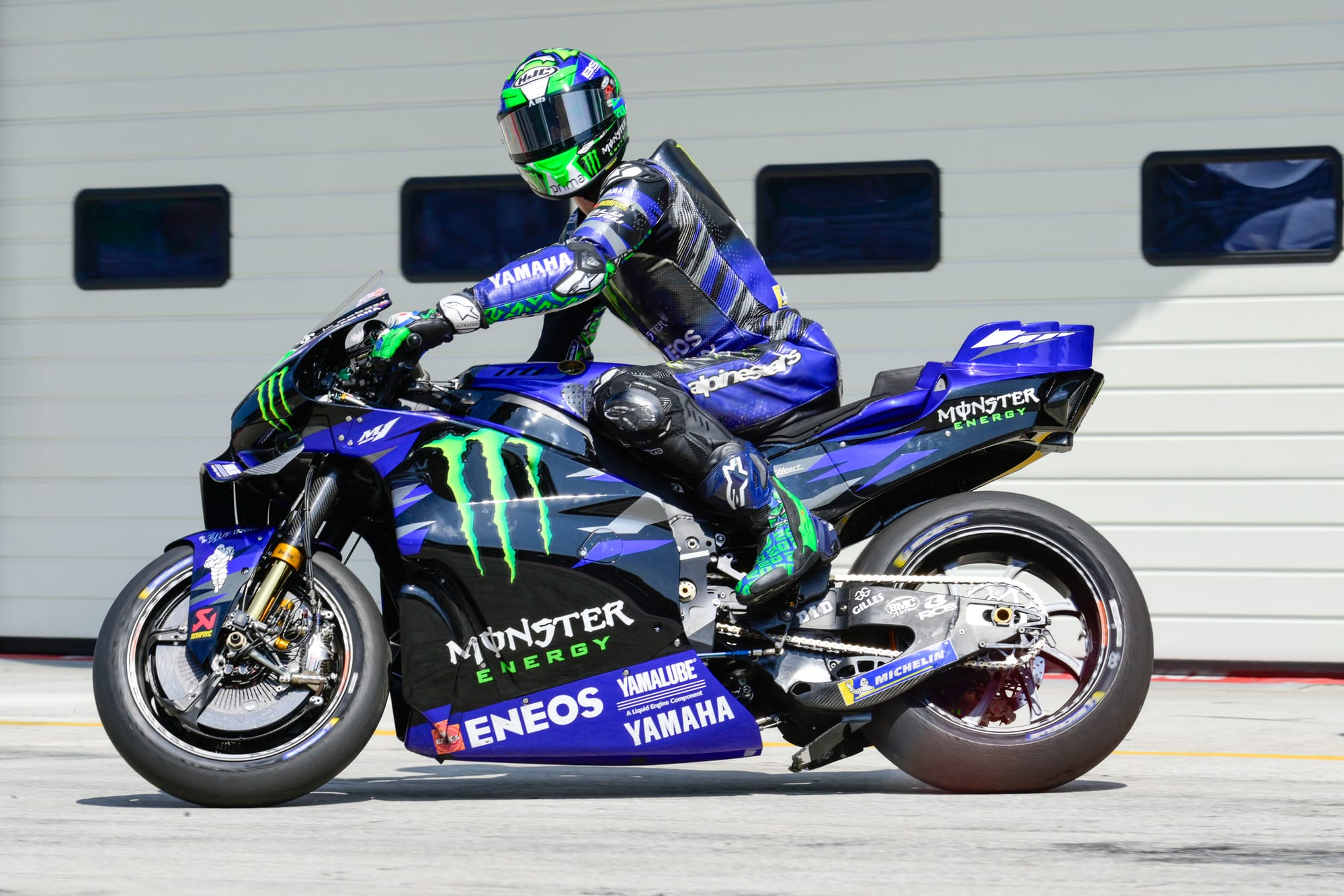
The jagged tech-camo Yamaha design concept remains the same as 2024 (which in turn wasn't a million miles away from 2023) and is at risk of starting to creak in its old age. However, there is a reversal of a design trend which does make an improvement.
Last year I criticised Yamaha for allowing blue to ebb away for the sake of more black, but this year the tide has turned to reintroduce its racing blue back to the bike, which feels right for Yamaha. This creates more contrast with the dominant Monster identity and serves its title partner’s presence better as a result.
The only tiny bit of awkwardness for me is the fact that the factory team now has the second best Yamaha livery on the grid (more on that later).
7. VR46
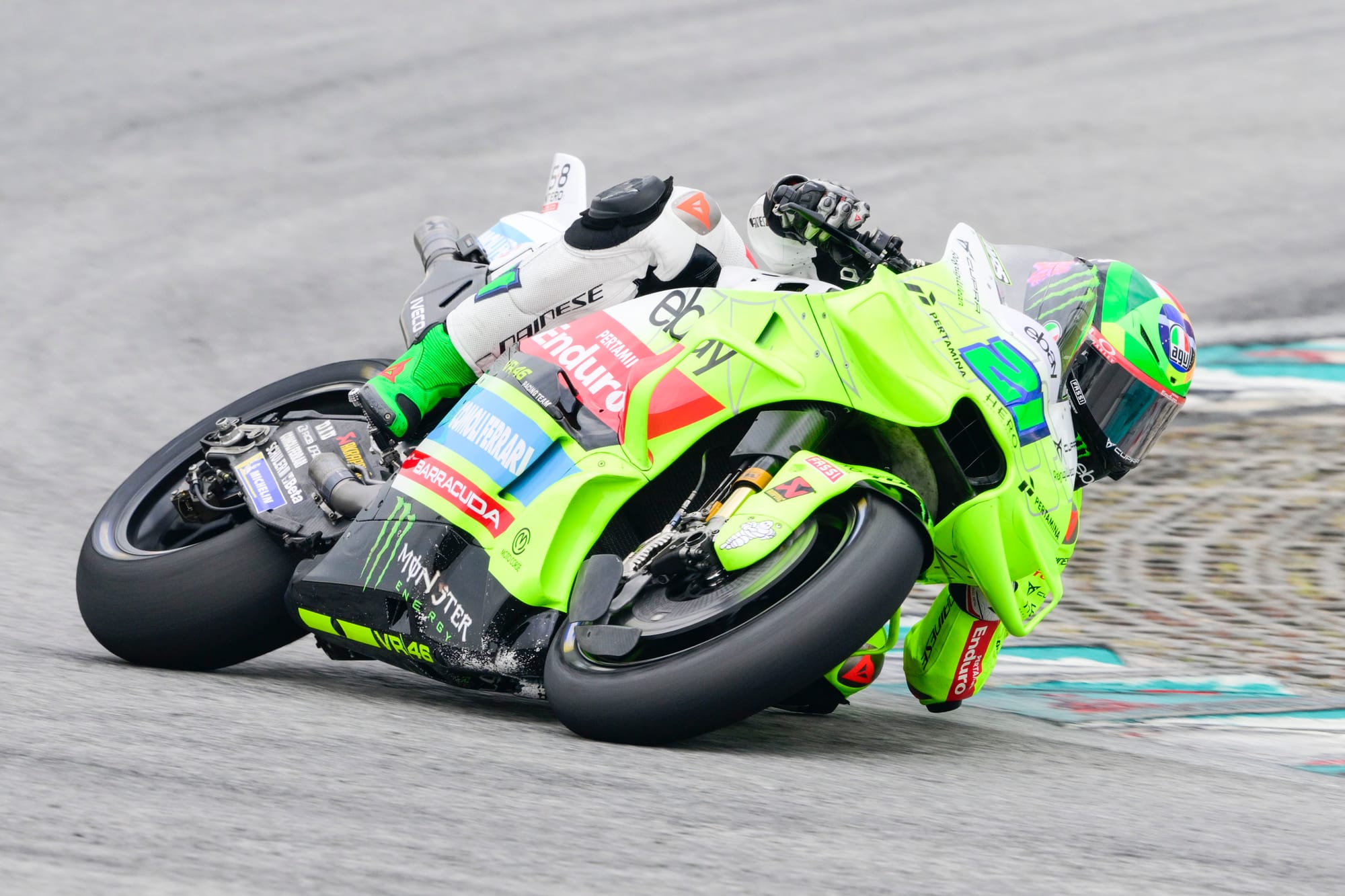
What felt like an electric shock last year with the neon eruption feels like a shrug-worthy sequel for 2025. Is it still lairy? Undoubtedly, that gradient still screams off the screen. There's no denying the lurid appeal of that chartreuse punch and I never doubt when VR46 is on track.
However, at the risk of sounding dismissive of the star power of one of greatest riders of all time, I find the mixture of old Valentino Rossi elements and current VR46 team at odds with one another.
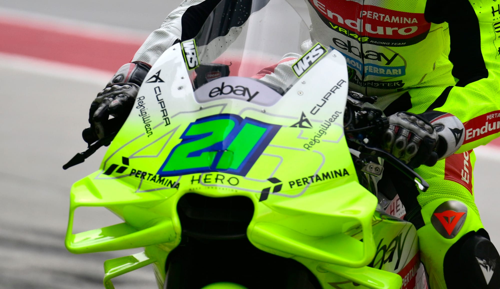
The clashing numbers on the nose are emblematic of this identity crisis. The appearance of the iconic 46 as the Ghost of GPs Past lurking behind the current rider numbers is overbearing, as though the team lacks faith in the appeal of its 2025 line-up. Is it right to dwell in so much nostalgia and milk the VR brand so heavily still? I suppose Rossi merchandise sales probably say si.
I understand it's part of the team name and for Vale fans it will be seen as a badge of honour, but I’d rather see the team give the current riders' identities more room to breathe and flourish.
6. Aprilia
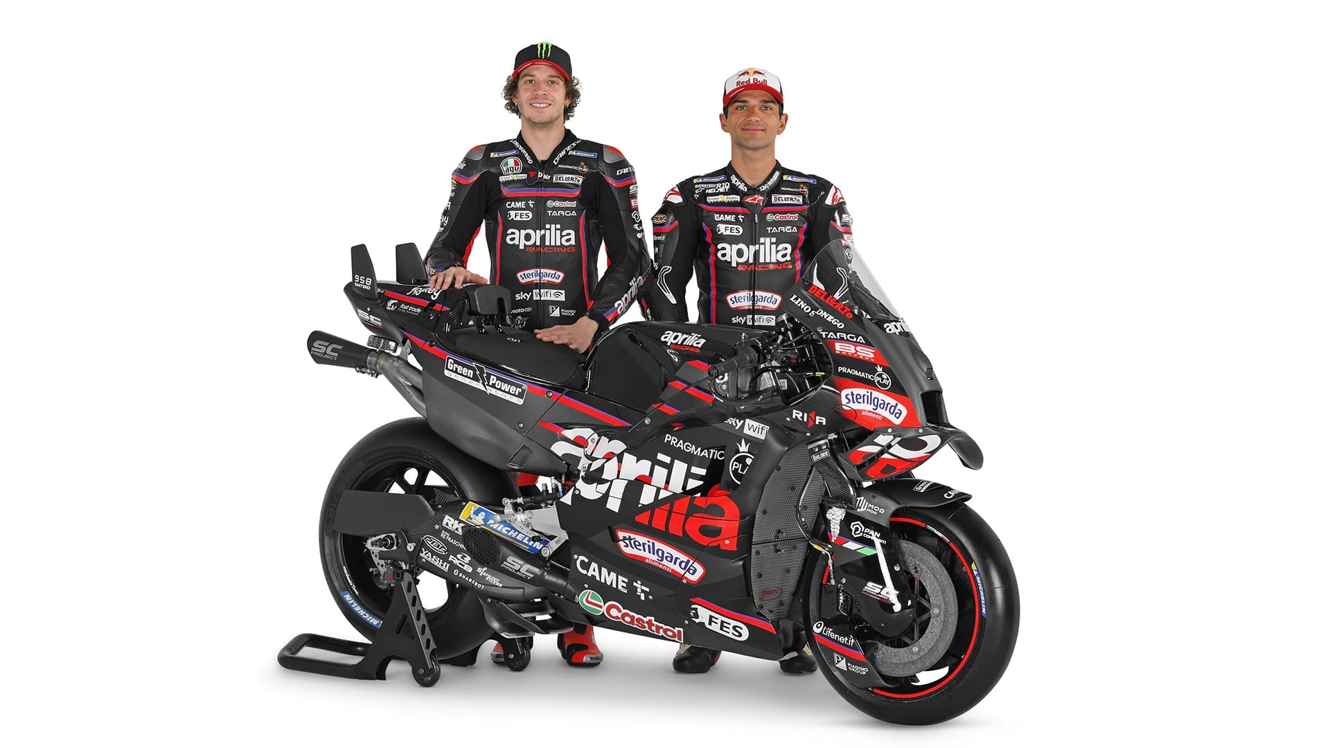
Now home to reigning world champion Jorge Martin, would Aprilia feel the need to make a bold declaration on its liveries to match the #1 plate? Well, no.
On the whole, not much has changed as a lot of improvements were made to the design from 2023 to 2024, and this is a continuation with a relatively similar sponsor line-up. The purple has been reduced to a pencil thin pin-stripe, with carbon grey panelling introduced across the top of the tank.
There is not much to report as the evolution neither improves nor deteriorates the look of the bike. Mind you, a piano black gloss (see Aprilia’s retro-inspired livery featured at the 2024 British Grand Prix) here and there would liven things up.
5. KTM/Tech3
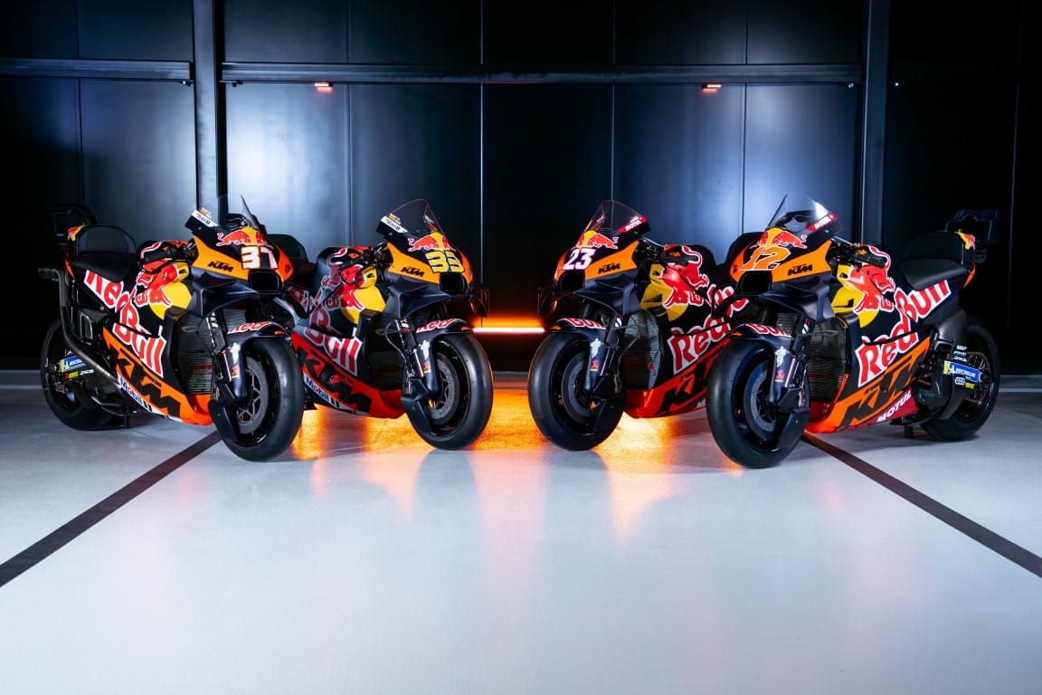
I’m seeing double here… Four KTMs!
In the past I would have criticised a lack of imagination around KTM/Red Bull’s more recent motorsport liveries. But for a manufacturer that is financially on the back foot wearing a broken stiletto, this show of solidarity across the two teams comes loaded with an important message: strength in numbers.
Tech3 no longer showcases the KTM-owned GasGas brand and as such, KTM and Tech3 can now be considered a quartet of bold Austrian branding. As a designer, I prefer to see more variety and ingenuity, but on this occasion, I respect the decision to homologate rather than renovate.
With a strong line-up of race-winning riders (with one exception that is surely an inevitability) the matching livery levels the visual hierarchy between them all. It is (still) a solid, well-designed livery and the decision to retain this design is about telling the world it is business as usual for KTM; they know who they are, they know what they are doing and to coin a certain tagline, all four bikes are Ready to Race.
4. LCR Honda (Castrol version)
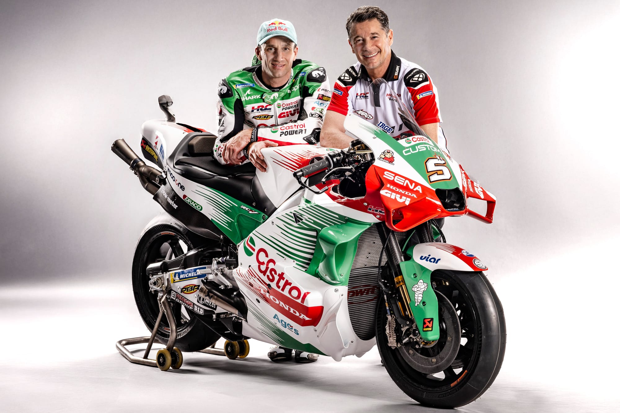
That plucking sound you can hear is the heartstring of all the nostalgists falling in love once again with the retro-infused Castrol Honda LCR.
At first glance, it's a similar treatment to 2024, with Castrol’s brand palette taking centre stage. But tweaks here and there reveal smart improvements.
The reduction in the number of separate green/red elements across the body gives the bike a cleaner presence without taking away from the iconic streaks. Take for example the nose of the front fairing; replacing the black strip from 2024 with a more expansive green panel gives Johann Zarco’s #5 much better grounding, as does painting the aero red - which in turn has more cohesion with a newly added red strip on the centre of the front wheel cover.
All of these changes give the bike a front-weighted poise and demonstrates how even with such a familiar design, there is always room for refinement.
3. Gresini
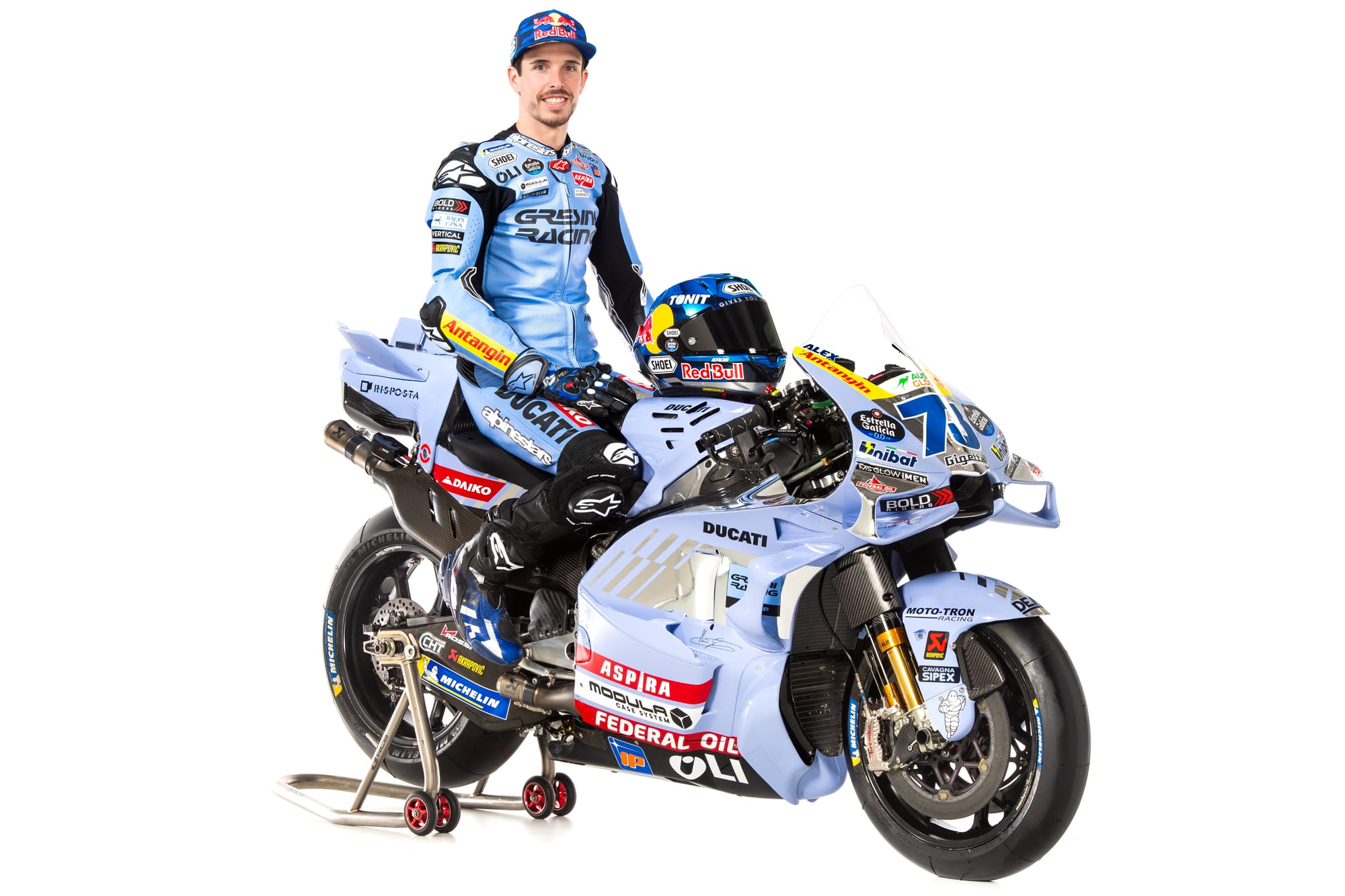
If you’re wondering where all the red went, Marc pinched the remaining paint tins and doused himself as he booked his one way ticket to Bologna.
Buoyed by a year in the limelight and undeterred by #93’s departure, Gresini has adopted an at-first subtle but eye-catching quicksilver to complement its familiar periwinkle blue.
The new chrome elements across the reconfigured motif should ping nicely under different lighting conditions, but the concept really comes to life when paired with the new silver panels on the revised leathers.
Interestingly, reducing the red detaches the team from Ducati's visual identity and subsequently reinforces Gresini’s independent spirit, something this charismatic team oozes in swathes. There is a swagger to the prominent GRESINI RACING that replaces the Ducati wordmark on the riders’ chests and overall it's a great visual package.
2. Honda

Such is the strength of the Repsol brand association with the factory Honda team, it will still take some getting used to seeing Honda lacking that familial orange flash. Even in the wake of the 2024 livery scaling back its presence, it is quite something to see a near virginal Honda in modern MotoGP.
Get exclusive extra MotoGP content - including our 2015 Revisited podcast series - in The Race Members' Club on Patreon
I say near, because Castrol, now the official title sponsor, has joined the factory team to form Honda HRC Castrol. With an emotive and well constructed launch video waxing lyrical about the heritage these two ubiquitous brands have in motorcycle racing, you would be forgiven for being a little disappointed not to see more of red, green and white Castrol splashed across this bike. Those honours go to Zarco on the LCR Honda, leaving the factory bike to remain tasteful and understated (a vibe not all motorcycle lovers necessarily yearn for).
You cannot deny the power of the HRC tricolour in terms of visual language and the team has done a great job pairing the design of the leathers to the bikes.
But could there be just a little too much red on the bike? Whilst there’s not enough red to confuse it with Ducati, I think there could be a better balance between the three tones. Plus in order for that mix up to happen, it would require Honda to somehow penetrate MotoGP’s live coverage.
1. Pramac
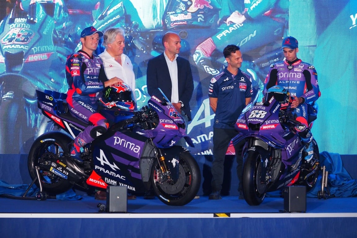
Pramac has taken Yamaha’s kit and, whilst picking up the bikes from the factory, stolen their lunch to boot with a livery that in my view is one of the best all round designs of 2025.
It’s a well layered, grown up statement, that fixes a lot of the issues I had with the 2024 Pramac livery, and avoids simply swapping Ducati red for Yamaha blue.
Tonally all elements blend together harmoniously, with an elegant gradient showing a unified coalition between Prima Pramac purple and Yamaha's rich racing blue. So as not to disrupt the partnership, Pramac's red accents have been reduced but punch through sparingly for greater impact.
It’s a livery that shouts ‘long term partnership’ and shows a team building an alliance towards something special.

