Up Next

At the heart of understanding the performance patterns in Formula 1 is the question of how cars and drivers deliver their speed relative to one another. The stopwatch tells you the fundamental truth, but a laptime alone doesn’t get to the bottom of the how.
A technique that illustrates this superbly has recently appeared online through a YouTube account called ‘GhostF1’. At the time of writing, this account features a quartet of videos from the recent F1 triple-header that overlays a ‘ghost car’ with an onboard of another for key qualifying match-ups.
Ghost Qualifying Comparison @Max33Verstappen vs @LandoNorris | 2021 Austrian Grand Prix pic.twitter.com/DdSW3oktxf
— Ghost F1 (@GhostF111) July 6, 2021
Three of these are comparisons in the battle for pole position pitching Max Verstappen against Lewis Hamilton (French GP), Valtteri Bottas (Styrian GP) and Lando Norris (Austrian GP). The other compares the McLaren drivers in qualifying on the most recent Red Bull Ring weekend.
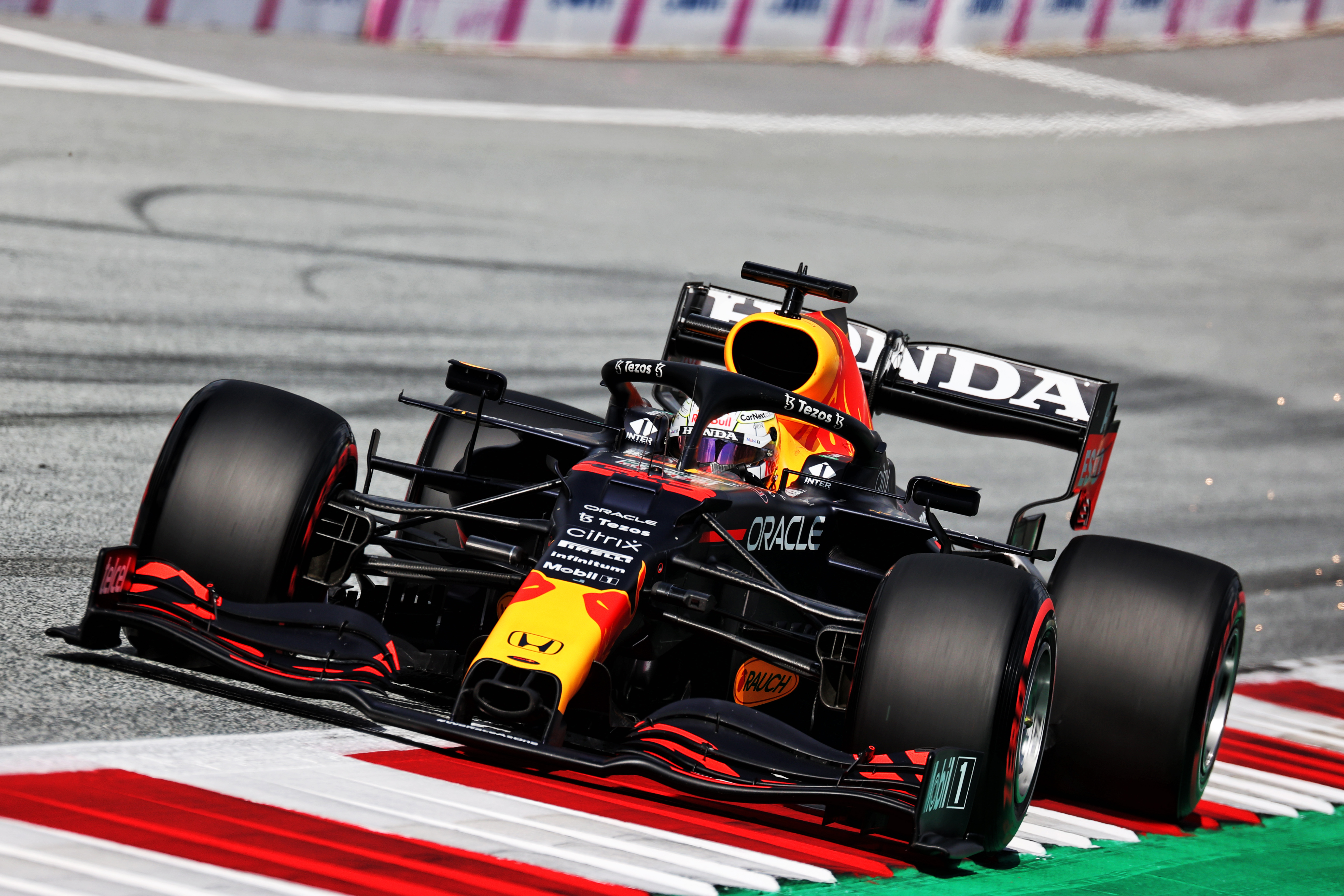
It was the Verstappen v Norris lap that first caught the attention. It showed the relative strengths of the Red Bull and the McLaren very effectively.
Often, Norris pulls away from Verstappen on the straights but you can also see the consistent trend of his minimum speed in corners usually being a little lower simply because the McLaren has less grip than the Red Bull.
It also shows just how good a lap Verstappen needs to deliver to ensure he takes pole position, with the run through the last corner where he is able to turn in later, rotate the car and get on the power while Norris is battling understeer throughout, crucial.
Even in the other examples where Verstappen has a bigger advantage, it shows how tiny the margin for error is even in a car capable of being quickest.

Visualising the relative speeds and lines of cars in such an overlay is a big step over a simple side-by-side comparison.
These are commonly used but even when superbly interpreted, as we have come to expect from Sky Sports F1’s coverage in the UK with analysts such as Anthony Davidson and Karun Chandhok, they are not as effective as the overlays.
Creating these visuals is clearly not the work of a moment, meaning they cannot be generated at the push of a button straight after the laps have been completed for inclusion in the post-qualifying analysis. But however long they take to generate, they can and should be used to tell the stories that matter more effectively.
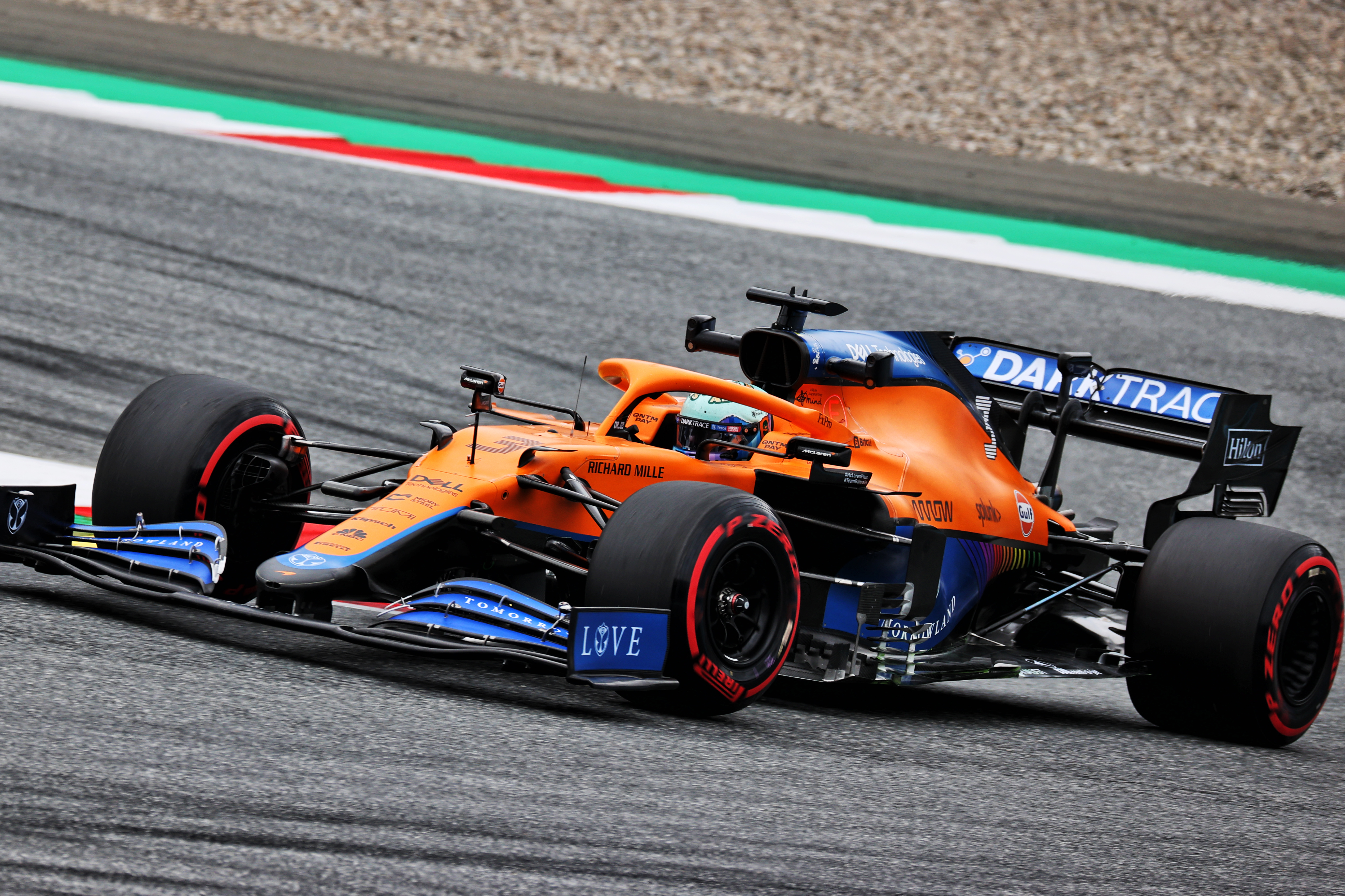
The comparison of the McLaren drivers is an example of a different kind of story that can be told, showcasing the difference between one team-mate who is thriving and another who is struggling.
It demonstrates many of the differences that were clear in the pair’s approach during the weekend, which The Race delved into here.
In Turn 1, you can see Norris is later on the brakes and carries more speed off the corner.
At Turn 4, Ricciardo struggled to rotate the car as effectively as Norris throughout the weekend and while this comparison exaggerates that thanks to Ricciardo not getting anywhere near the apex. It does hint at the problems he was having there and the size of the time loss for a poor exit.

You can also see Ricciardo does start to gain on Norris in the final phase of the straights, which is logical for a driver who knows he’s going to start lower down the order and therefore needs to bias the set-up a little more towards overtaking.
Assuming that these overlays are accurately constructed – and they appear to be – they are exactly the kind of thing that F1 as a whole, or if not individual broadcasters, need to bring to their coverage. Considering the ghost car concept has been a staple of racing gaming for so long, it’s a surprise it’s not been capitalised on by F1.
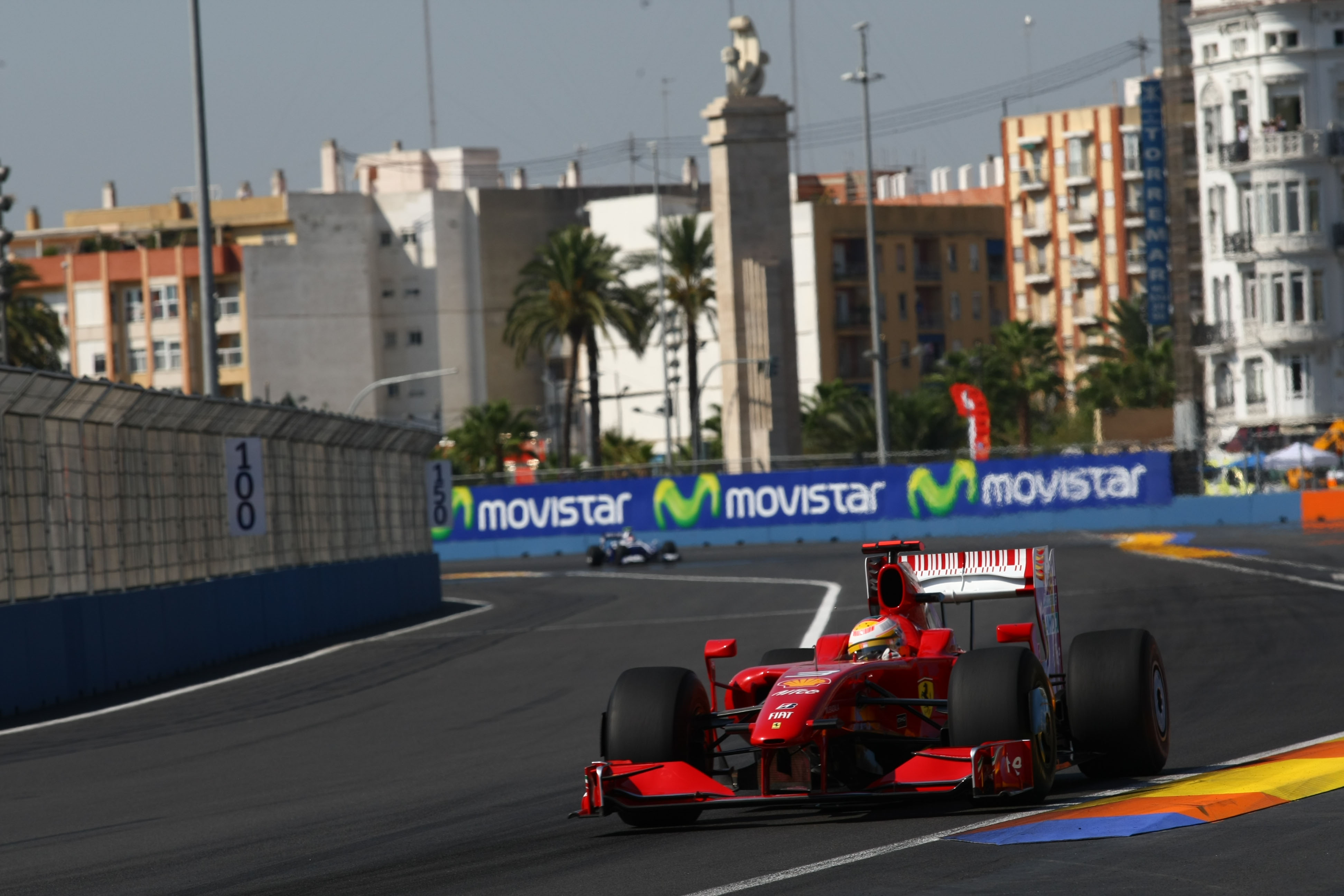
There were experiments some years ago. In 2009, there were several external ghost car comparisons that appeared in coverage as part of the ideas tabled by the Formula 1 Teams’ Association.
The most memorable of these was at Valencia where it showed Ferrari stand-in Luca Badoer compared to regular driver Kimi Raikkonen through a right-hander.

Badoer was much later on the brakes and therefore ahead of Raikkonen early in the corner, but his speed through and off the corner was dreadful.
It remains one of the clearest and effective representations ever offered to the television audience that braking later does not equal fast. Stressing the importance of exit speeds is one thing, but showing it in a way that is unmistakable is more effective.
Sadly, they were very infrequent and soon disappeared, not least because they were time-consuming to put together. But the time is right for a return, particular when it comes to onboard footage.
F1 has been effective in finding ways to draw more fans in recent years. Harnessing such ‘ghost car’ visuals would be a superb way both to augment the coverage for existing devotees and catching the eye of potential new ones given they communicate so much, so easily.


