Up Next

Every new Formula 1 season brings with it an evolution of the championship’s television coverage and fan offering.
Big or small there are always ways F1 bosses try to add something new to the party, but not everything is successful.
With a new year upon us though, what would we look to implement technologically to improve how we follow F1?
BRING BACK THE ‘GHOST CAR’ COMPARISONS
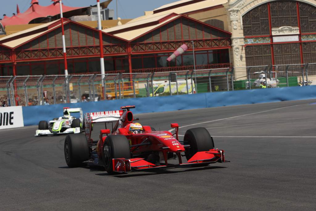
During 2009, F1’s coverage very occasionally included some outstanding visual trickery that overlayed two cars on the same image. This was the most effective visualisation F1 has ever produced to show varying car speeds, but it only appeared fleetingly.
It was an initiative that came out of the many discussions that the Formula One Teams’ Association had concerning ways to improve F1 for the fans, and it was an excellent idea – if apparently a little labour-intensive to produce. But it quickly fell into disuse, which is a real shame.
You can talk about sector times all you like, put up graphics showing corner speeds and represent the variable speed of cars in all sorts of ways, but this was comfortably the most clear. An extreme case was used in the coverage of the European Grand Prix at Valencia that showed Ferrari stand-in Luca Badoer clearly braking later than team-mate Kimi Raikkonen, only to lose multiples of the time he gained approaching the corner at the apex and exit. It was slow in, fast out in action.
While often differences between team-mates will be tiny in a given corner, fans would surely be fascinated to see the difference between, say, a Williams and a Mercedes through a sequence of corners. As they say, a picture paints is worth a thousand words – or perhaps, in this case, a thousand numbers. – Edd Straw
GIVE LIVE DATA FOR CRUCIAL ELEMENTS
There’s so much available data which the teams all see – which therefore has no competitive implications in transmitting. For example, the teams all see GPS traces of every car and from this can derive fairly accurate power readings of every engine. If they are all able to do this, why can’t we have a similar conversion done of the GPS data to reveal engine power?
Other data that would allow greater depth of understanding would be tyre loadings, especially in qualifying. This would spell out the differences not only between the cars but between the drivers within teams. Combining this with the thermal tyre images that used to be provided (below) would be fascinating.
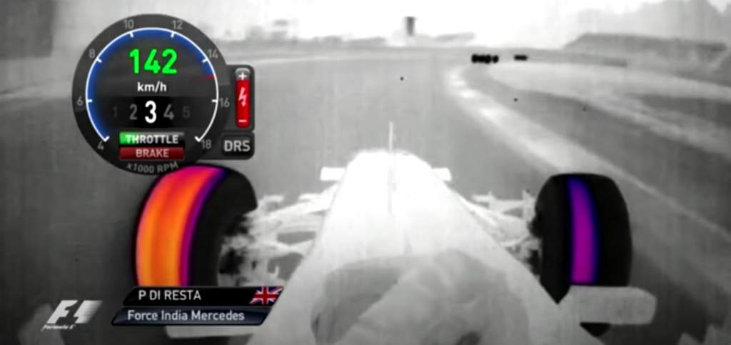
Seeing driver technique up close on data by, for example, showing differences in percentage of brake and steering overlap on corner entries would be great. The fuel usage data disappeared from our screens soon after the first hybrid season. This would also be great information in following the race in more depth. – Mark Hughes
SHOW/RANK IN-AND-OUT LAPS
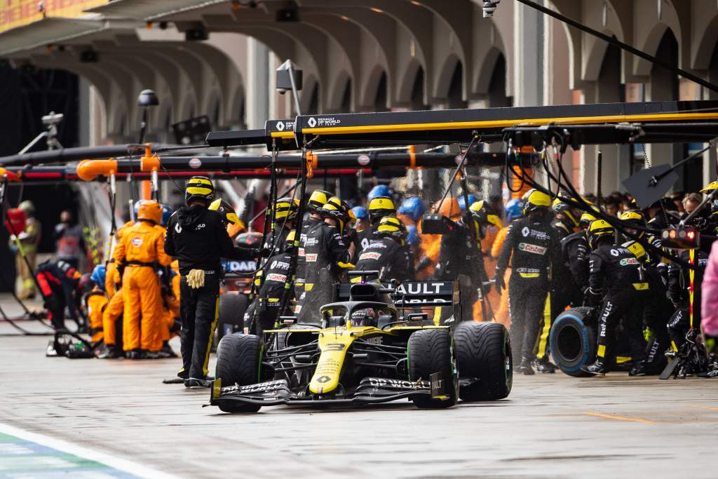
Plenty of emphasis is placed on the speed of pitstops – there’s even a competition for it! But one element of the equation is grossly under-presented to the viewer. In- and out-laps.
All too often the importance of gaining or losing a place is placed on a slow or fast pitstop. However, the art of attacking the in-lap and out-lap on cold tyres is one of the last unknowns to the F1 fan.
Other motorsports time in- and out-laps, so why shouldn’t the pinnacle? It would be another weapon in the arsenal of what is a tricky task rating each driver at the end of the year.
If during and after the race the fans had easy access to the in- and out lap-times, that would give a much clearer picture of which ‘team’, emphasis on the collective, is doing the best job in the pits. All the teams are in a very similar time window when it comes to pitstops. Let’s find out who the stars of the tricky in- and out-laps are. – Jack Benyon
DRIVER’S-EYE VIEW
This has taken way, way too long to implement into F1’s coverage. A couple of years ago it was being really seriously assessed, first with a clunky pair of glasses and then as an actual camera (see image, below), but that turned to nothing.
Meanwhile Formula E has pioneered the use of the camera in live coverage (see video, above), and it’s brilliant.
Incredibly high-definition camera technology with ultra-stable pictures mean that the raw feel of a lap in an F1 car is reduced. Onboard footage can still look great but it’s not as powerful as it was before. It almost looks too easy. If we saw it from the driver’s actual perspective nobody would have that view: especially seeing the amount of switch changes and minor head movements that are made throughout a lap.
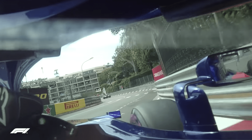
In qualifying and the race it would be a spectacularly immersive experience and that’s brilliant for fans.
With a bit of sim racing experience last year logged, I had a very brief turn sampling FE commentator-turned-Kings Racing co-founder Jack Nicholls’ virtual reality headset in the GPVWC’s F2-style car at Spa. As obvious and basic as it is to say it was ‘so 3D’, that’s the best way I can describe it. It was just so absorbing. I was stunned by how cool it was.
I would dearly, dearly love that experience to be possible in F1, where the viewer can be planted into the cockpit and look around. FE tried to do something with virtual reality like this before but it was way too primitive. Eventually the day will come where it’s possible.
Until then, driver’s-eye view footage is the next best thing. The technology is out there and is FIA-approved. It worked. It makes the coverage better.
I can’t see any reason why F1 doesn’t utilise it. – Scott Mitchell
MINI-SECTORS
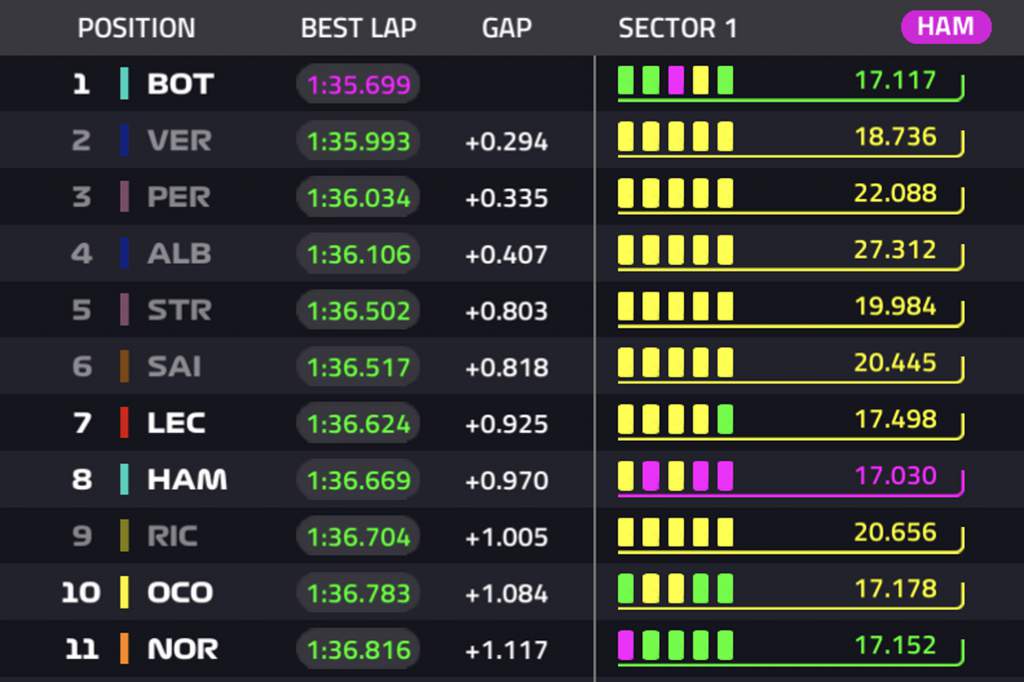
Currently, the three main sectors and overall lap times are regularly used in F1 coverage. You also get gaps updated in the so-called mini sectors that comprise the lap. But only sparingly are these used to compare car pace through specific sequences.
Ideally, these could be used to show exactly how much quicker one driver or another is through specific parts of the circuit, or even types of corner over full circuits.
The timing sheets should also be made available to download from the FIA site for this. They do exist, detailing every mini-sector time for every lap, so you wouldn’t want to print them out! But encoded in there is more timing information for the most hardcore and numerically-inclined fans – and data-loving journalists – to pore over. And all it would take is a simple upload. – Edd Straw
HEART-RATE MONITORS
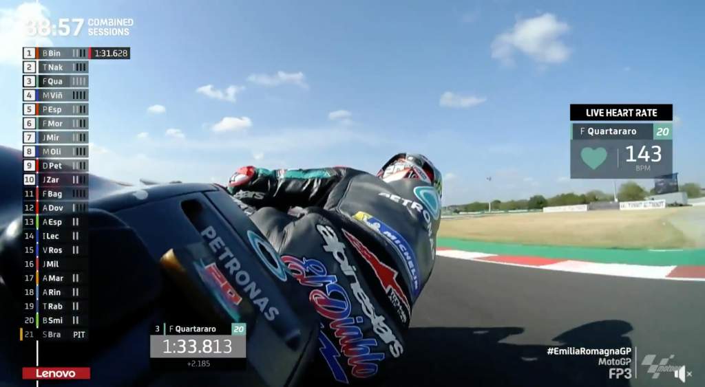
Anyone who watched the race in which Joan Mir sealed the MotoGP riders’ title for Suzuki this year will know exactly why this is being suggested.
Davide Brivio – the team boss – was wearing a heart rate monitor during the race. OK, it didn’t revolutionise the race or the broadcast, but it added a new element of drama which gave the commentators something to check in on in quiet moments title deciders so often provide.
We're expecting this number to skyrocket on Sunday! 😂
What a huge weekend this could be for Davide Brivio and @suzukimotogp! 🙌#ValenciaGP 🏁 pic.twitter.com/hFeG9PlZ5G
— MotoGP™🏁 (@MotoGP) November 13, 2020
Imagine the coverage cutting to Toto Wolff or Christian Horner after a crash or a dramatic moment and seeing their heart rate go through the roof. Hardly a pleasant experience for them but something that could add an extra talking point.
It would also help us to see that these often stout characters suffer human emotions just like the rest of us, bubbling under the surface. – Jack Benyon
OPEN UP RADIO IN A BIG WAY
An open radio channel where drivers can comment on another driver in real time during a race. Yes, of course you’d get a moan-athon on baulking, las- minute line moves,etc, but I reckon you’d also get some real gems. On a human level you’d get welfare checks like at Bahrain in the Grosjean shunt, you’d get banter between team-mates and probably some superb indiscriminate swearing.
Fond farewells and American accents 😂
There's a lot happening in @LandoNorris's post-race radio!#AbuDhabiGP 🇦🇪 #F1 pic.twitter.com/V2srUgoUfi
— Formula 1 (@F1) December 14, 2020
The drivers talk to engineers throughout the race, so why not other drivers? It would tap into a more open insight, further identify drivers’ personalities under stress and also give some memorable moments for added media content. The feeds would be open to fans online to listen in to and also be collated for a highlights package the day after the race.
Let’s go even further and allow a specially selected fan to have a 30-second chat on both the dummy grid and also on the slowdown lap too, with each driver? – Sam Smith
STOP OVERSIMPLIFYING GREAT DATA
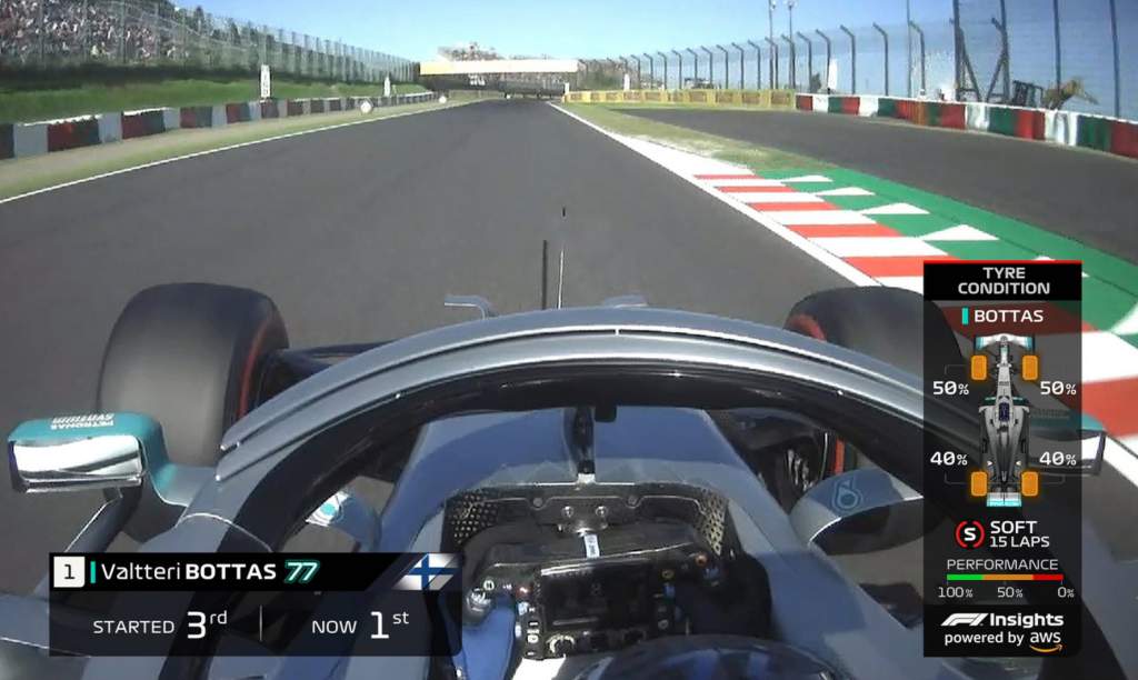
As well as focusing on what we’d like to see added to the F1 broadcast experience, here’s one that shouldn’t return in 2021: let’s call it the ‘tyre life guesswork’ graphic. It seems to have been motivated by the way tyre life is monitored in the F1 computer games, where players are given a percentage of tyre life used up, which is colour-coded based on how close to the end of a tyre’s life you are.
We’re told that many data streams feed the graphic we see on TV during races. If that’s the case, they should just share the real data. Piling it all together to create a fictional number hasn’t worked, and the idea is undermined every time we see a graphic saying a driver’s tyres are ‘in the red’ with as little as 10% remaining, followed by a radio message of “tyres are fine” from the cockpit.
It’s an admirable idea, currently being poorly executed. Let’s stop trying to over-simplify it, and trust the audience to understand the real data points, either through their own knowledge or the help of TV commentators. – Glenn Freeman


