McLaren’s oversold chrome scheme undermines a great F1 trend
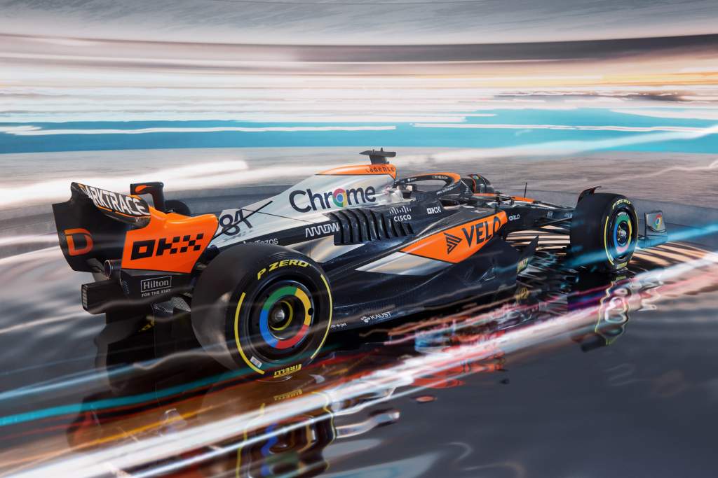
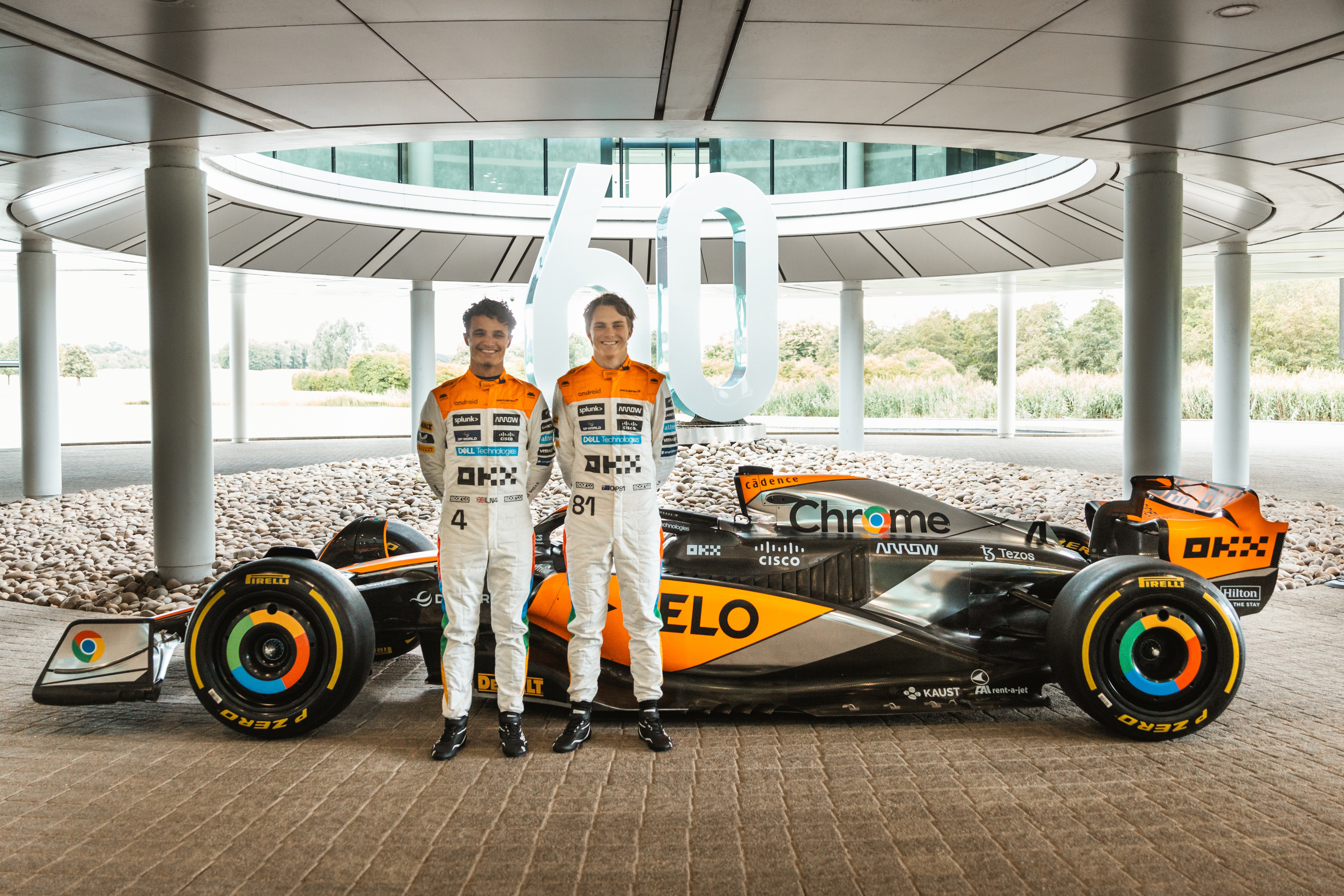
The latest special McLaren Formula 1 livery, a tie-in with sponsor Google Chrome to return – yep, you guessed it – chrome to the team’s design for the British Grand Prix this weekend, doesn’t sit well with me.
Are we really meant to receive it as though it’s a classic design that McLaren’s bringing back? If so, there are two issues for me: the first is that this latest mishmash, with papaya just as visible as chrome, hardly qualifies as ‘bringing back’ a classic. The other is that it’s not yet 10 years since a McLaren last ran in a chrome livery full-time in F1.
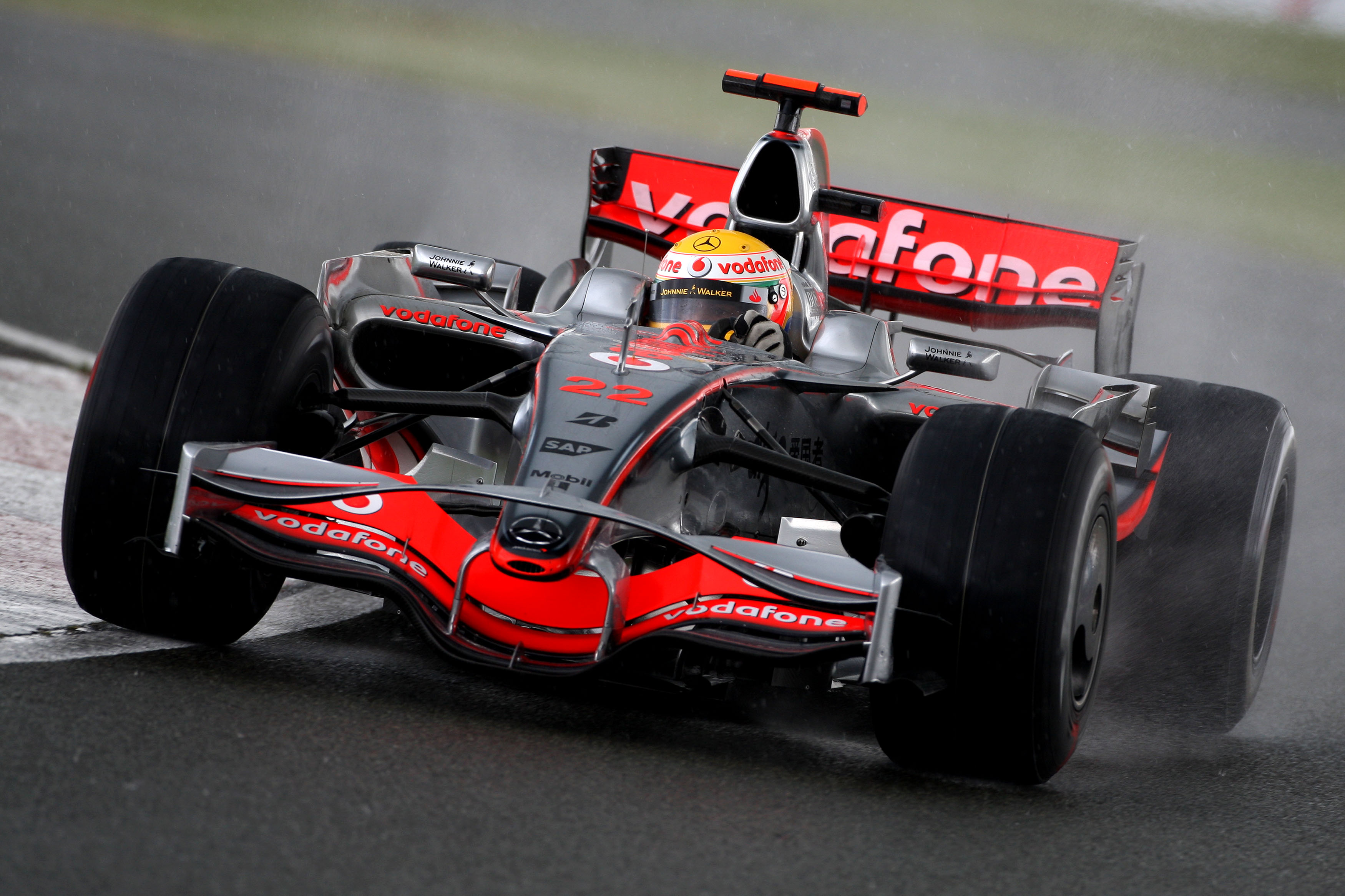
It’s not just the aesthetics of the design – though that is a big part of it, as this effort pales in comparison to the sleek, genuinely pretty livery that adorned the designs of 2006-08 that for me marked the peak of sophisticated, spaceship-like, nimble F1 cars and that was so celebrated in McLaren’s video teasing its British GP rebrand.
It’s not even just the fact that McLaren is massively overselling this given how much of its regular design is still on show (something that is in part prescribed by F1’s sporting regulations).
It’s the genuine risk of undermining the value of the one-off/special/celebratory livery, just when F1 is starting to open its eyes to the potential there, that is most rancorous.
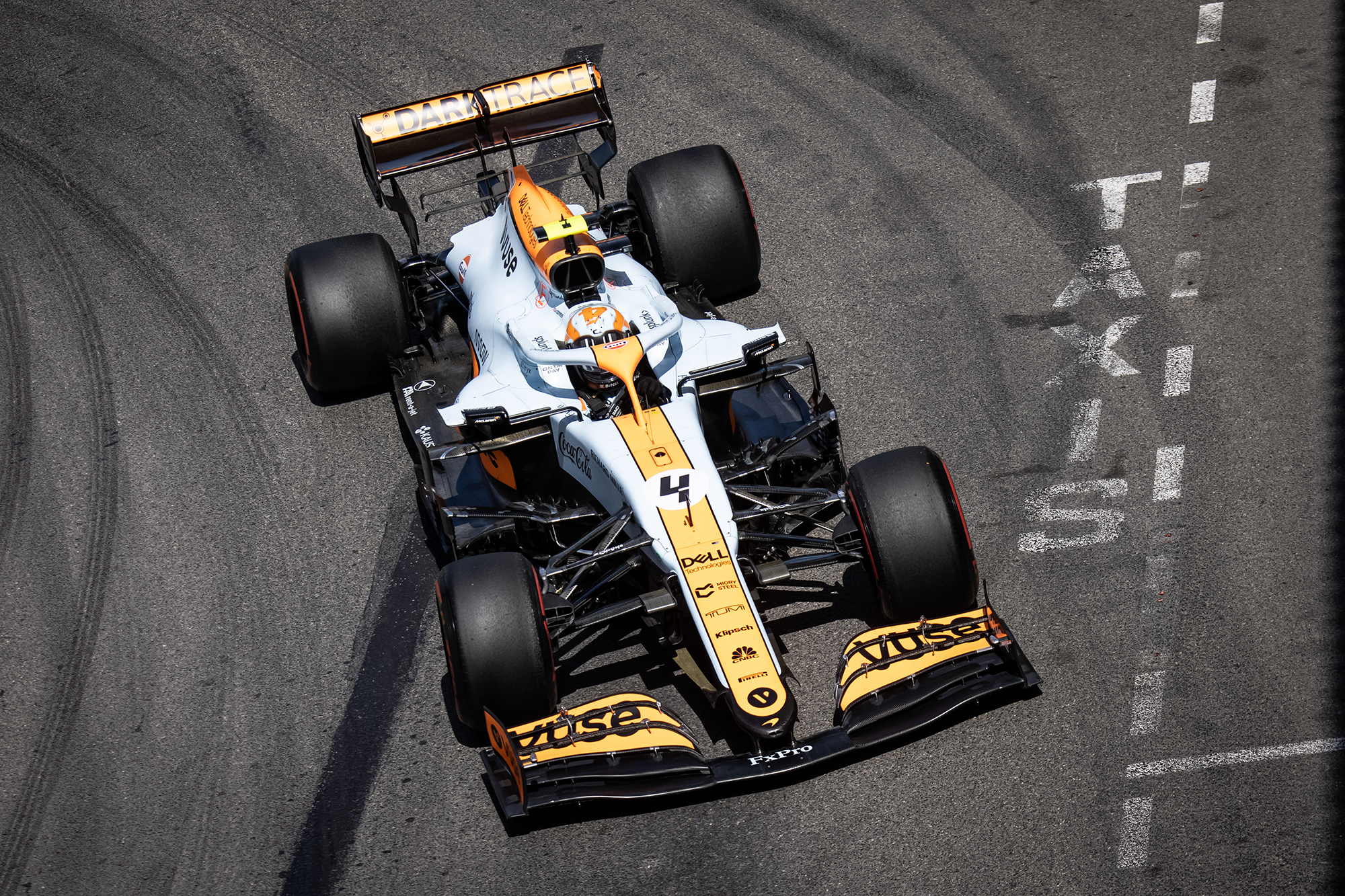
McLaren has actively pursued alternative liveries better than any other F1 team. The Gulf colours went down an absolute storm at the Monaco GP in 2021. History might not remember this year’s celebratory Triple Crown livery in the same enamoured way, but it was a genuine nod to McLaren’s past in its 60th anniversary year.
But the OKX design, with “neon pink embellishments and dynamic, cyberpunk-inspired engine illustrations” of the Singapore and Japanese GPs last year? It’s a pass from me. Ditto the Vuse Abu Dhabi GP liveries of 2021/22 left little impression (though the intention of showcasing works of art by underrepresented groups was well-intended).
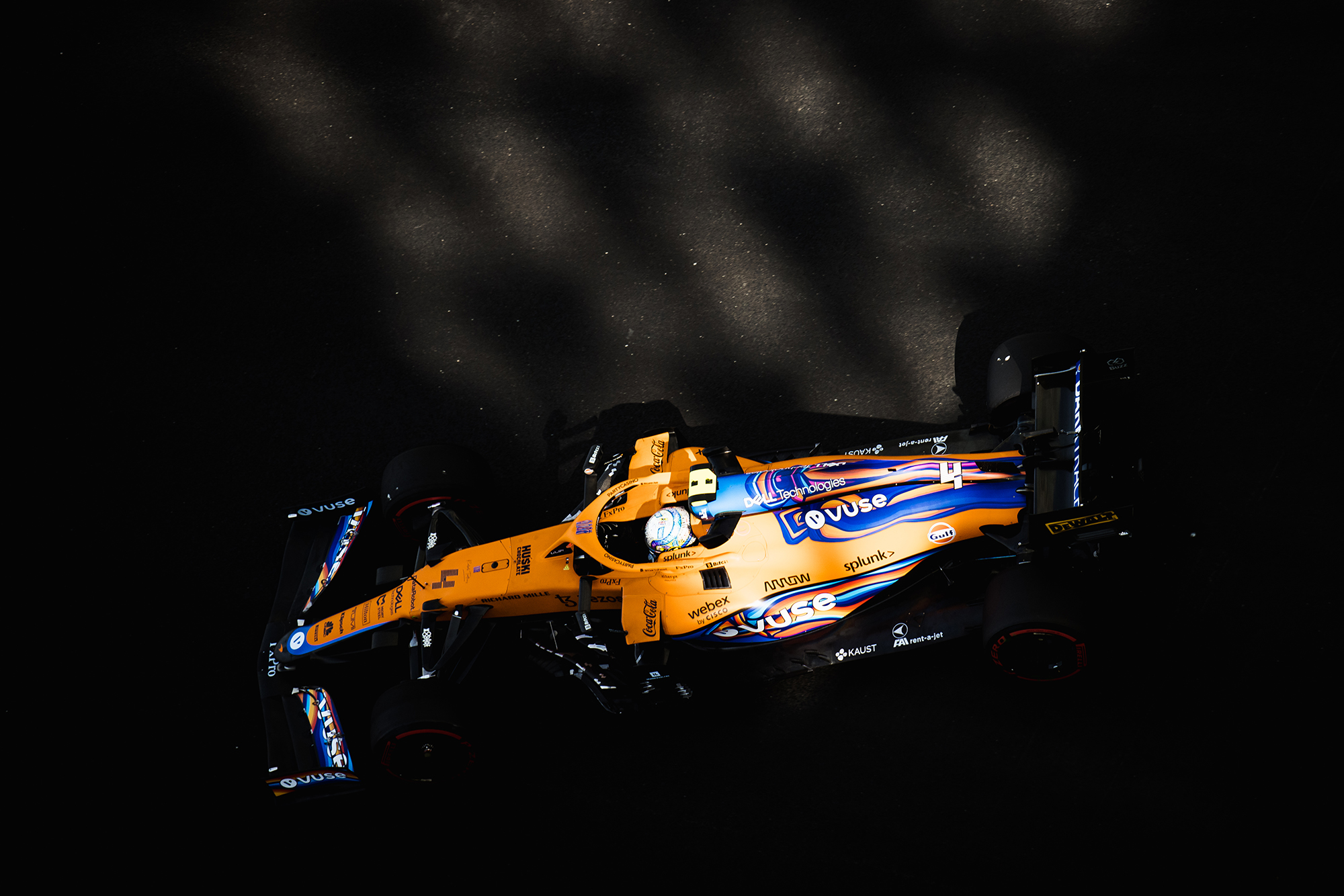
And this one? It just feels like a marketing exercise gone wrong, one that’s only half been committed to.
And that’s where the risk of devaluing the special livery concept comes in – even acknowledging, or perhaps even more so because of, the requirement in the sporting regulations for a team’s two cars to be “presented in substantially the same livery at every” race, with any “significant change to this livery” only possible with the agreement of the FIA and Liberty Media.
McLaren’s social media throughout the day built anticipation for this reveal; you didn’t need to look at the teaser posts on various platforms for long to see comments, many from people of a similar age to me who grew up with the chrome design being the iconic McLaren livery, expressing genuine excitement for its return.
OK, so we're not that impressed with McLaren's 'chrome' special #BritishGP #F1 livery and by the sound of it neither are most of you.
Here's how we'd have done it, courtesy of @lukemotorsport (& thanks to @_Project212_ for the original MCL60 model) pic.twitter.com/Ox67JavmlD
— The Race (@wearetherace) July 3, 2023
But what a letdown this is. Try to build excitement by all means, but don’t call Frankenstein’s monster Cary Grant.
It was “cool then” and it is “still cool now”, as McLaren said of the original colours in the teaser video referenced. But this design just isn’t. Even if this year’s anniversary celebrations do allow McLaren some leniency for such misadventures as this – McLaren says this too is part of those.
And for goodness sake – and I toyed with whether or not to include this – make sure said teaser video that’s clearly required approval of a leading F1 team, valued at a potential $1billion, and a subsidiary of arguably the most powerful company in the world doesn’t include two images of, say, a Force India VJM01 (fine, a Spyker F8-VII now we’ve headed down the pedantic route).
One last concern draws again on the timeline for this. It’s not yet seven years since McLaren started the move back to its traditional colours. Papaya wasn’t involved for the first year of that in 2017 – remember the orange and black combination of that ill-fated final McLaren-Honda season? – but did return for 2018 and has been present since.
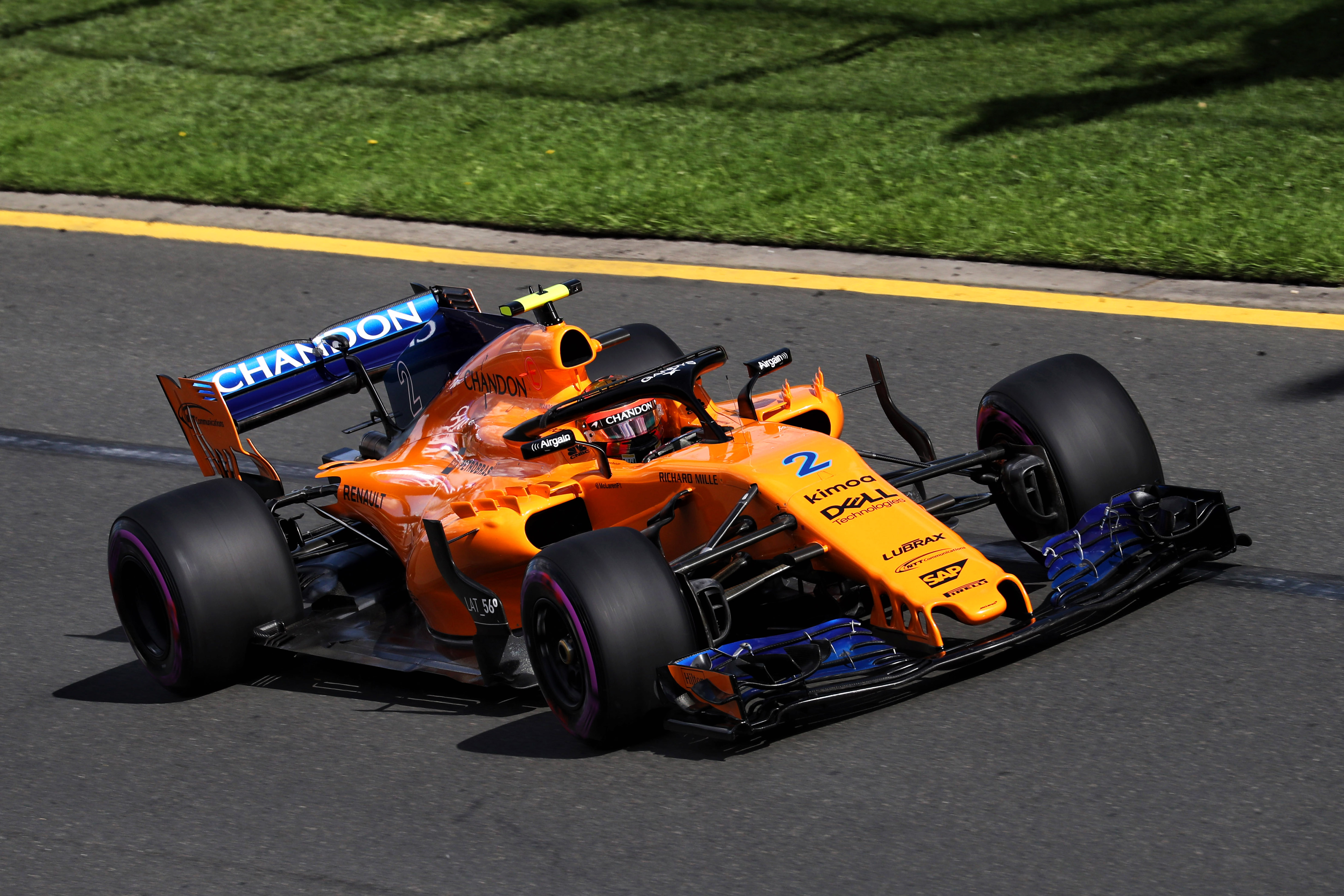
Present since, but in a diminishing way.
Zak Brown told media when unveiling the chrome livery that McLaren wants to “keep our papaya identity” as part of the motivation for the split design, though he also acknowledged the restrictions built into the regulations. That seems fair enough; orange was after all reintroduced in part, Brown said in 2017, as a response to pressure from fans to do so.
And that was fine too – that was great.
Except it’s not really papaya now, is it? It was papaya and blue by 2021. It’s papaya and black or, owing to the need to save weight, papaya and carbonfibre now, to an increasing extent compared to recent years to the point where that identity is to a degree being ground down.
And if you’re saying nine years down the line that this previous design you ran with is iconic, and call it a “fan favourite” as McLaren’s press release does, it undermines your current offering and your claim that you’re “trying to build our association with papaya”.
There are limiting factors that mean this ‘chrome comeback’ understandably isn’t the full monte. Committing to doing something lesser anyway – with a handy link between design scheme and sponsor name – and on a more and more regular basis, is starting to feel like a bit of a gimmick.


