
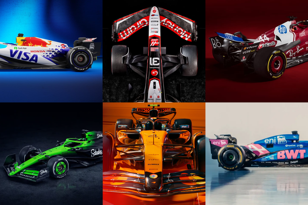
There might not have been any real cars on show, but all 10 Formula 1 teams revealed their proper 2025 livery designs at the first ever collective launch at the O2 arena in London.
The Race's F1 contributors all have their own personal favourites but we've asked The Race's Creative Lead Oliver Card to cast his expert design eye over each team's offering.
He's ranked the liveries from worst to best:
10 Sauber
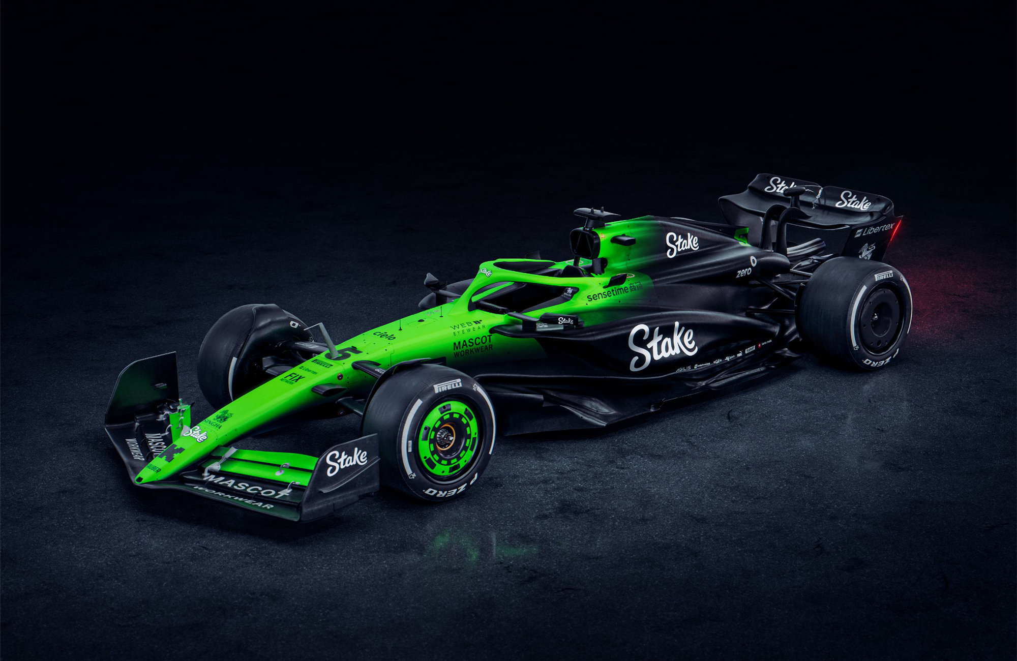
I loved the divisive lairiness of last year's car that wasn't afraid to leap off the screen. It was a shock to the system and the zig-zag elements gave it some real dynamism.
The luminous green remains for its final year before the Audi takeover, but in a less complex gradient form. In renders provided by the team, this is shown as a clean transition, but sadly in real life under the lights of the O2 arena, the awkward misalignment of the gradient graphics slightly cheapens the effect.
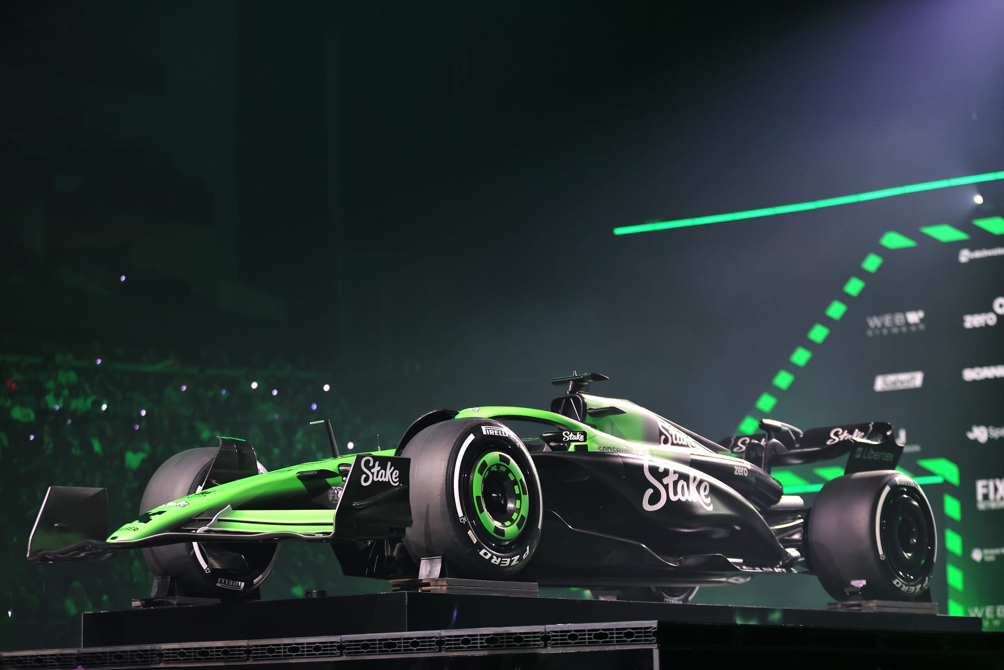
The green transitions to a dark grey that doesn't quite blend with the carbonfibre and, as such, pulls the punch the neon once had when it was first introduced. You can still spot it a mile off though.
9 Ferrari
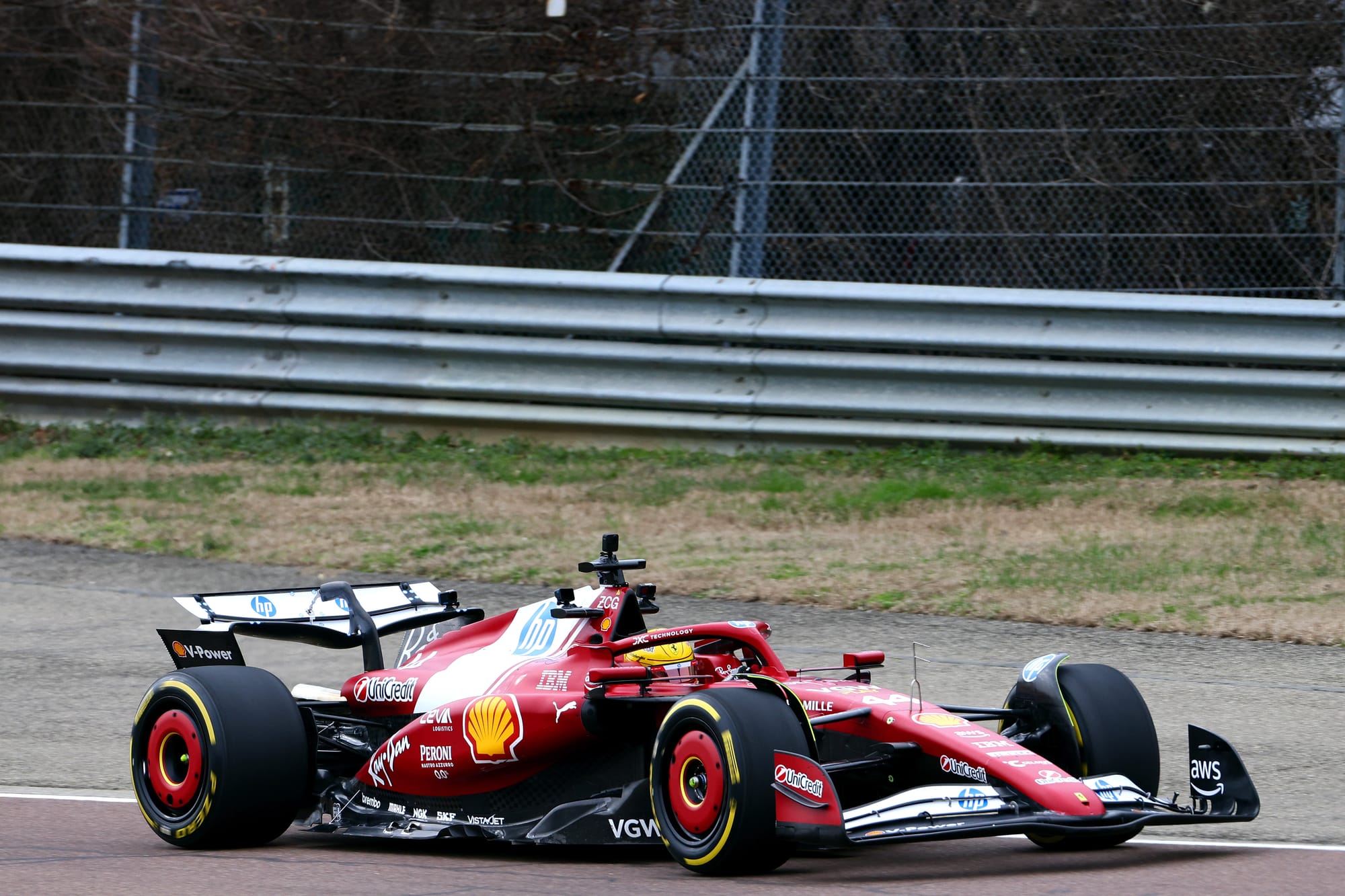
White elements on a Ferrari are nothing new as it was not uncommon during the Santander / PMI-era cars to see significant white sections carrying sponsors, but this new look features a particularly dramatic and dominant panel that terminates abruptly into a carbonfibre section.
After the elegance of the dual white/yellow stripe motif from 2024, subtlty now makes way for brand awareness. It's a shame to see the reduction of yellow from the car as it visually softened the gap between Ferrari and its brands but, with HP and IBM's more corporate blue taking precedence, it's an element that had to be dropped.
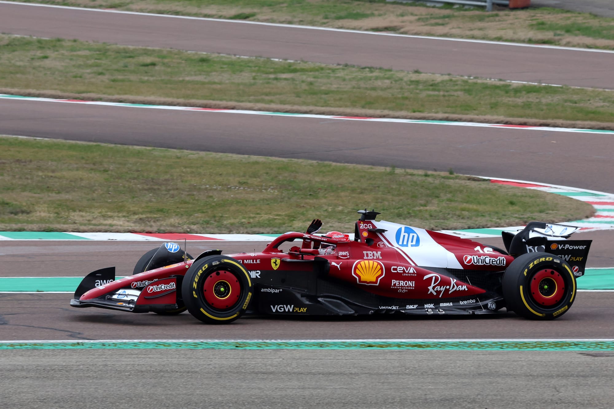
As the HP partnership was struck midway through last season, Ferrari spent 2024 wearing the title sponsor logo awkwardly, so this is the first fully integrated livery design. While dominant, integrating the HP logo on a white background starts to embed the identity into the car's livery; the white base has even been aligned with the forward slant of HP typography, on one side at least.
I have idealist imaginings of how much better it would look if you extracted the HP wordmark from the roundel, allowing for it to be enlarged across the engine cover, but this would fall outside the remit of its brand guidelines. HP is paying for exposure of its logo and, for better or worse, it is certainly getting its money's worth and garnering attention.
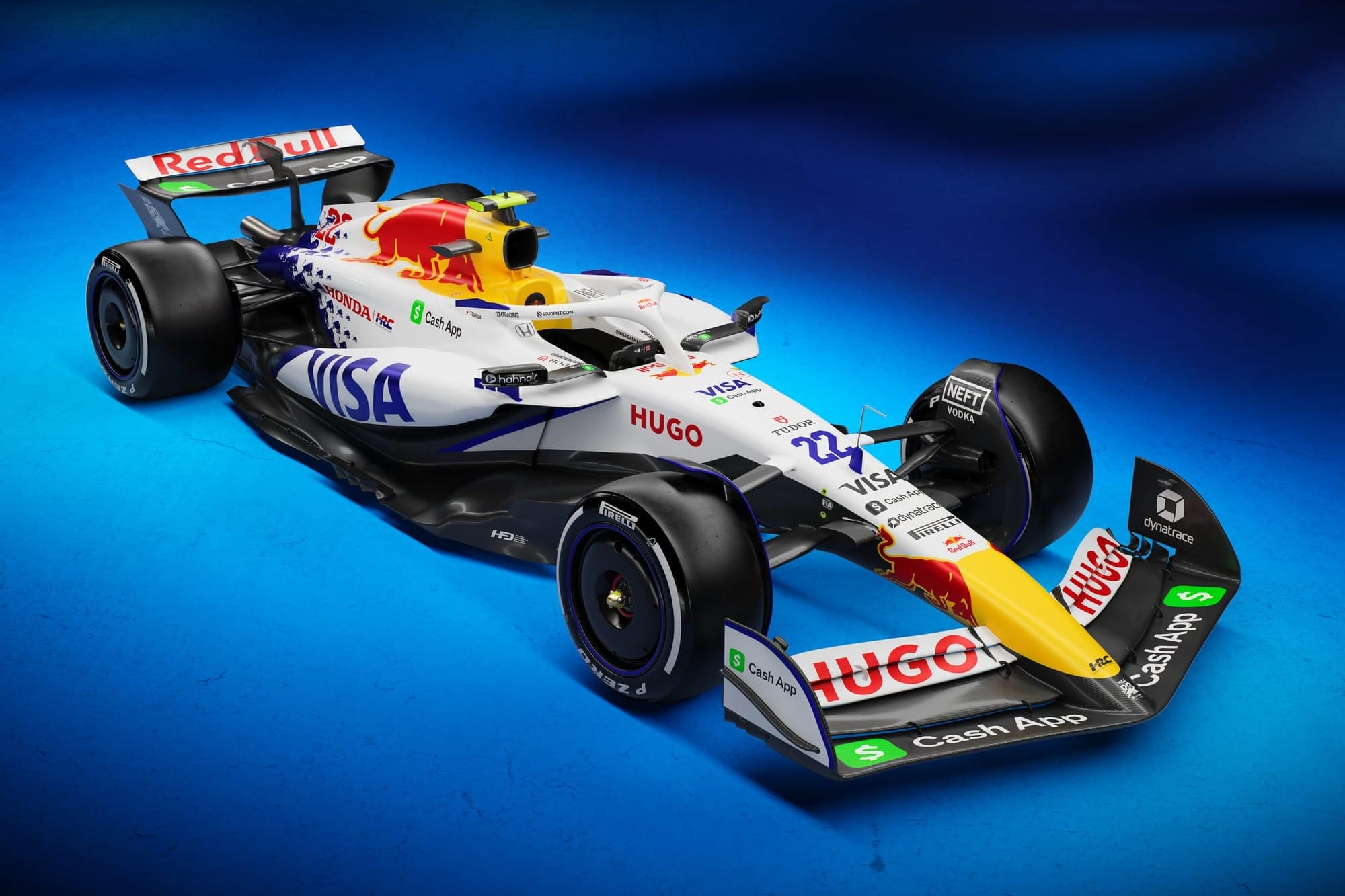
8 Red Bull
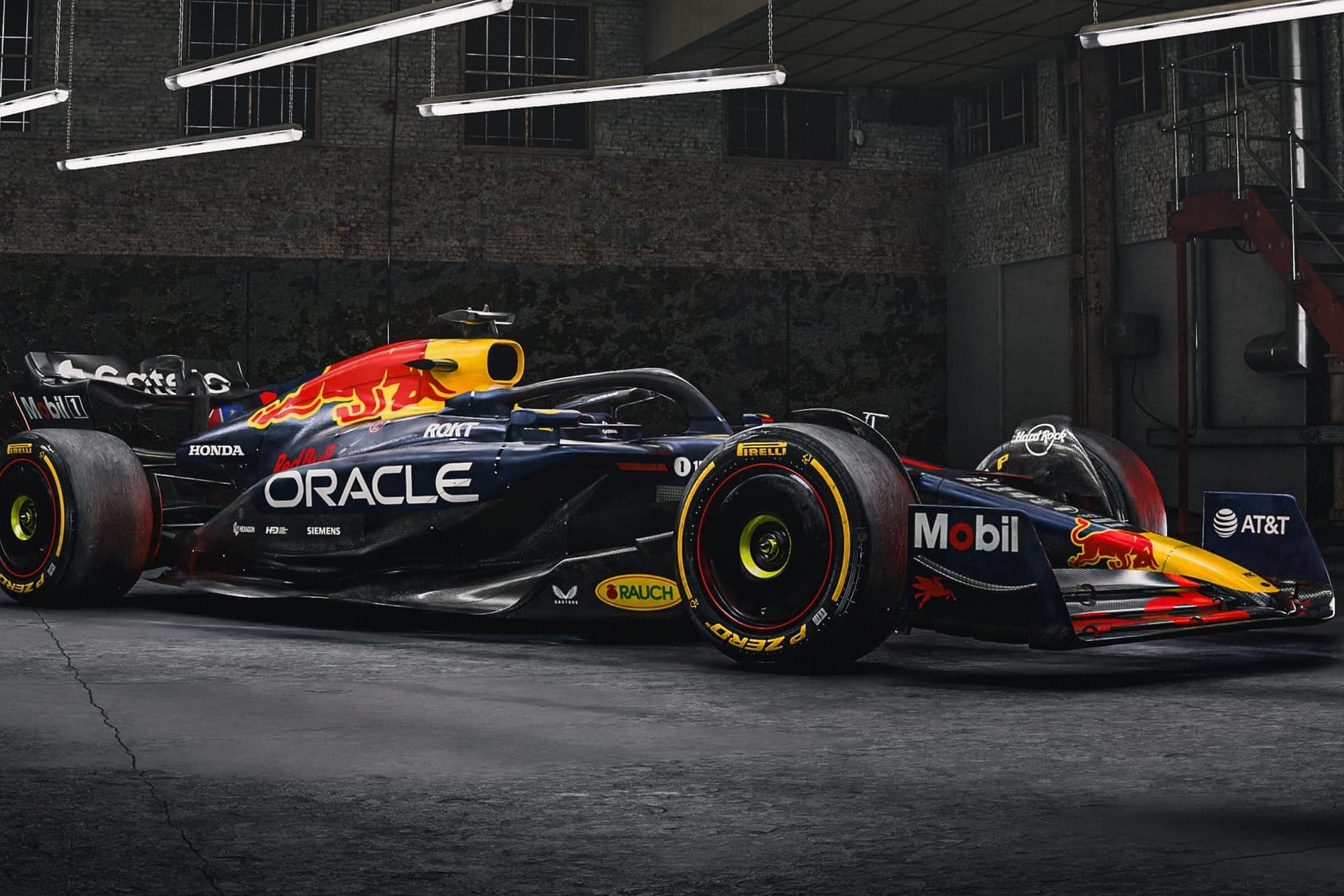
After a creative and lengthy video saluting how UK custom car culture is a fantastic display of personal expression, Red Bull revealed a near-identical livery concept to last year.
Has F1's historically most disruptive team become, dare I say, conventional? There are changes, but they are minor modifications (logo scaling and decal placement adjustments) that are far from noteworthy.
To take a page out of Red Bull's playbook, I shall repeat the sentiment of what I said last year: this livery doesn't stop being good because it's familiar, as it still remains one of the modern classics of this generation. However, we are now in year nine of this concept and it is starting to creak.
The F1 75 launch shows how the championship has evolved the way it communicates to a brand new audience. Why is Red Bull so resistant to moving with the times? I suspect, and hope, it is holding off to create something special for not only the 2026 regulation change but also the dawning of a new era with its upcoming technical partnership with Ford.
7 Haas
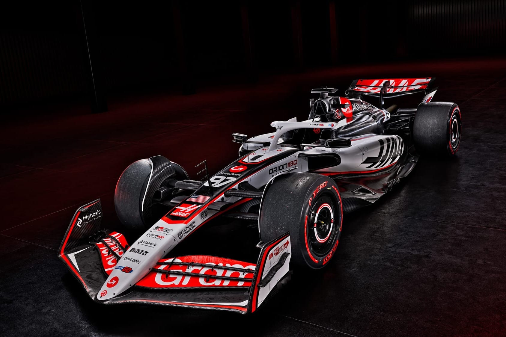
We've now had a decade of Haas liveries and this 10th edition doesn't stray too much from past interactions.
Rather than mixing things up too much, this evolution of the 2024 concept introduces more white than before, creating a more eye-catching contrast on the sidepod sections.
The large bold Haas branding is an inversion on the logo from last year and leaps off the car more. The subtle red striping underpins the whole concept in a treatment that is familiar but ultimately cohesive.
6 Aston Martin
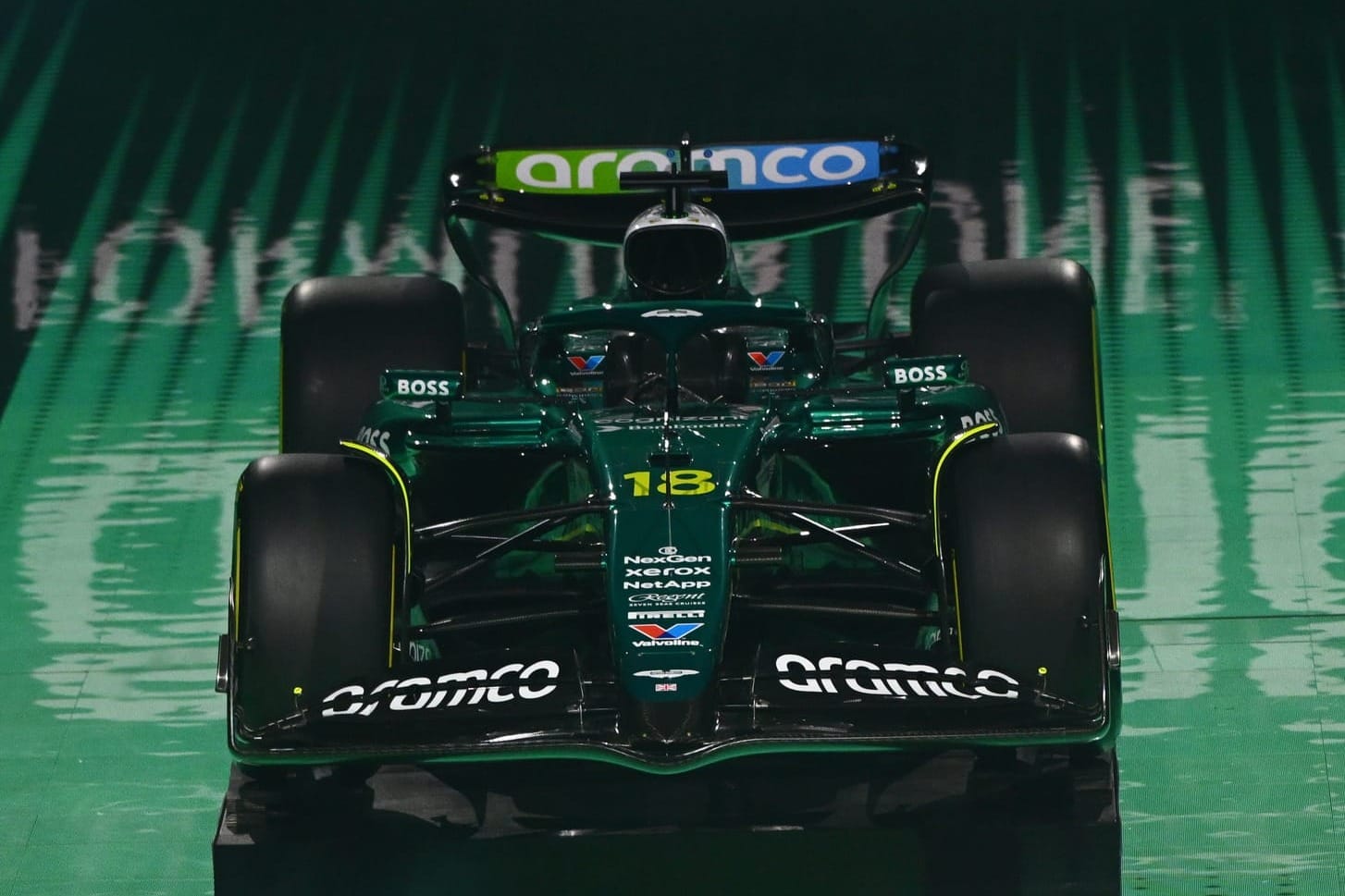
Aston Martin hasn't shied away from paint stripping for 2025 and this year we have more areas of carbonfibre on show that the previous year.
While this could have darkened the overall impression, Aston Martin's punchy chartreuse green has fortunately been given more prominence, acting as a dividing line between the duller carbon tone and the deeper racing green. Ultimately it's better to embrace the contrast rather than pretend it's not there.
Another addition for 2025 is the white air intake which adds a contrast to the top of the car. I'm glad to see the F1 team do more to embrace the Aston Martin Racing visual DNA through its dual tone scheme, even if I would love to see it taken much further.
Want to stay ahead of the curve during F1's launch season? Join The Race Members' Club on Patreon to get ad-free, early access and exclusive F1 content across podcasts, videos and the written word - there's 90% off your first month if you join now
5 Williams
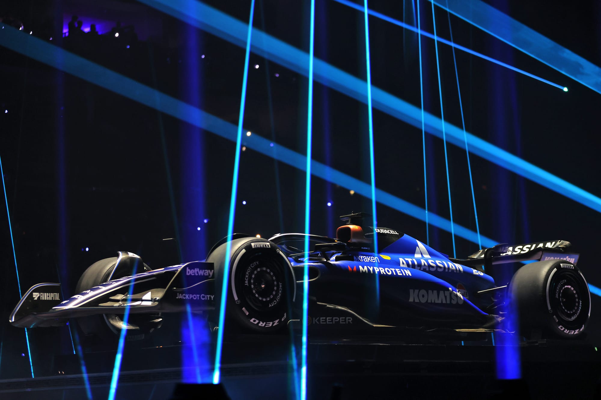
It's a traditional approach from Williams.
This doesn't mean the car is boring per se, maybe just a little visually conservative, especially when compared to more shouty approaches from the rest of the grid.
The use of a richer royal blue lightens the appearance and is implemented across less complex graphics across the body. This revised tone is drawn from the brand identity of their new title sponsor Atlassian, with a logo that looms large but doesn't overbear the car.
In terms of sponsor integration, neither party has had to compromise too far, resulting in a harmonious integration keeping fans and commercial partners happy in equal measure.
4 McLaren
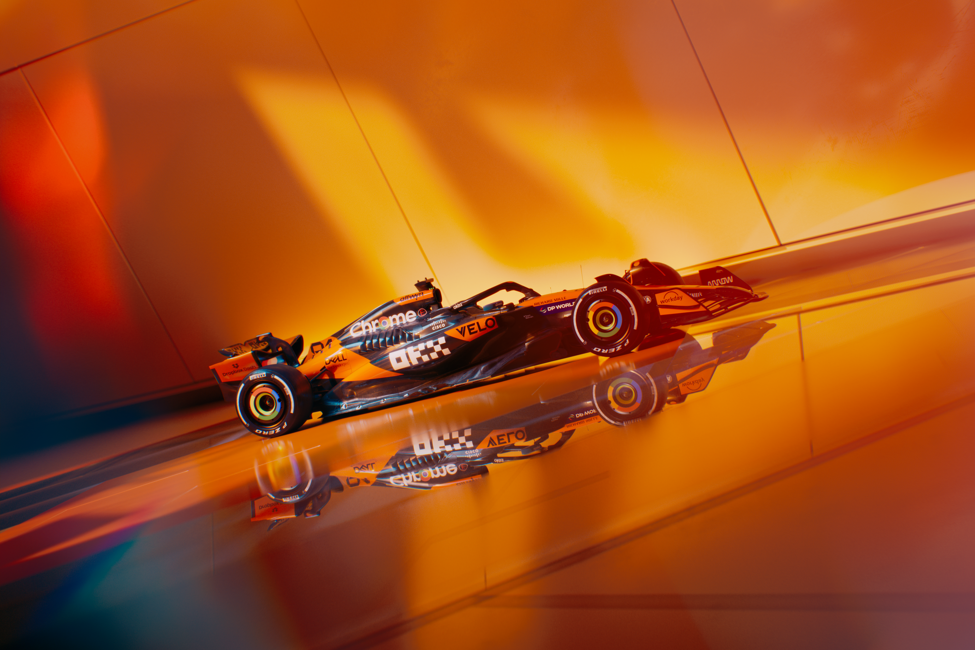
After a buoyant 2024 constructors' championship campaign, McLaren has taken a leaf out of Red Bull's book and made very few significant livery changes to its MCL39 challenger. As a result, it still begs the question: is this a black car with orange accents, or vice versa?
Either way, by nature of its success last year, it will be viewed as being iconic among fans and with its considered sponsor integration (most notably the Mastercard front wing motif) the car looks solid overall.
What is maybe more interesting is how this will be utilised as a base for one-off liveries as arguably this is where the McLaren looks its most eye-catching in 2024.
3 Mercedes
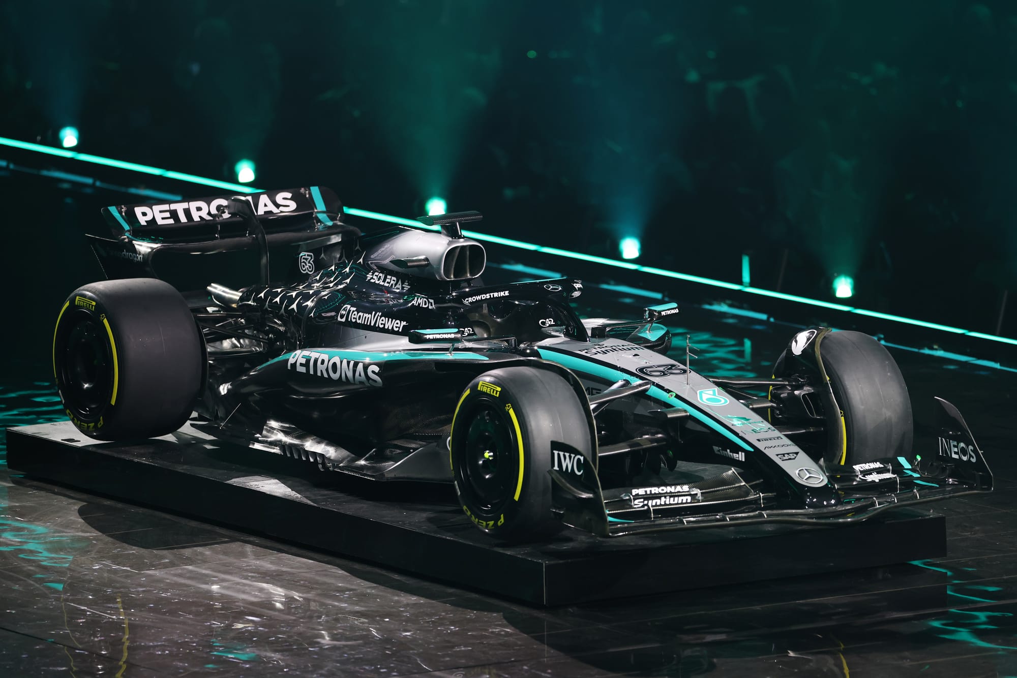
What's most notable with Mercedes' 2025 car is not what's been added, more so what has been taken away. The absence of red from the airbox is a notable reduction of INEOS presence, but the logo does still feature elsewhere on the car.
Outside of this, the concept is largely unchanged from 2024, with minor changes to the scaling of the Petronas green racing stripes which are now fatter as they pass over the sidepods.
Issues still remain with number visibility, but on the whole what worked last year has been brought across once more for a livery that still feels complete and doesn't shy away from former glories.
2 Racing Bulls
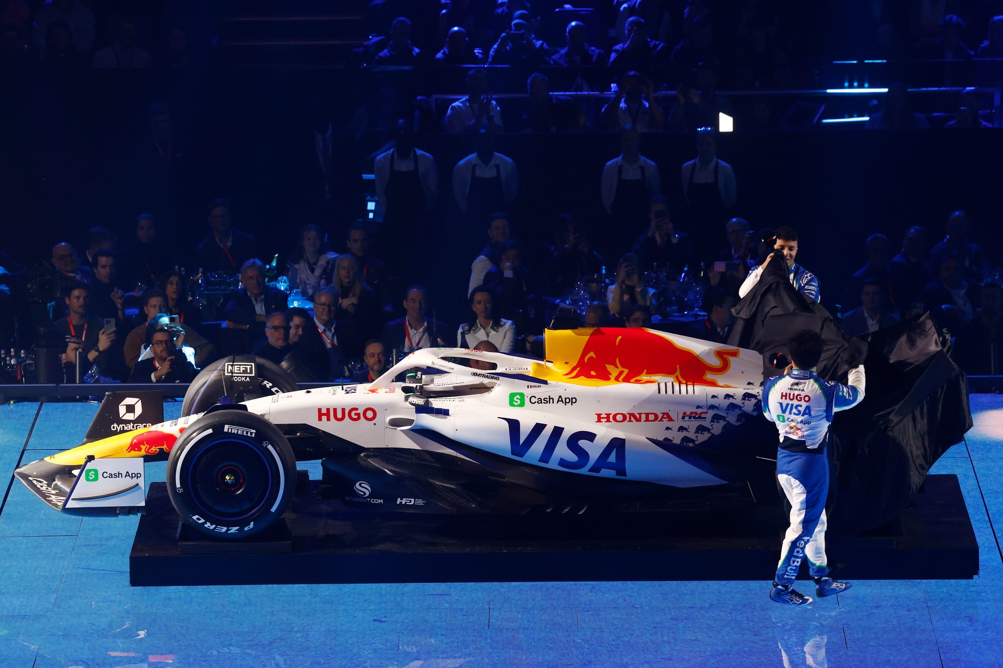
Toro Rosso/AlphaTauri/RB has a history of cleverly reinterpreting the Red Bull identity, so that it felt part of the family but, visually at least, more than just a sister/junior team.
For 2025, and its Racing Bulls rebrand, the dominant colour flips to white, but this is the most overtly Red Bull-branded interpretation that draws the team closer to its bigger sibling. It has a sense of familiarity and earns a close comparison to previous Red Bull Racing one-off liveries, particularly the Turkey 2021 one-off.
I was expecting more to be made of the Visa Cash App apple green accent, as the blue-green combo could be quite playful, but the decision to lean more so on Red Bull brand assets means this would have created a visual clash.
This is so close to being a number one contender, but falls short in just one small area. The use of the 'Blue Bull' as a scaled pattern does give a good amount of movement towards the rear of the design, but the motif feels in the shadow of how Mercedes has used its star marque in recent years.
1 Alpine
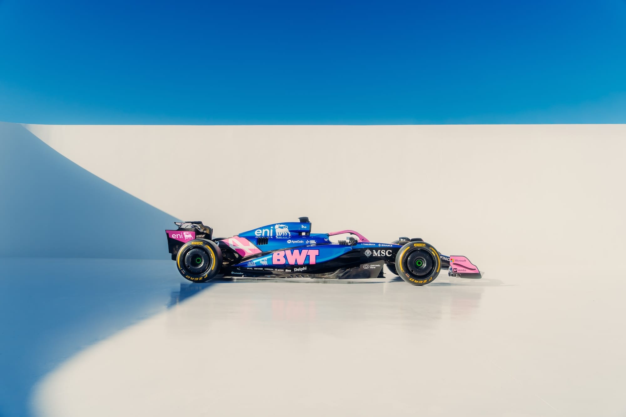
Alpine has had this secret weapon in its arsenal but has so often been reticent to maximise its potential.
Love it or hate it, BWT's bubblegum pink demands your attention and draws far more focus than much of the rest of the grid. You can understand Alpine's resistance to fully embracing the pink, as it could lead to comparisons with the Force India BWT era, however the overall package here really starts to utilise the colour palette properly.
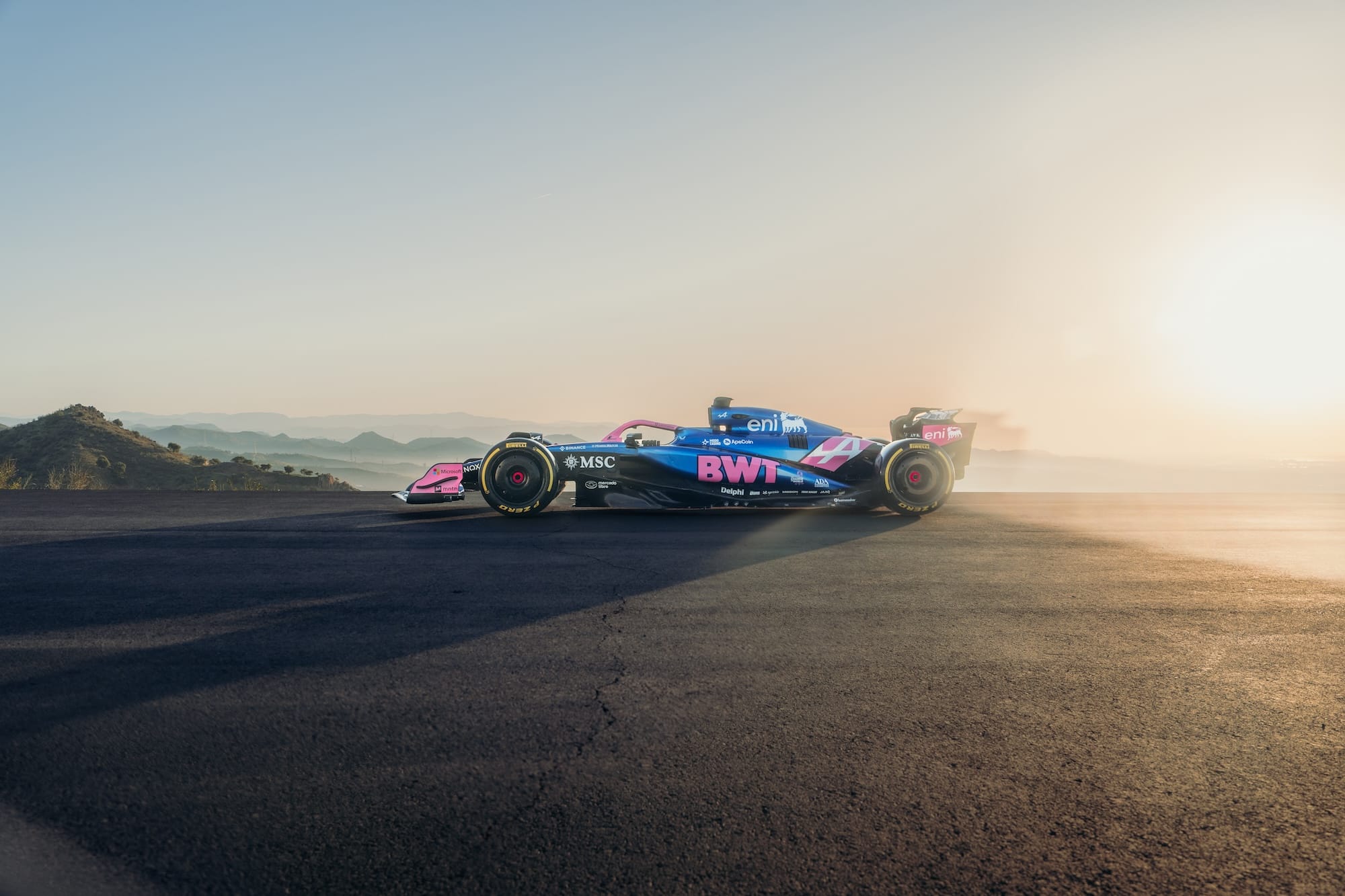
The glossy metallic blue finish looks pin sharp (in the way the STR14 did for Toro Rosso in 2019) and day or night, it will jump off the screen. The introduction of the silver accent on the ENI logo tops the concept nicely and shows how the team has stepped away from a gloomy noir tone.
Much like the pink itself, I can imagine this being divisive choice for many, but I feel that Alpine comes out on top for making the most of blending its sponsors and own identity to provide a design that is genuinely refreshing and bold.

