Why Ferrari needs to ditch its uninspiring 2021 F1 livery

As a seven-year-old boy, I saw a Ferrari for the first time at the BOAC 500 at Brands Hatch. In fact, I saw eight of them, three of the gorgeous 330 P4s, a 412P and a quartet of 250LMs.
Ferrari were well beaten that day by the singleton Chaparral Cars entry from the USA, the cream white be-winged 2F of Phil Hill and Mike Spence which for once held together, matching reliability with speed.
But my single abiding memory of that day, that day of racing bliss with my father, is the blood-red coloured Ferrari S.p.A SEFAC entries from Italy.
Yes, of course, the driving line-up of Chris Amon / Jackie Stewart, Ludovico Scarfiotti / Peter Sutcliffe and Paul Hawkins / Jonathan Williams was memorable as was the quality of the opposition but in the black & white television world of the 1960s it was the colour that hit me.
Images from that day still come into focus, sleek, blood red bodywork and gold wheels the reflection in which you could see your face.
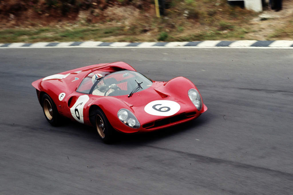
Then there were the discreet but nonetheless eye-catching yellow prancing horse stickers which adorned the flanks of the cars and the large white circular roundels replete with black numbers which made it easy for Dad and I, spectating at Clearways, to spot which one of the cars from Maranello was in view.
The cars also carried a circular white sticker with the letter “P” denoting “Prototype” class and intriguingly, each Ferrari had a licence plate on the rear of the car, presumably to fulfil a regulatory requirement.
The Ferrari prototypes of that day in 1967 had a “presence” and I was in awe of those cars upon seeing them for the first time. In an instant, my black and white world had become colour.
It wasn’t until the next decade that I saw a Ferrari Formula 1 car for the first time, the British GP at Silverstone of 1975 – the one where the rain fell only on the southern part of the track and car after car crashed at Stowe corner.
The 1975 Ferrari 312T (below) blended the same Ferrari red with a white airbox and polished aluminium front and rear wings. Red and green striping on the airbox gave more than a nod to Ferrari’s home country.
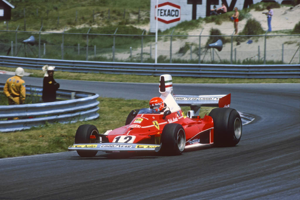
The lightweight aluminium wheels even retained a gold centre-piece design. I was a Shadow fan back then but again, notwithstanding a grey Northamptonshire day, the vivid hues of the two Ferraris stuck with me and my clumsy photographic attempts from that day bear witness to my enthral.
Scroll forward to 2021, I’m watching the British GP with my two sons and it struck me that something is terribly amiss with the latest Ferrari SF21.
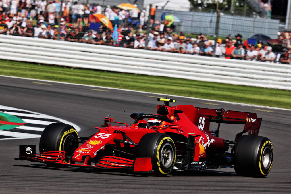
No, I’m not referring to the car’s inherent lack of grip and performance (although Leclerc drove splendidly that day) but the car has no presence, it’s a dirty, drab and uninspiring shade of crimson that were further marred with ungainly green blocks carrying “MW” logos earlier in the season which meant nothing to anybody watching.
In between 1975 and 2021, Ferraris have changed their colours on a number of occasions, mostly at the behest of long-time partner Philip Morris to align with product packaging shades and maximising colour television pop.
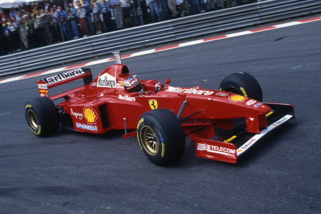
I get that and as a commercial guy that’s worked all my life in professional motor sport I know how important it is to represent your partners but something essential has been overlooked in creating the 2021 Ferrari look and that is appeal.
Motor sport liveries that appeal also endure, it’s as simple as that and more subtly, the brand messaging that is intrinsic to the livery permeates the sub-conscious mind. Think John Player Special Lotus, Martini Brabham or Martini Porsche, even Woking’s 2021 Monaco GP Gulf McLaren.
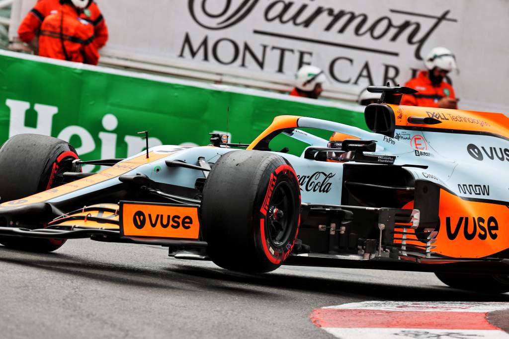
For the tens of thousands of Tifosi who will grace the Parco di Monza and the millions around the world who would like to but cannot and who will be watching this weekend’s Italian GP in a digital format, I feel for you.
It would be nice if you could feel the passion and spirit that Ferrari once brought to a seven-year-old boy on his first encounter.
Regrettably, at least for 2021, that won’t happen but Signor Binotto, please, when you are adapting to the new F1 technical regulations for 2022, can you pay as much attention to making your cars look magical, mythical and inspirational and like a Ferrari really should.
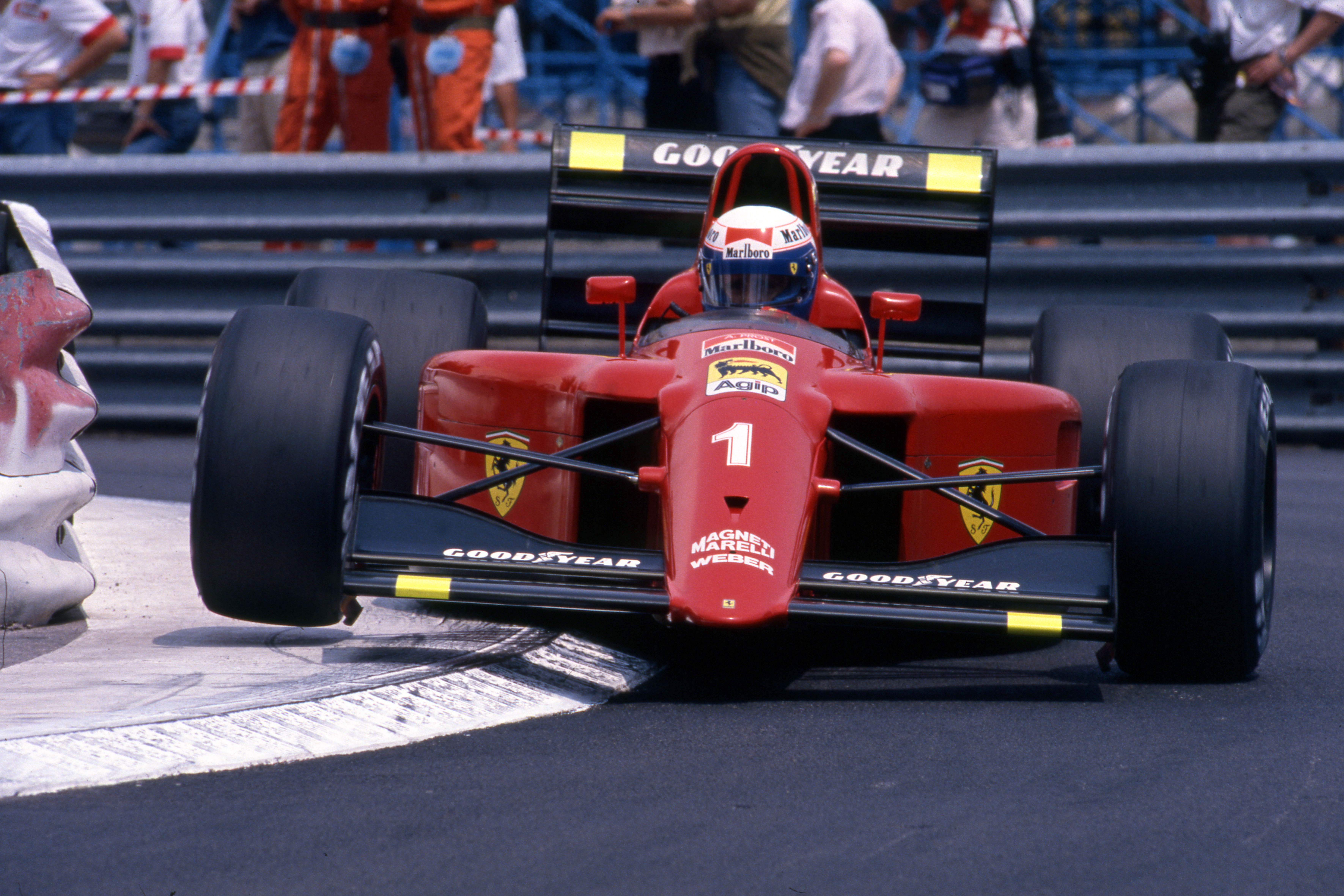
Please consider reverting to Il Commendatore’s red, gold wheel centres, distinct numbers and subtle use of the prancing horse motif whilst maintaining your partner requirements. It can be done, you just need to apply the right resource.
It’s all in the hue and the execution.


