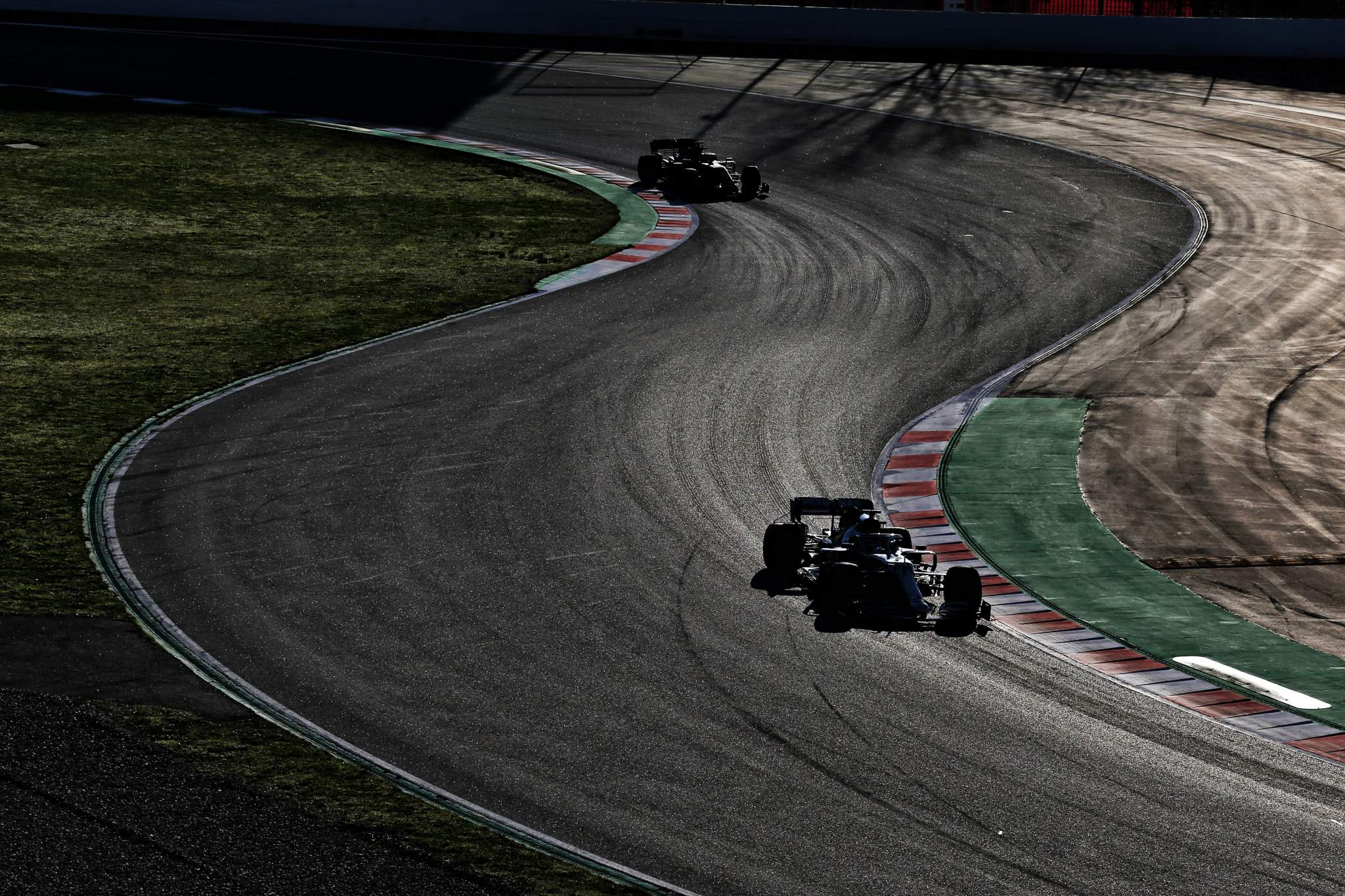
We often try to make predictions from pre-season Formula 1 testing, but in reality there is nothing more difficult to do.
Normally, if the top teams from the previous year are still at the top then that part of it is easy, but it’s the very compressed midfield where predictions become particularly difficult.
To try to get some sort of direction, you need to gather as much information as possible. Was the time set on new tyres? Was it a one-lap qualifying simulation run or part of a multi-lap run? Do all three sector times add up to the best lap time or is there a better lap time from a driver’s best three sectors? And where does the best time stack up relative to a race run?

Usually, we have all these questions and very few answers so we also add in what the car looks like out on track. Is it consistent lap on lap? Can we see much understeer? Is the rear nervous during braking or corner exit? If these are noticeable, then is there a better time in there somewhere?
However, one of the big questions we always ask is does the car look heavy. You can normally see when a car is loaded up with fuel because the driver brakes earlier, doesn’t chuck the car around so much and it’s slower to accelerate off the corner.
But back in the old days when the car and driver weight was something like 625kg and you changed the fuel load by, say 100kg, you added 16%. Currently, the cars weigh 745kg, and as they are more fuel efficient to do the same miles that 100kg probably turns to 75kg. That adds up to a change of weight of 10%, so in effect it’s a lot more difficult to spot.
So to try and get on top of it all, I have had a look back at last year’s pre-season testing data. As the saying goes, hindsight is 20/20 and given teams tend to take a similar approach from year to year in terms of the fuel loads they use, it will give us some idea of what they might each be doing this year for their fastest times.
I have converted each team’s fastest pre-season lap into a percentage of whoever was fastest. That gives us the offset from team to team. Then, to compare to that I have done exactly the same using the average percentage performance of each team over the first four different circuits of the 2020 championship. Again, we then have each team’s offset to whoever was fastest over those four race weekends.
One thing we can be certain of is that over those early-season races the best times will have been set on low fuel, with the majority of times we’re using coming from qualifying. So in effect, the cars are running on a sniff of an oily rag. Unsurprisingly, the gap from Mercedes to everyone increased, but by varying amounts.
| Team | Pre-season* | First 4 tracks** | Delta |
| Mercedes | Datum | Datum | 0.000% |
| Red Bull | +0.709% | +1.228% | 0.519% |
| Renault | +0.718% | +2.224% | 1.506% |
| Ferrari | +0.829% | +1.631% | 0.802% |
| Racing Point | +1.222% | +1.435% | 0.213% |
| McLaren | +1.436% | +1.656% | 0.220% |
| Williams | +1.593% | +3.168% | 1.665% |
| AlphaTauri | +1.560% | +2.251% | 0.691% |
| Alfa Romeo | +1.597% | +3.374% | 1.777% |
| Haas | +1.712% | +3.232% | 1.520% |
* First and second pre-season test combined
**Average of first four races on different tracks – Austria 1, Hungary, Silverstone 1, Barcelona
If we now put that delta percentage in order of the largest deficits when the racing stated, we get the following table – in which the second column is the fuel load that it would take to add up to that difference.
You need fuel in the car, so for the team with the biggest difference, I have left it with 5kg. This also means that Mercedes works out at carrying around 64kg when it did its fastest test times.
| Delta. | Fuel load | kgs |
| Mercedes | +0.000% | 64 |
| Racing Point | +0.213% | 57 |
| McLaren | +0.220% | 57 |
| Red Bull | +0.519% | 47 |
| AlfaTauri | +0.691% | 41 |
| Ferrari | +0.802% | 37 |
| Renault | +1.506% | 14 |
| Haas | +1.520% | 14 |
| Williams | +1.665% | 9 |
| Alfa Romeo | +1.777% | 5 |
It’s never just one thing that leads to a change in pace from testing to race weekends – or even from qualifying to race laps. It’s not all fuel as engine modes can also have a big effect. But this gives you an idea as to what those different fuel loads can do to a car’s laptime.
Incidentally, for comparison, if you are following pre-season testing this year the 2020 Bahrain 1 pole was 1m27.264s (Lewis Hamilton) and the fastest race lap was 1m32.014s (Max Verstappen).
And the percentage difference in the team’s performance for that one event was as follows:
| Mercedes | Datum |
| Red Bull | 0.47% |
| Racing Point | 1.21% |
| Renault | 1.32% |
| AlphaTauri | 1.36% |
| McLaren | 1.47% |
| Ferrari | 2.15% |
| Williams | 2.33% |
| Alfa Romeo | 2.55% |
| Haas | 3.26% |
Interestingly Bahrain was just one of Mercedes’s 14 times in 2020 topping the performance list. On the other hand, it was actually Ferrari’s worst performance relative to Mercedes, so the pressure will be on it in testing.
This data isn’t going to give us all the answers in interpreting testing times, but it’s just another piece of the puzzle to feed into what we can learn. When it comes to predicting the form for the season, testing can be misleading but all you can do is put together the data you do know to create a model for what the competitive order might be.
And like all predictive models, it will only be as precise as the available information, which is why the picture is always reshaped come the first weekend of the season – although often by less than you might expect.
I’ll be following testing and will do my best to decipher what’s going on, but as you can see from above, it’s not easy and all the teams are out there to throw the odd curveball to confuse the others.
